CASE STUDY – One Acre Fund
Creating Clarity to Foster Growth.
Refreshing the Tubura brand in Rwanda, to create clarity and open opportunities for innovation and growth.
One Acre Fund operates in Rwanda under the local brand Tubura, which means “to grow exponentially”. We have a long-standing partnership with One Acre Fund, and in 2022, they reached out to us with the intention of realigning the Tubura brand to facilitate growth for their operations in Rwanda.
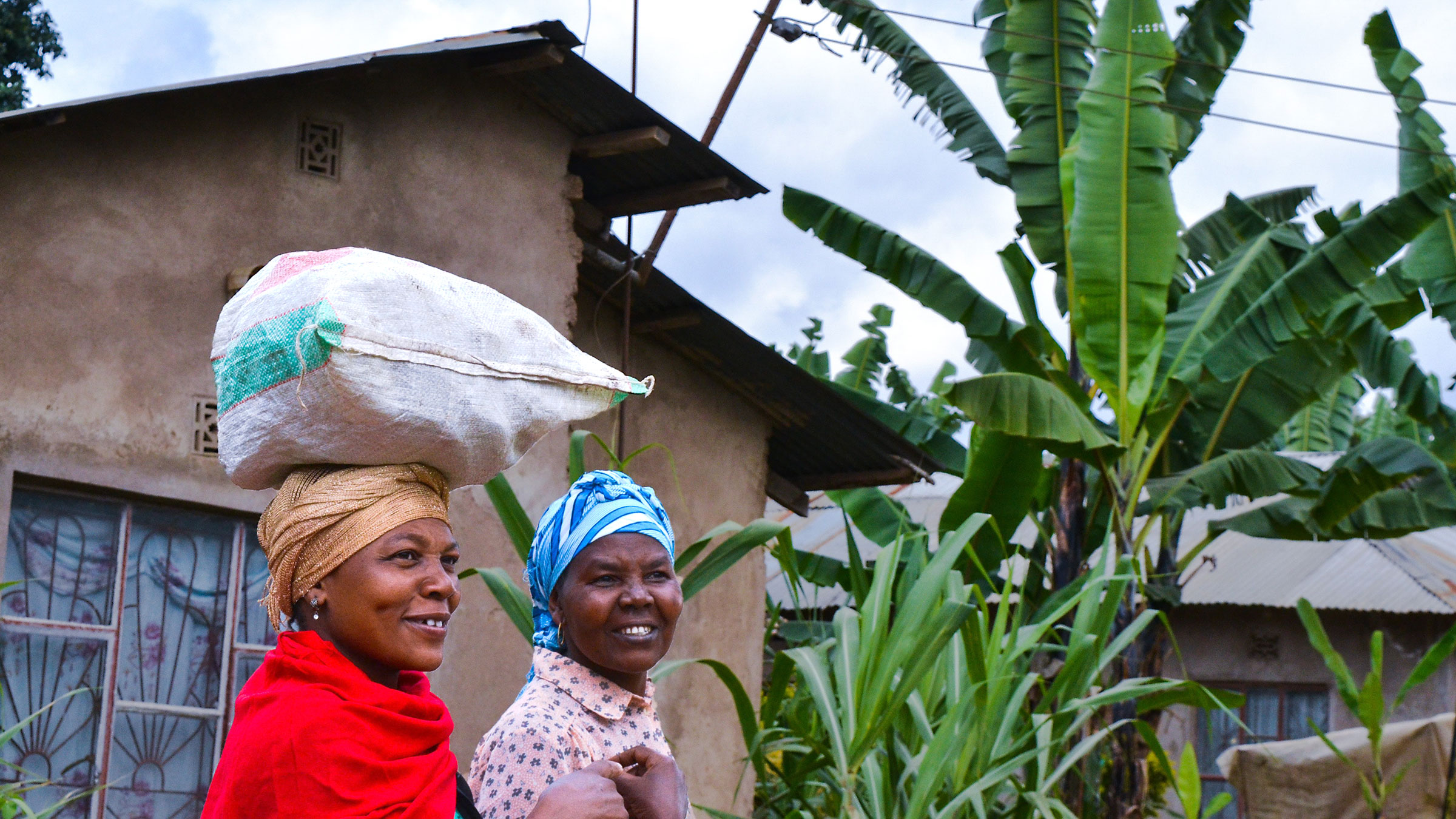
Tubura has been in operation in Rwanda since 2007, serving over 600,000 farmers directly and working in partnership with the Rwandan government to support the agricultural sector. As it stands, Tubura is the country’s second largest employer after the national government, employing around 2,500 people and bolstering the country’s agriculture-based economy.
Brand Immersion
Design Research
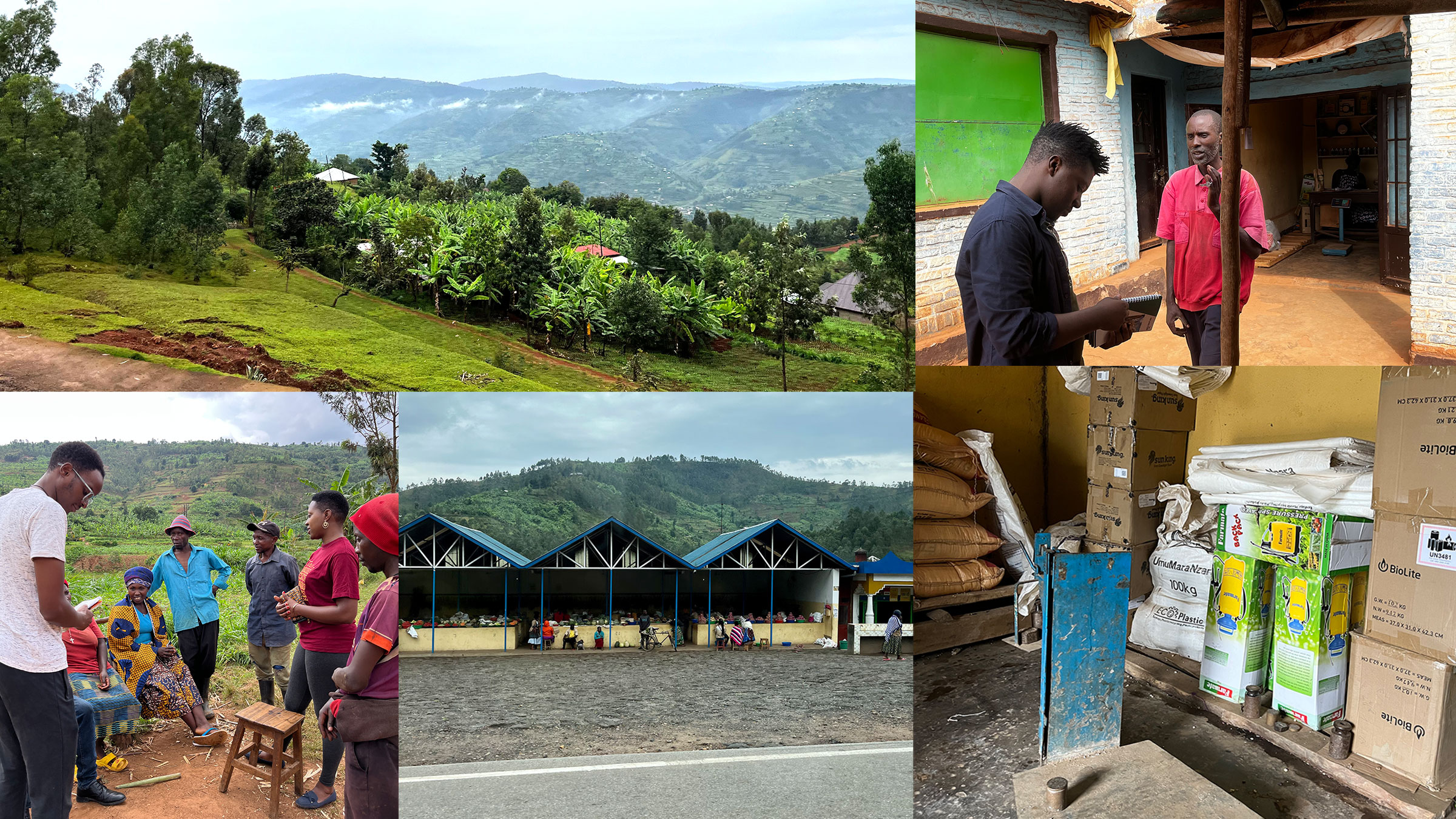
At ARK, before engaging in creative execution, the first step of our working process is always to understand the problem at hand as comprehensively as possible. This lead us to spent a good amount of time in the farms and fields of Rwanda to get first-hand, contextually relevant experience of the audience that Tubura engages with on a daily basis.
To better understand the operations of the business and create a strong link between the local farmers’ needs and the new products and services provided by the revitalised Tubura brand, we utilised Human Centred Design tools and conducted multiple interviews with farmers and vision leaders within the organisation.
A Blueprint For Success
Brand Strategy
Once we had analysed and consolidated our research results, we began developing a brand strategy for the refreshed Tubura brand – a strategy tailored to farmers throughout Rwanda.
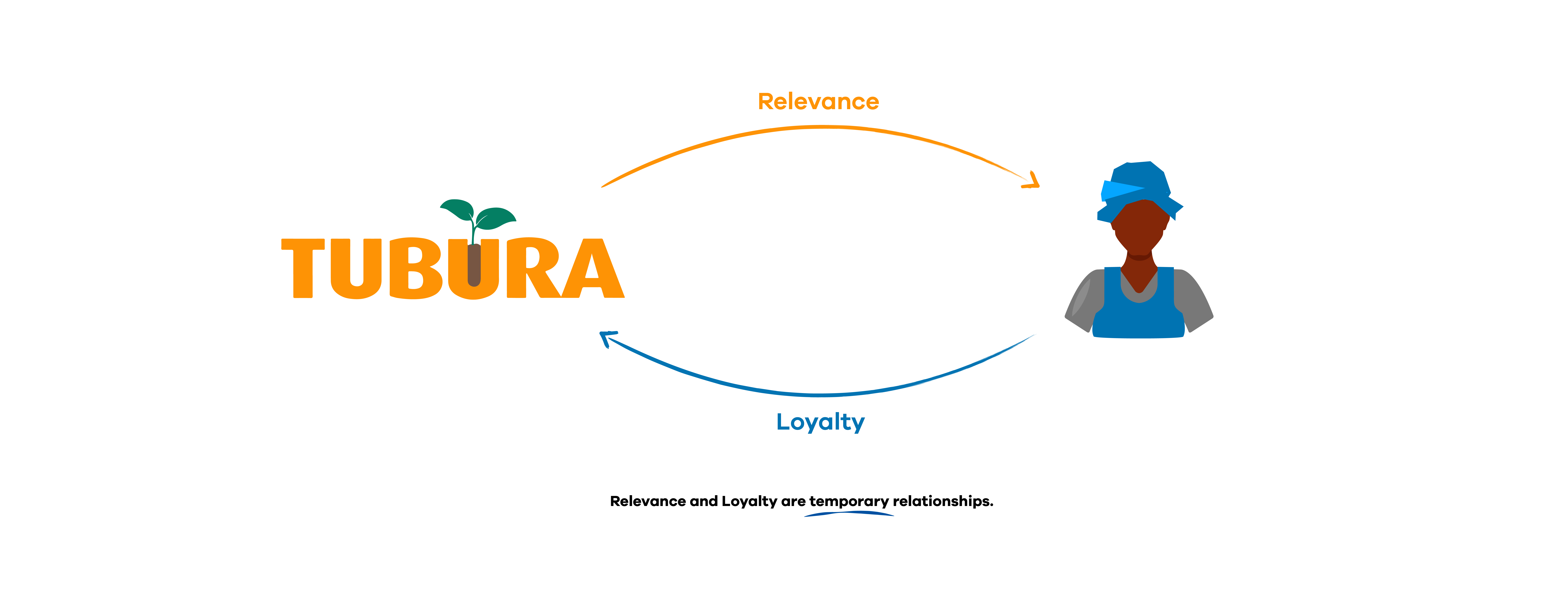
Our primary objectives were to establish organisational clarity in order to facilitate easier ways of working and to create external clarity that would effectively enhance the brand’s image among partners and other stakeholders – all in a bid to ensure agility in new offerings and fuel expansion.
Crafting a Path for the Future
Brand Refresh
Identity
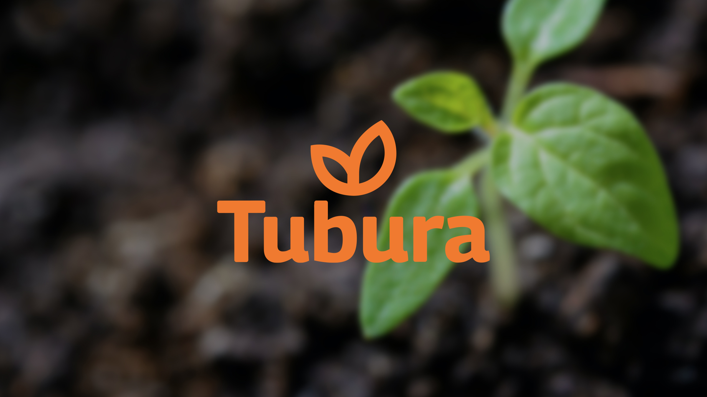
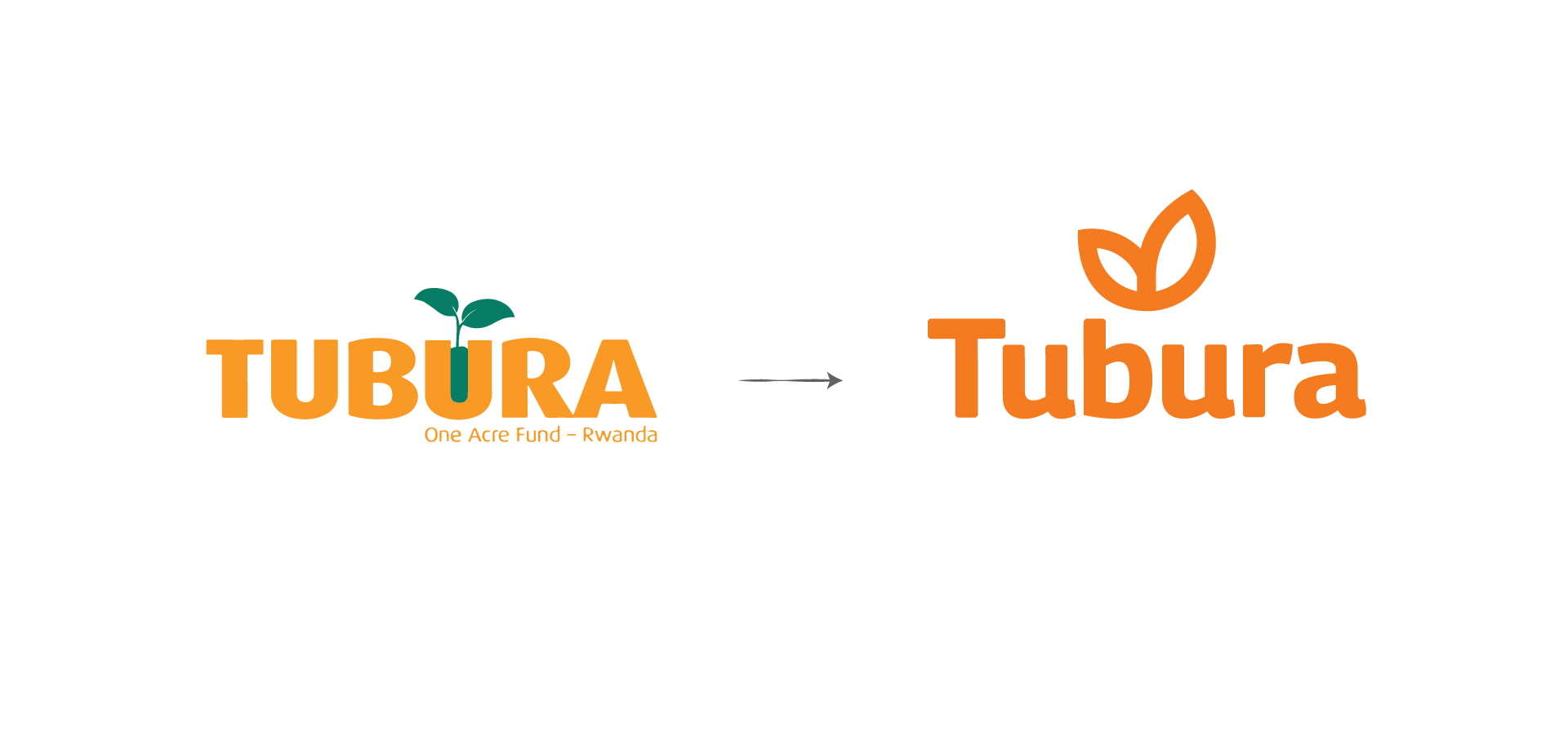
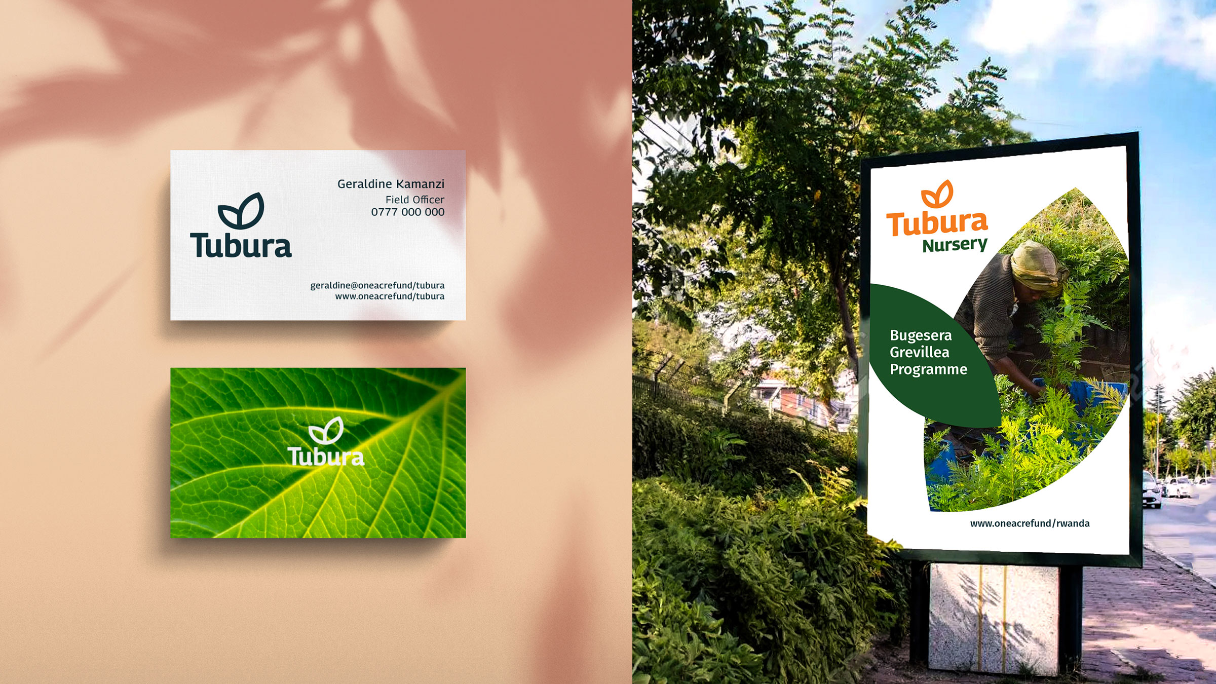
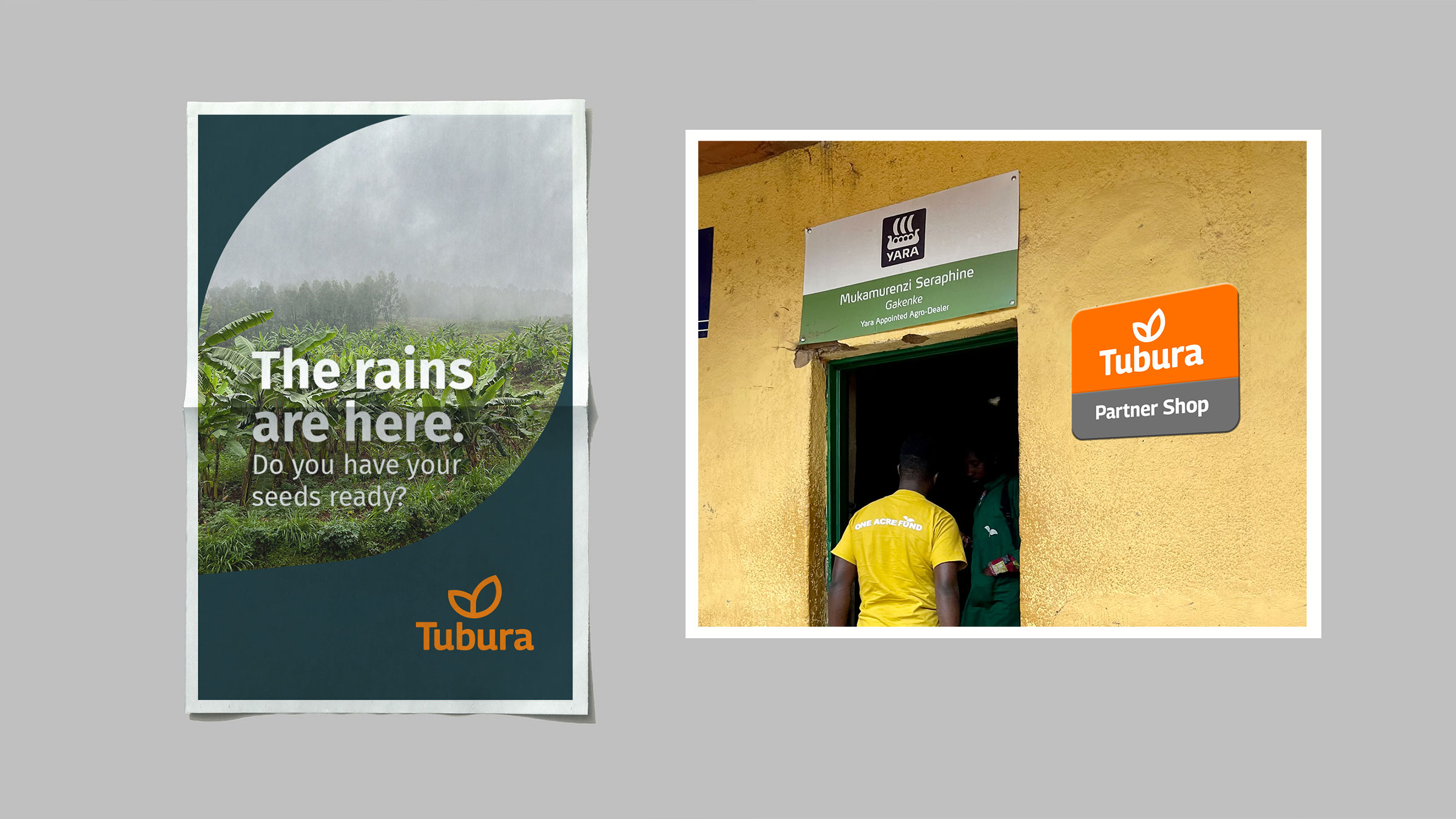
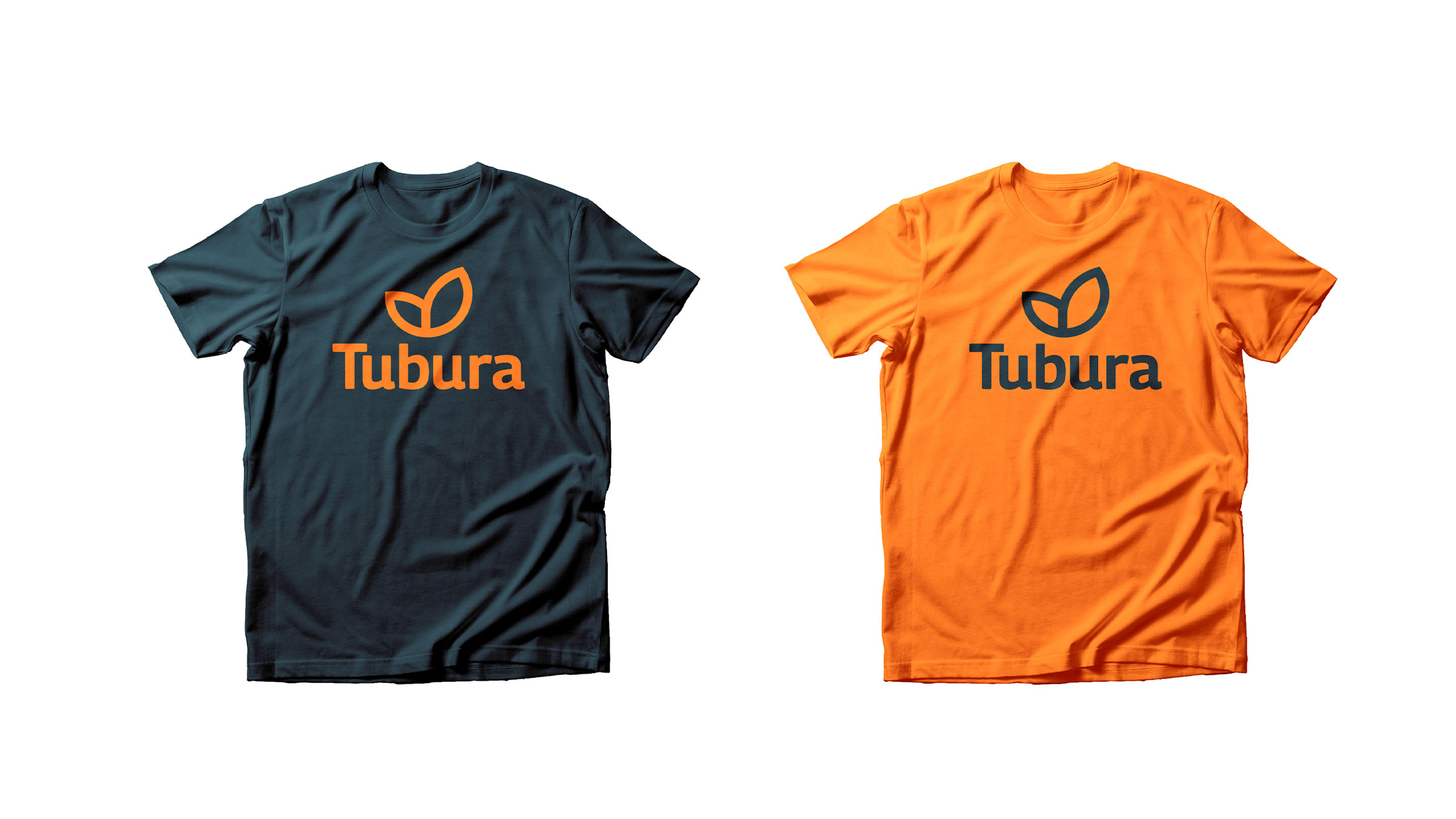
Keeping in mind the significant equity of the Tubura brand, which has fostered strong ties with local farmers for more than 10 years, the revised Tubura identity has been designed to build on and advnace this equity. The overall orange colour and depiction of entwined leaves in the monogram tie back to the legacy identity while the minimal logo construction coupled with the contemporary typeface give the refreshed logo a future-facing aesthetic.
Brand Architecture
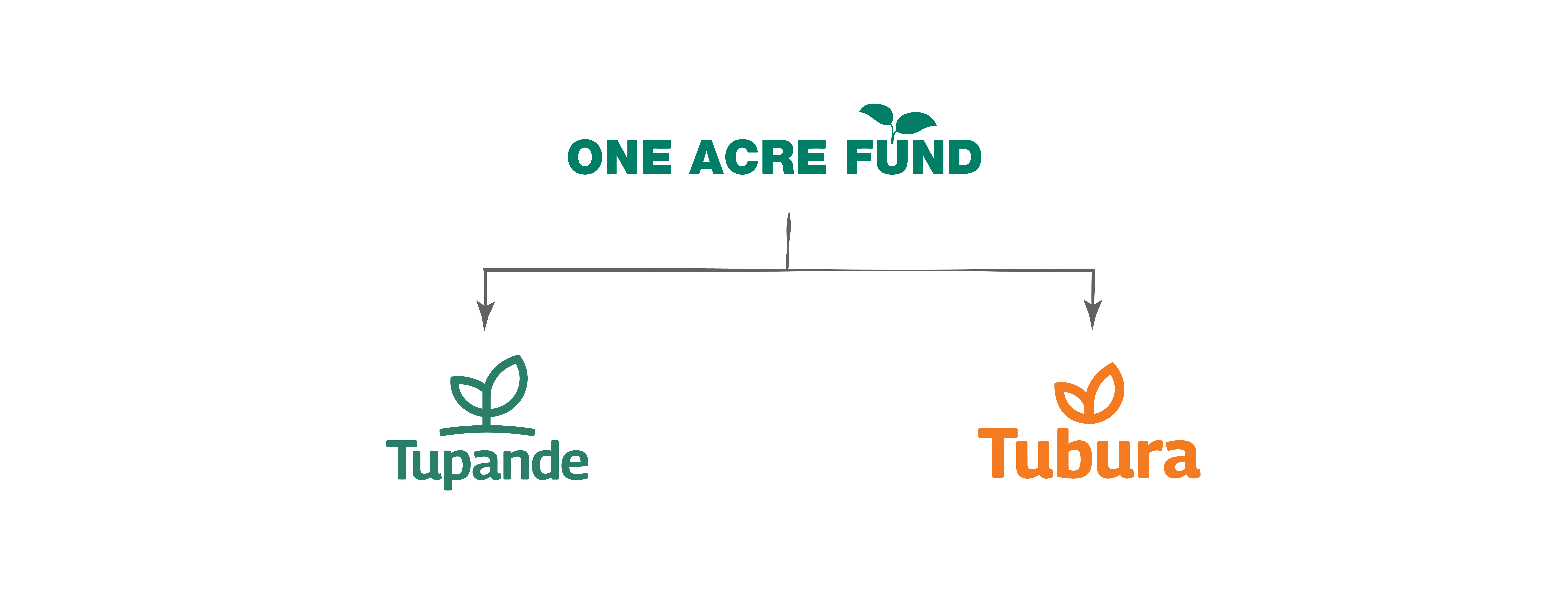
Building on the work we did in 2021 for Tubura’s sister brand, Tupande, we created a consistent look and feel across the One Acre Fund brand family in order to bring about a sense of cohesiveness. This allows the brands to play harmoniously if need be, while being differentiated enough to resonate locally and represent their respective entities individually.
Application & Execution
The brand’s creative direction and visual language is characterised by a revamped, vibrant, orange colour and curved lines born from the geometry of the monogram.

Launch
In early 2023, Tubura was successfully introduced into the market with an array of novel products and services tailored to farmers.
