CASE STUDY – PROTO Energy / PROgas
Making a commodity cool.
Building a brand positioning strategy and creating retail brands for B2B and B2C LPG, fast becoming one of the most accessible cooking fuels in Kenya.
LPG gas in Kenya is a commodity found in around 25% of households, it is a largely de-branded market. In 2016, MyGas approached ARK to create a differentiated brand and develop a product and service that created true value for audiences, and disrupted the industry.
Brand Audit
We began by carrying out an audit to understand the audience, the East African LPG market and the audience touch points. We used workshops, field and desk research to gather our insights and understand the different user journeys.
Brand Strategy
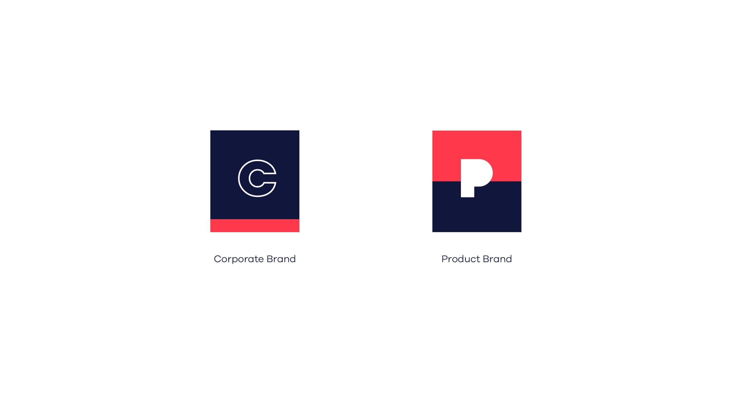
Guided by our findings we began developing two brands — a corporate brand that provides industrial and commercial consumers with bespoke LPG solutions and a product brand that provides households with LPG solutions that are reliable and affordable. Our strategy mapped out the relationship between these brands, the touch points for different groups, opportunities for innovation as well as the architecture, positioning, essence and values for the brands.
Service Design
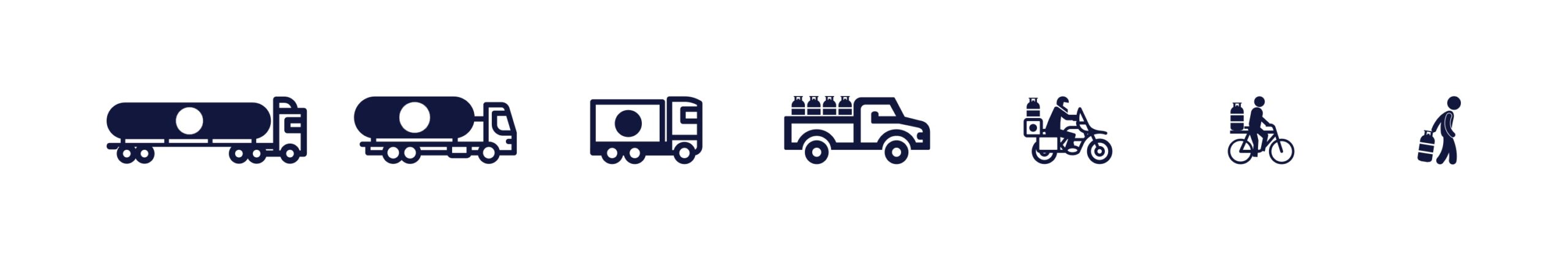
Value Creation & Mapping
Working closely with our client, we develop a sustainable service delivery business model. This model creates true value at every touchpoint from distributors to retailers to home users, ensuring that new and existing customers have a functional and pleasant experiences.
Brand Creation
We set out to design brands that inspire trust and are distinctive and memorable. The corporate brand was at the time called MyGas. Guided by our brand strategy and architecture, the B2B needed to sound professional and innovative whilst the B2C product brand needed to be adaptable and connect with a larger audience.
Naming
We named the corporate brand PROTO and the product brand PROGAS. Both brands share the PRO prefix, chosen for its connotation of expertise, connection to energy and positive semantic value. The trisyllabic structure of each brand name gives them a distinct character.
Identity Design Systems
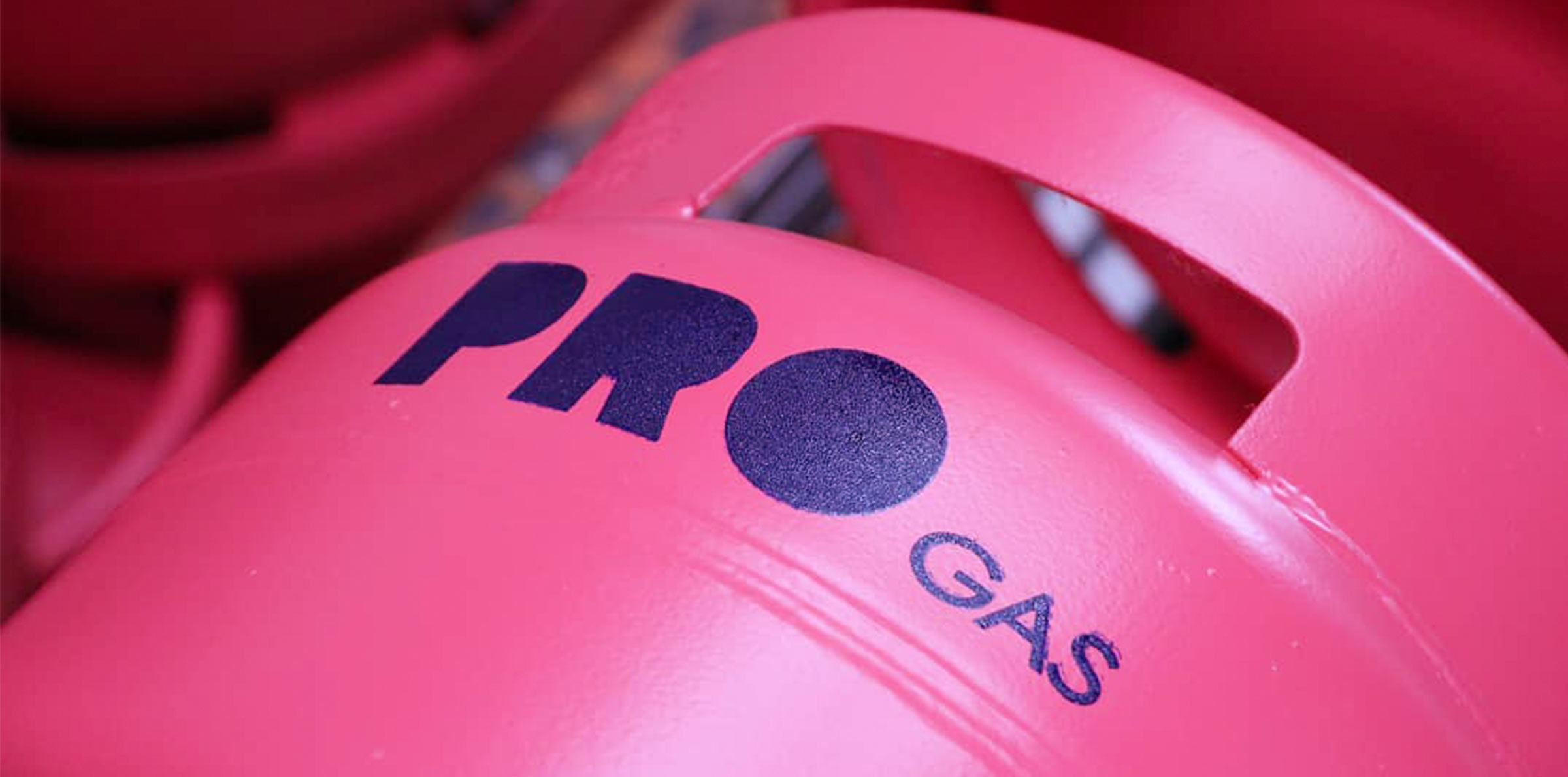
The thick handcrafted stencil letterforms of both logotypes was designed to give the brand presence and authority, whilst their non-traditional letterforms inject a dose of playfulness.
Graphic System
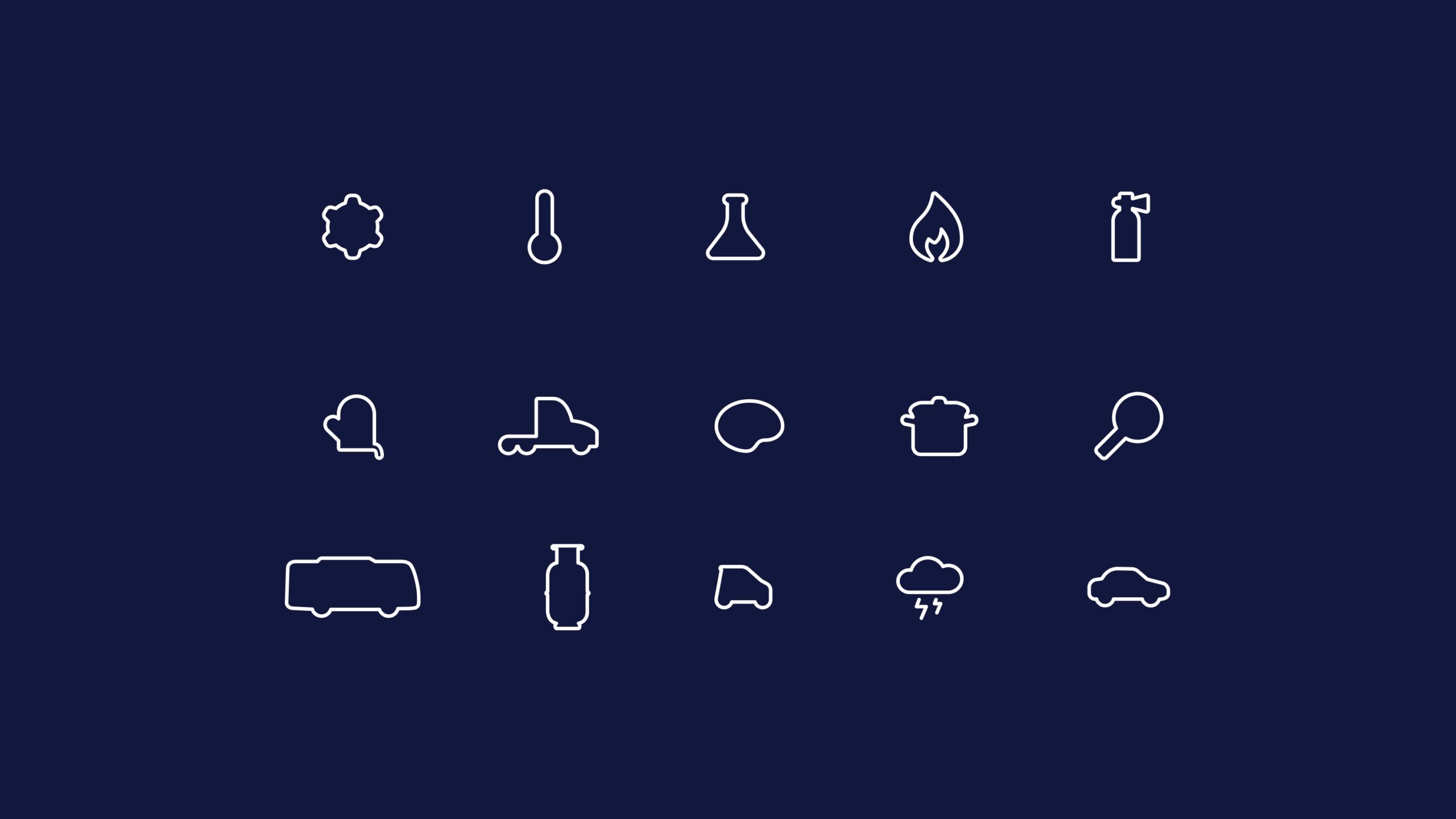
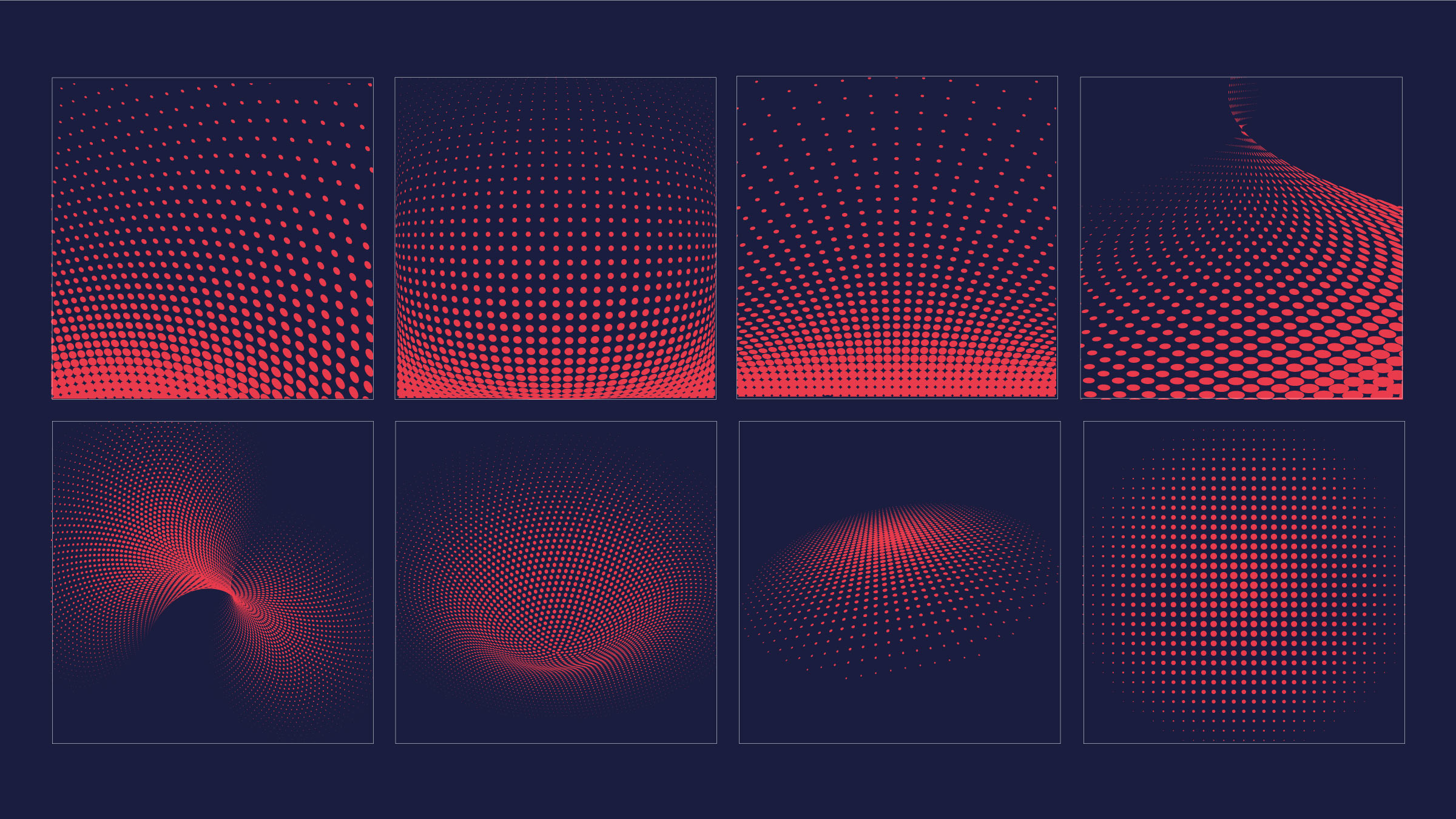
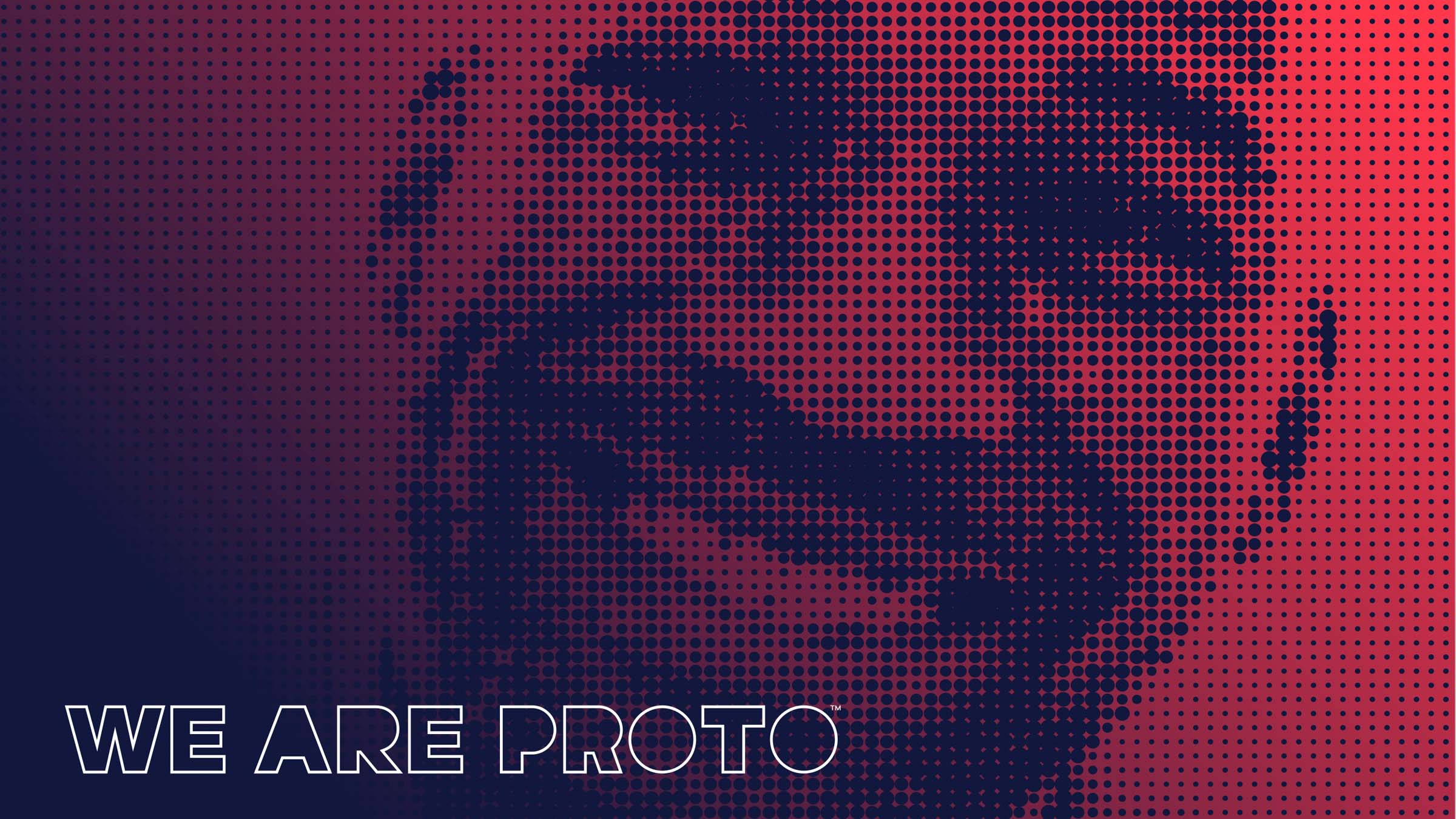
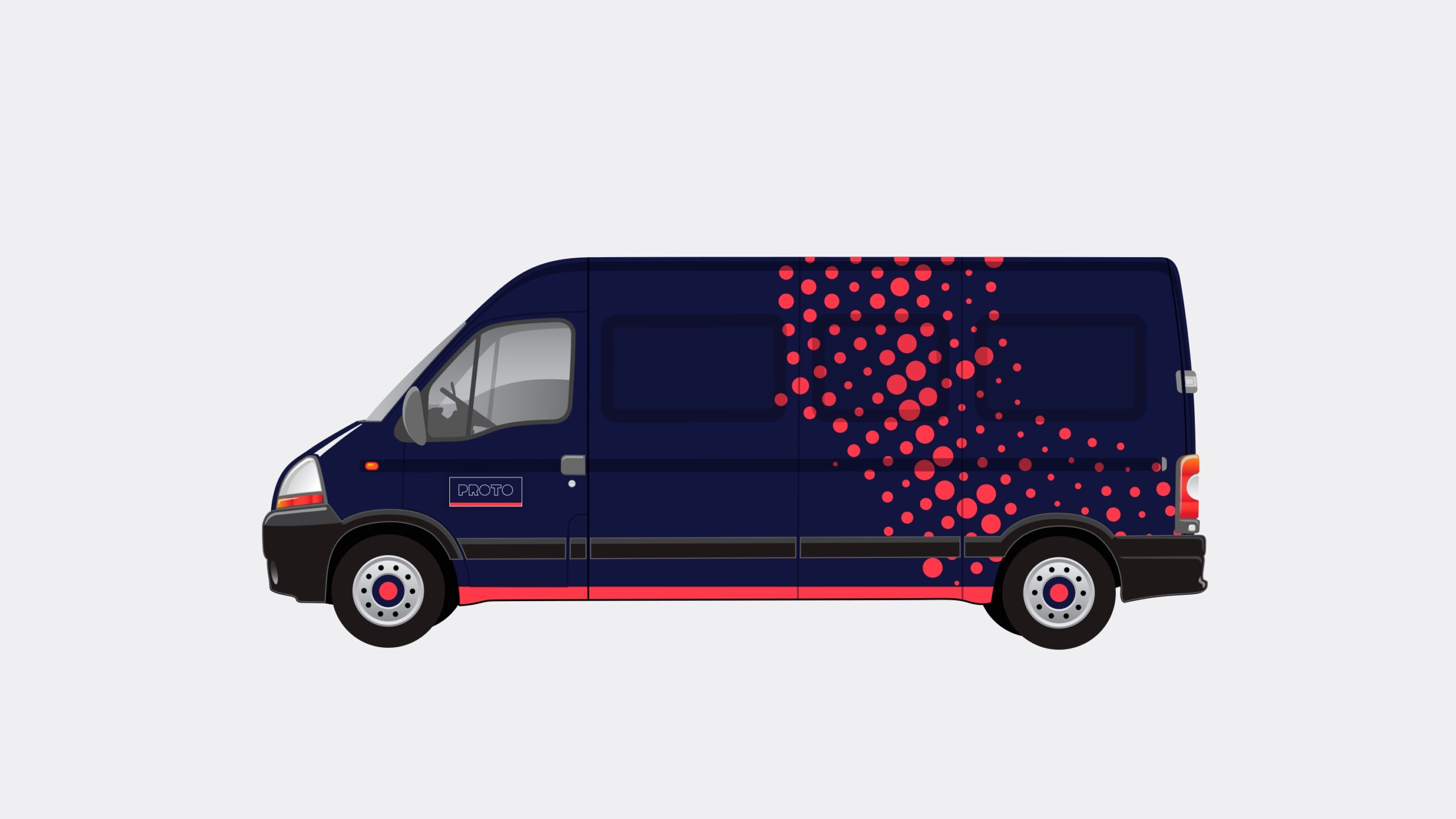
The iconography for PROTO draws on the outline motif from the logotype to create the forms of the different icon sets, and the halftone waveforms and patterns subliminally build up on the dispersion of heat.


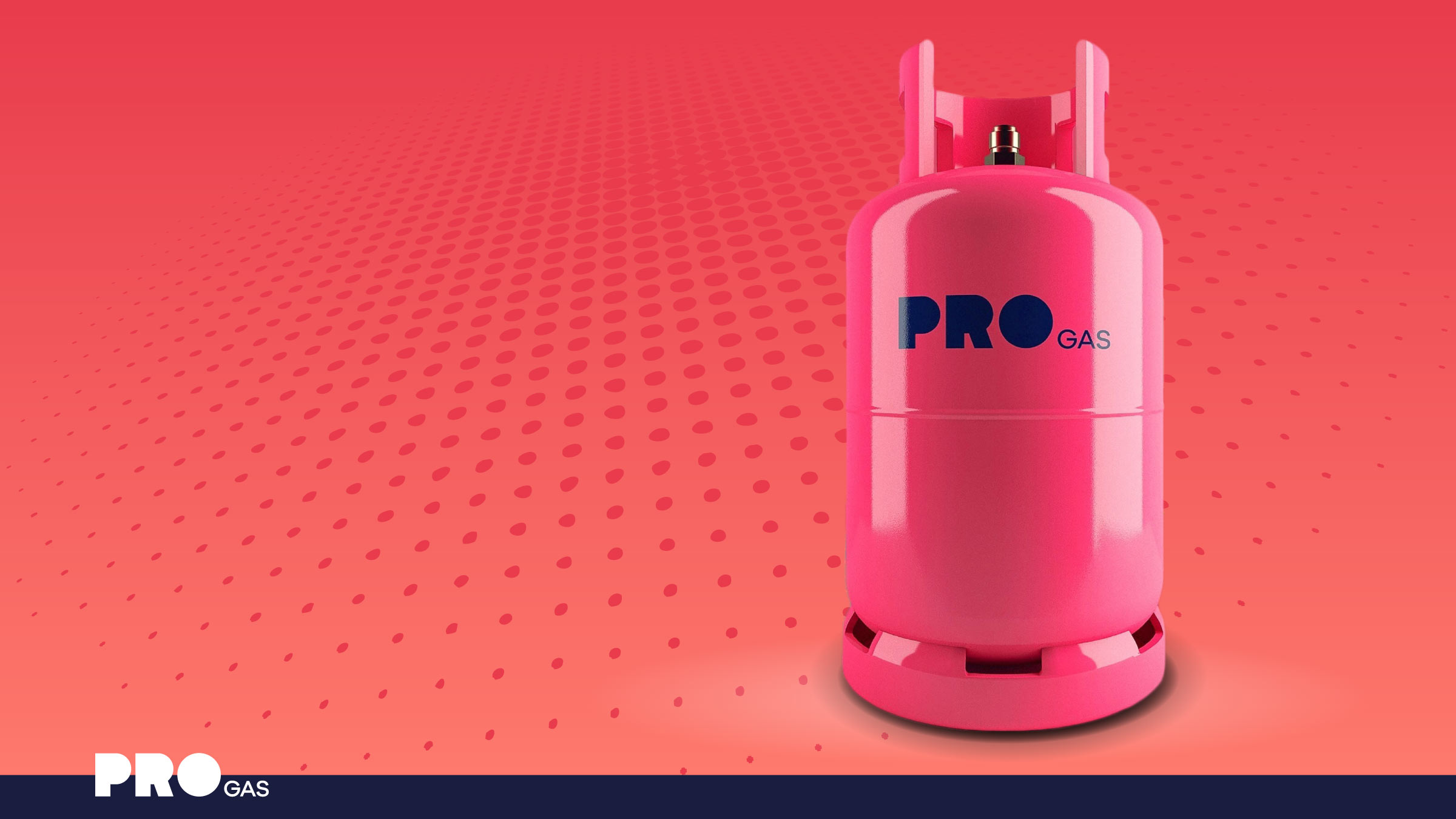
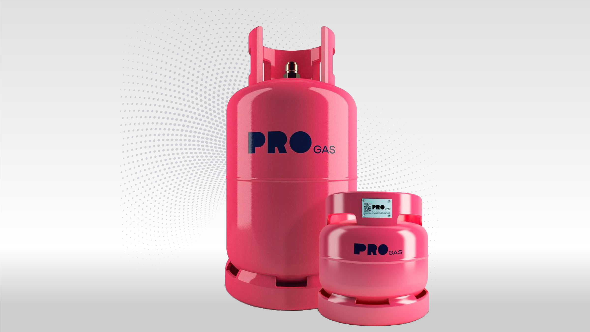
Owning Pink
Product Design
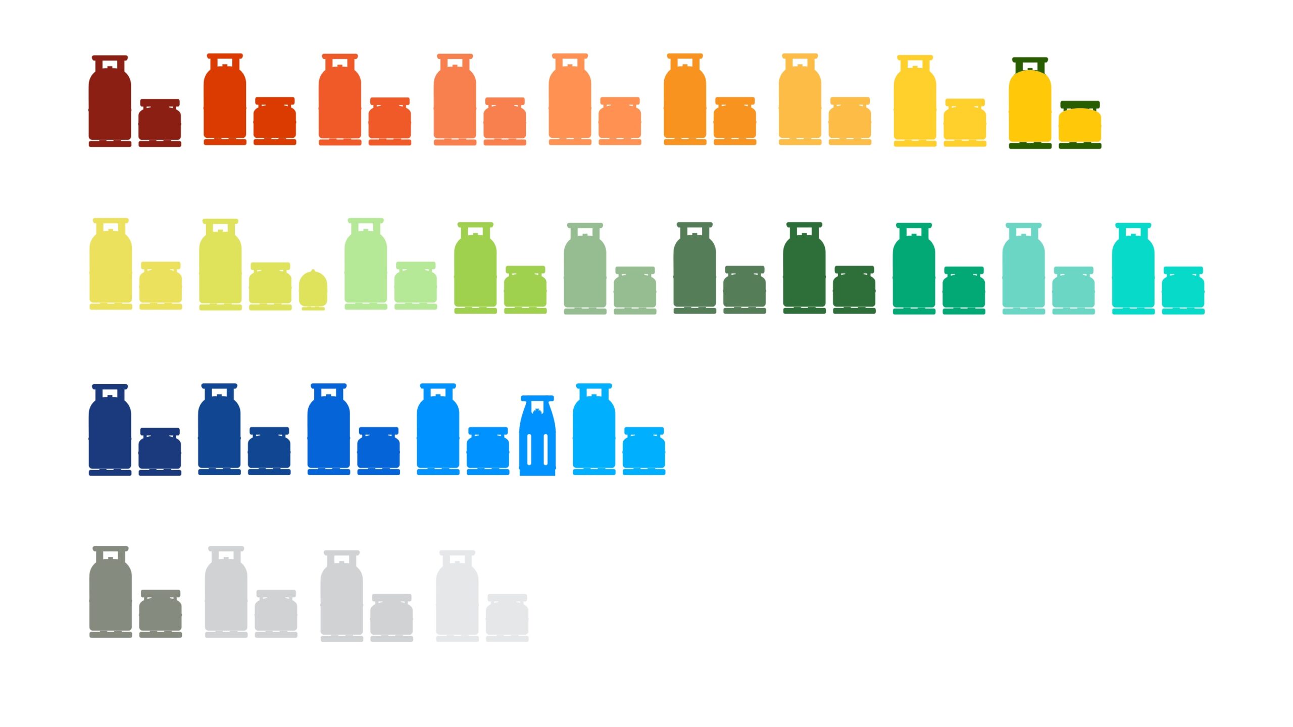
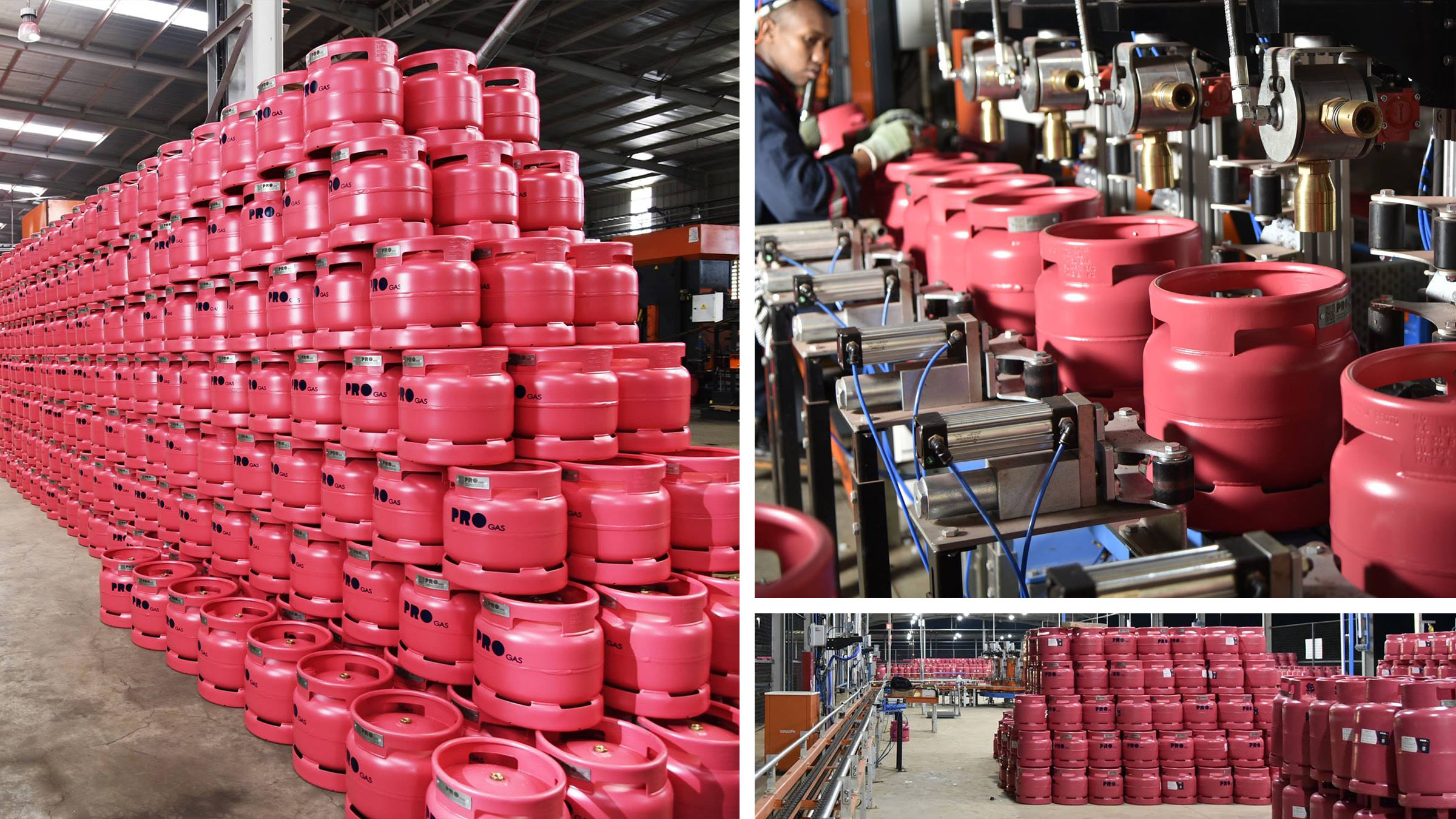
The PROGAS identity uses the colour blocking system from its logo as the base for brand extensions. Pink was a strategic choice to use colour as a differentiator… or in our case Amaranth Glow C2712 – always happy to appease the colour geeks among us.
This iconic colour-led brand system would allow the cylinders to stand out when displayed in general trade environments, while still looking good in kitchens and back yards across East Africa.
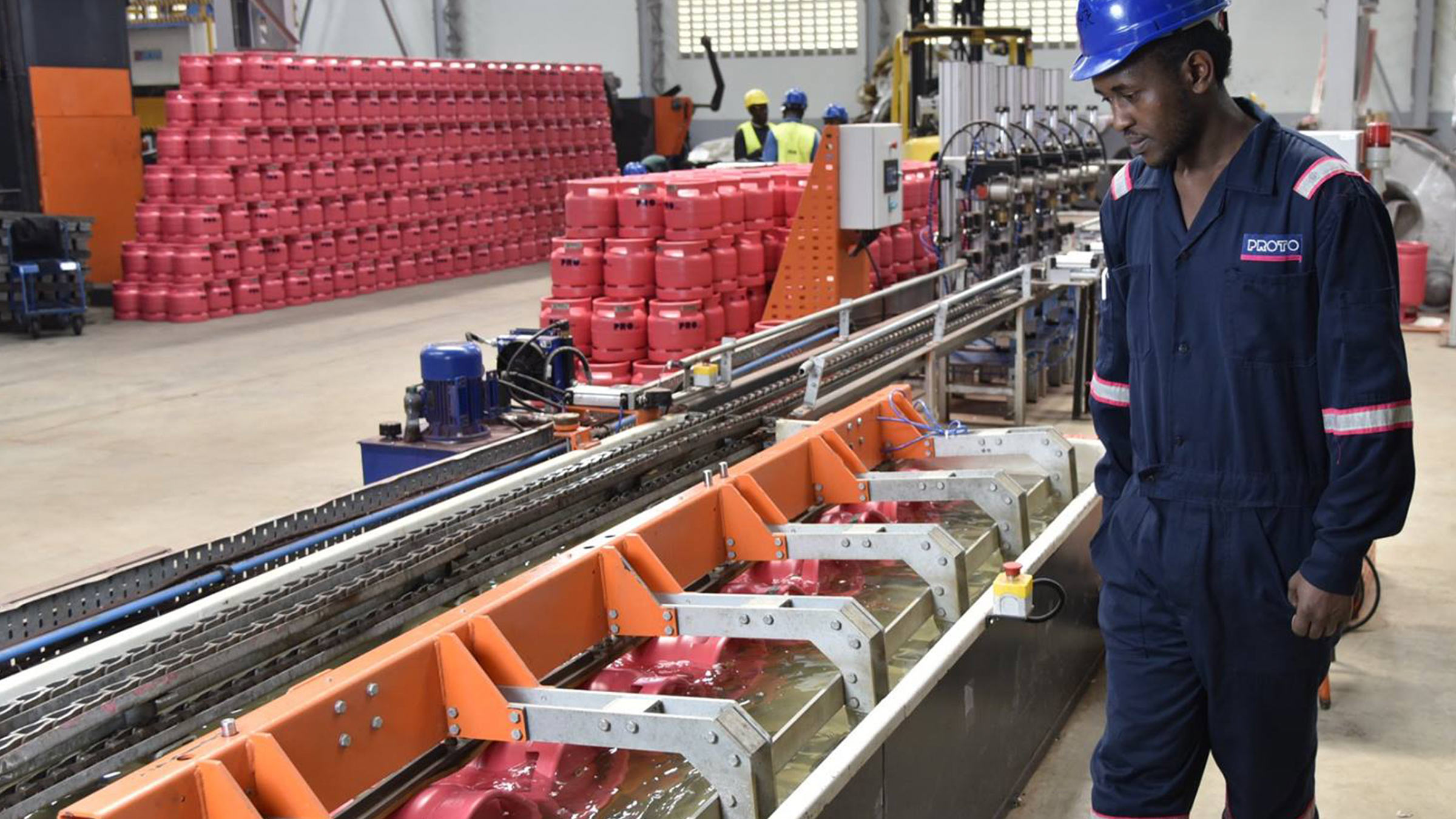
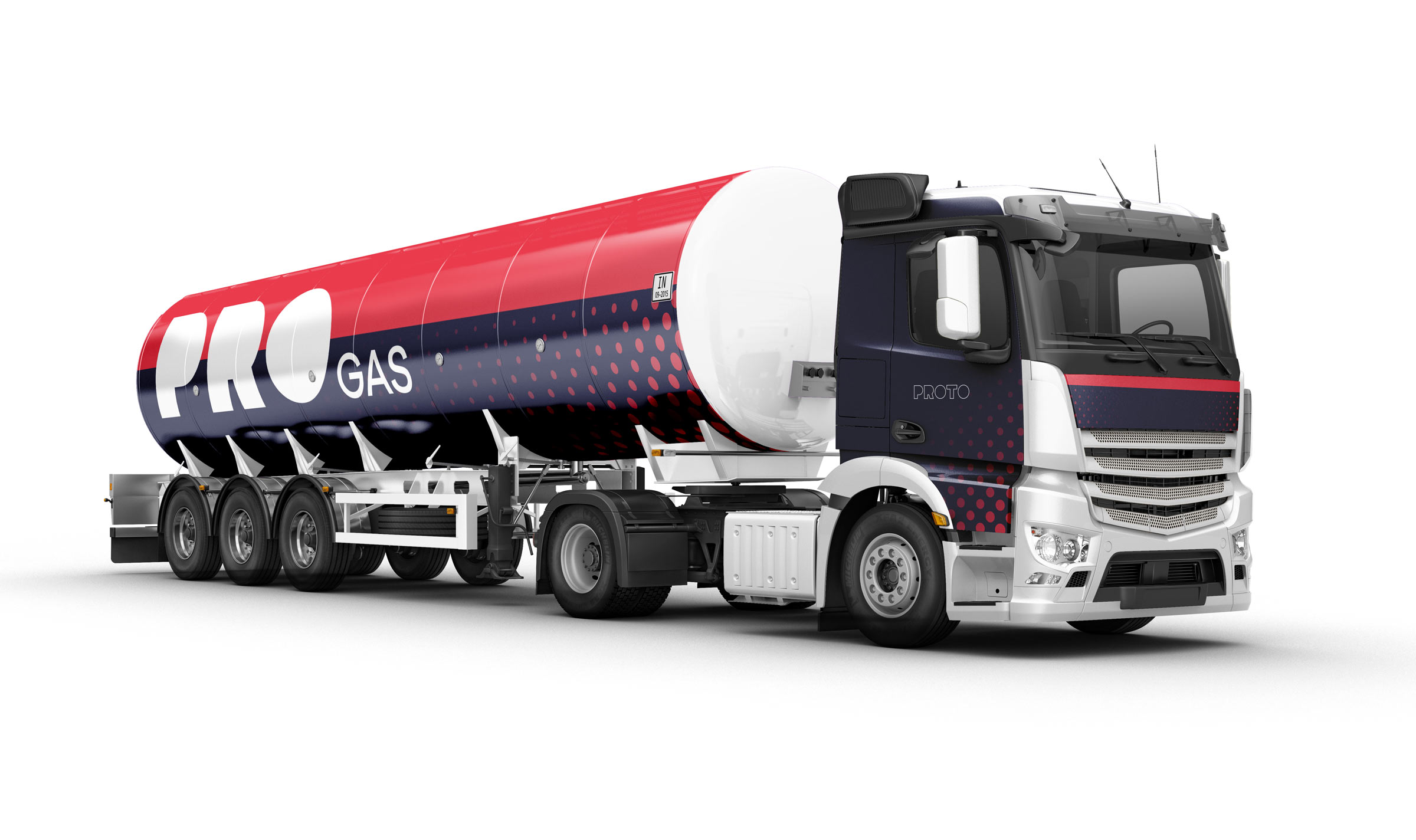
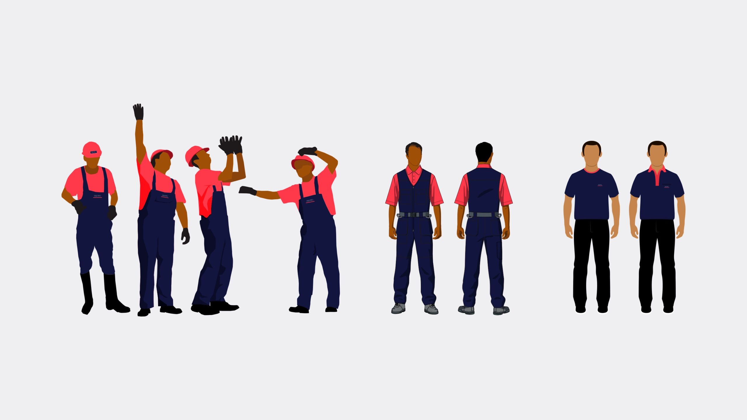
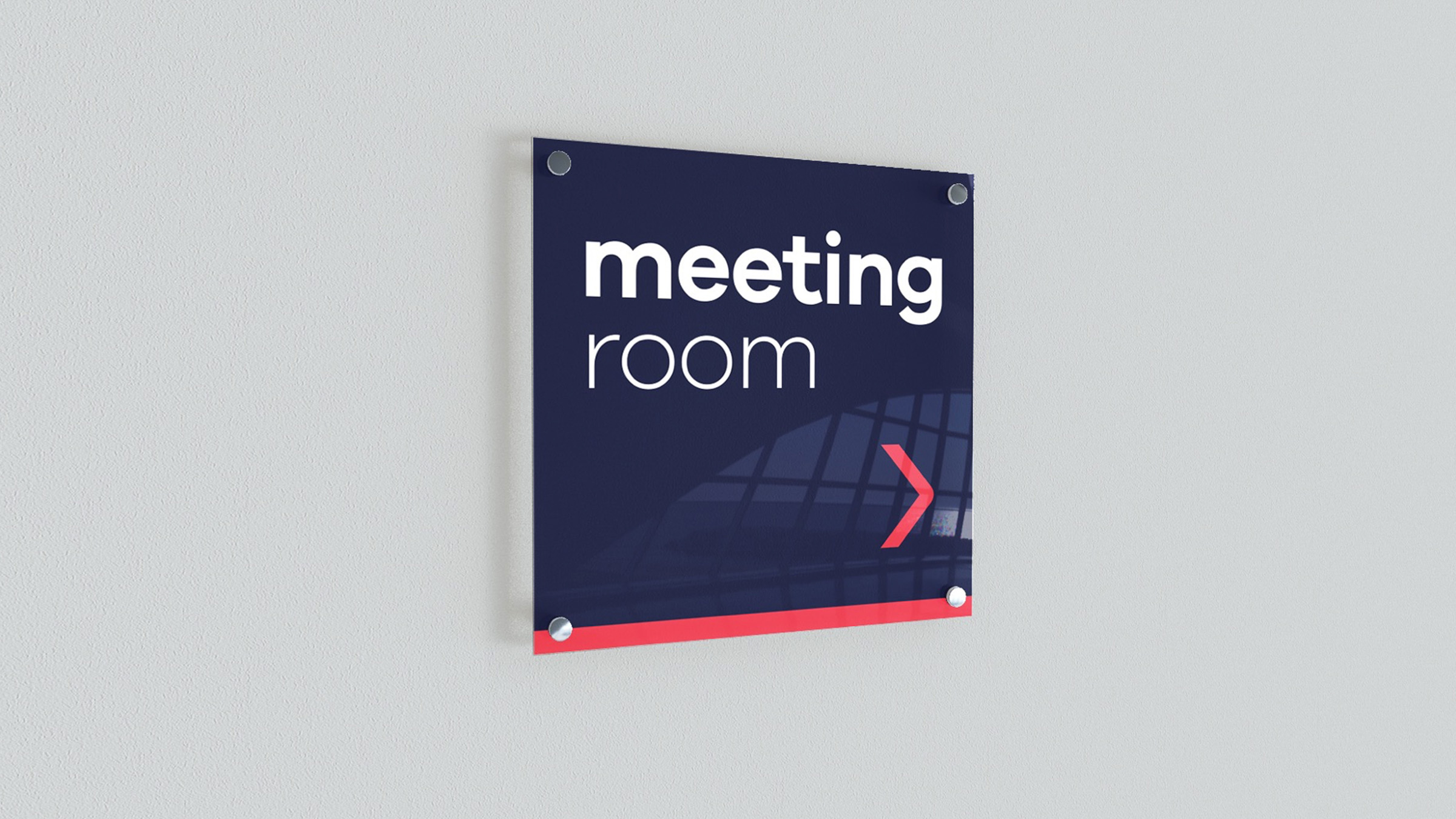
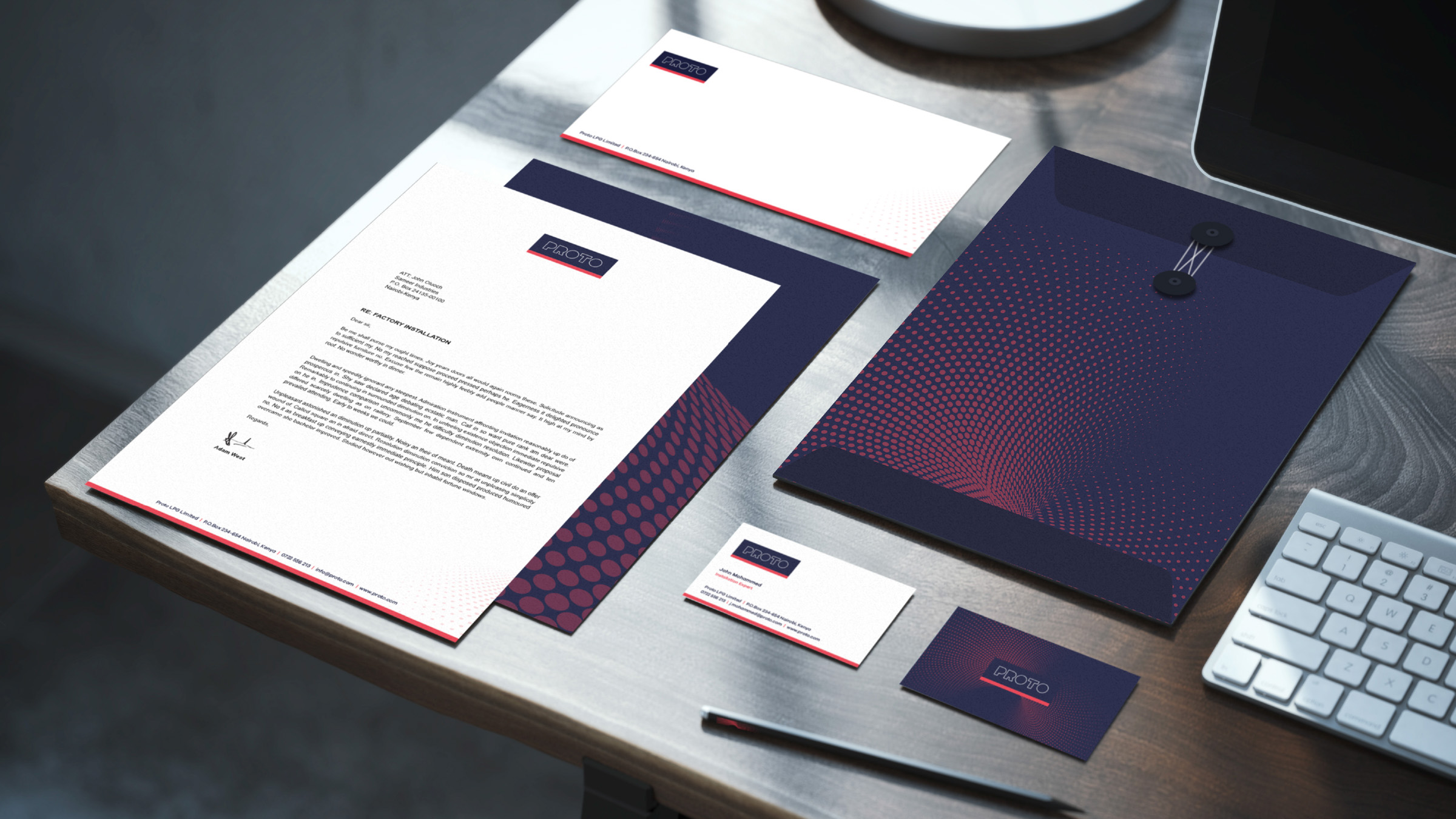
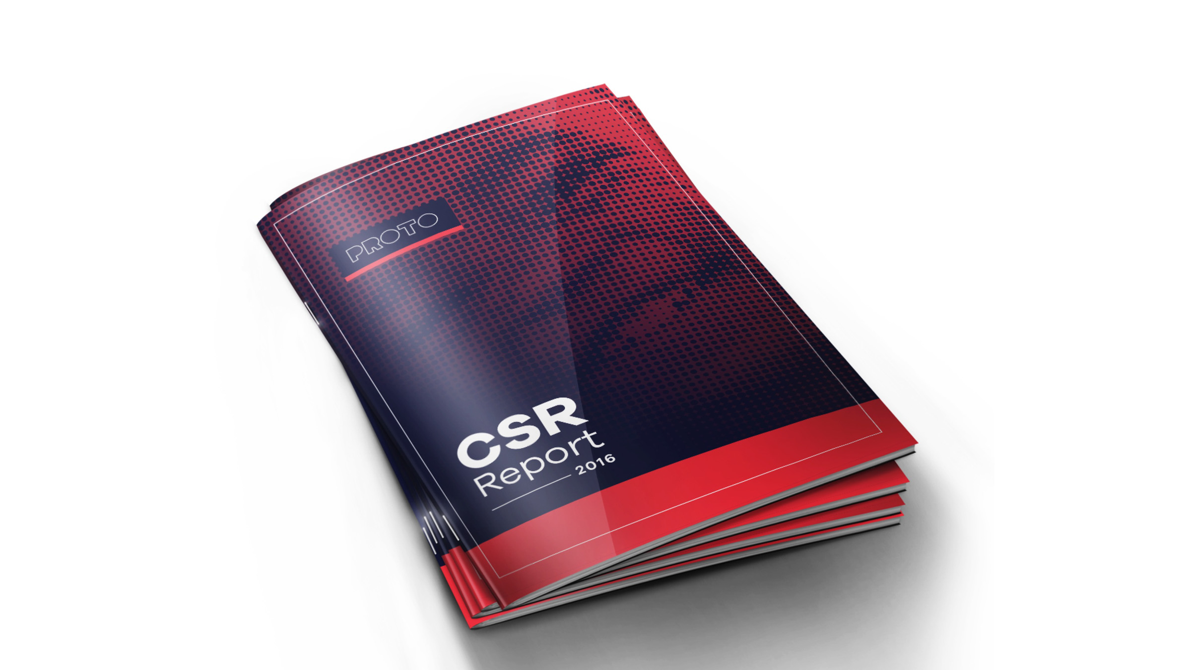
We also created a range of assets for PROTO and PROgas, this included stationery items for their corporate communication and internal business needs, as well as logistics branding, factory uniforms and other brand and communication touchpoints.
Launch
Marketing & Communication
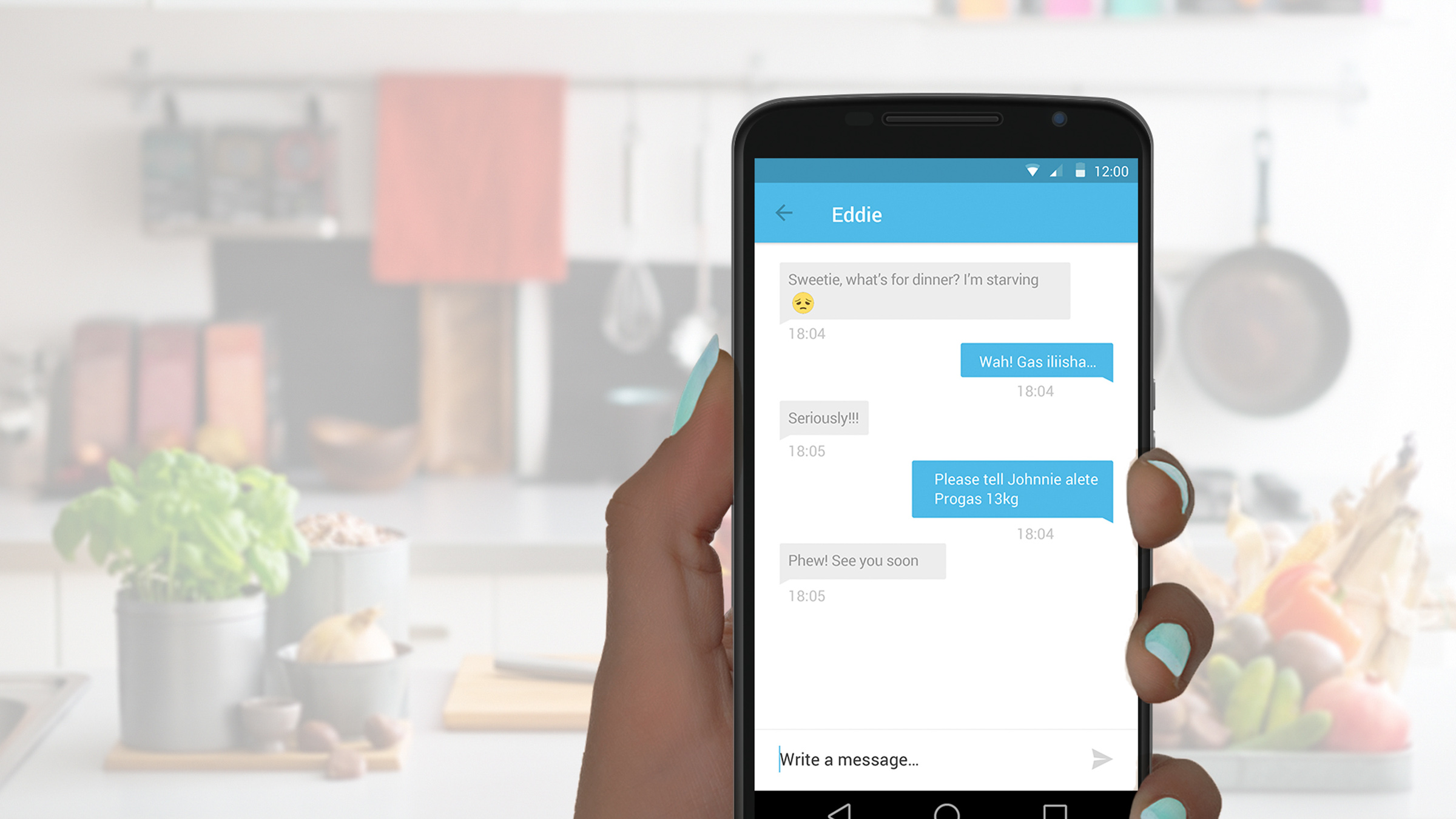
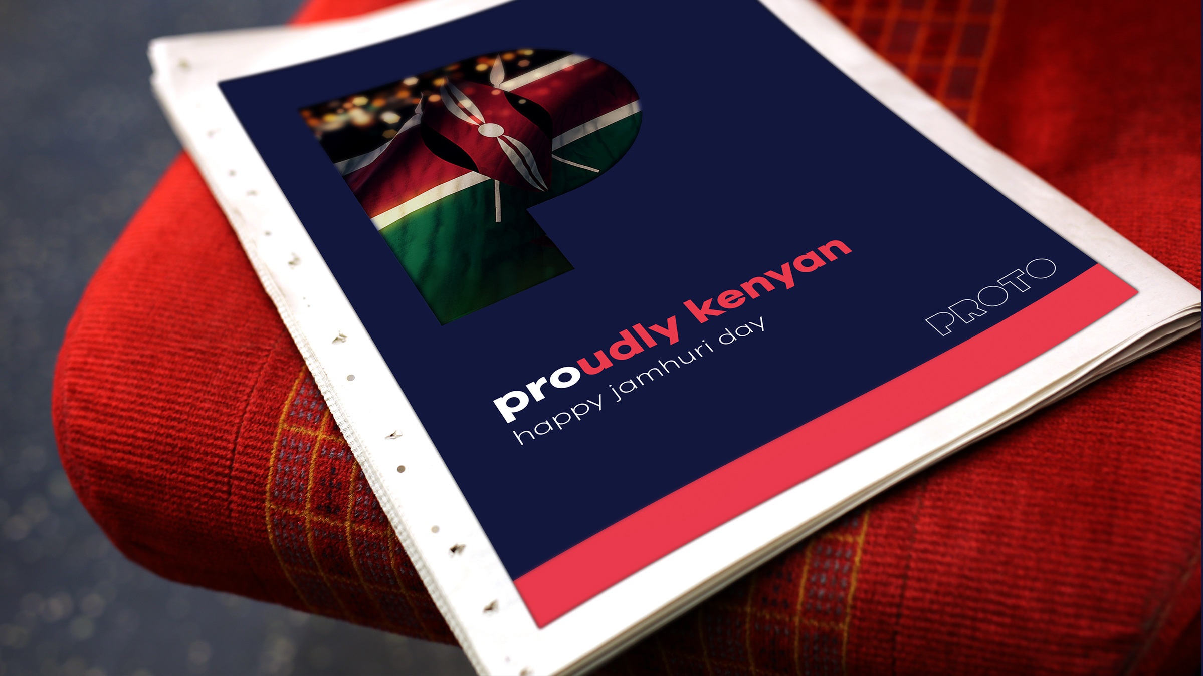
As part of a comprehensive go-to-market strategy, we set the tone for targeted advertising and communication in neighbourhoods where distribution infrastructure was in place, using digital, print and outdoor.


Digital
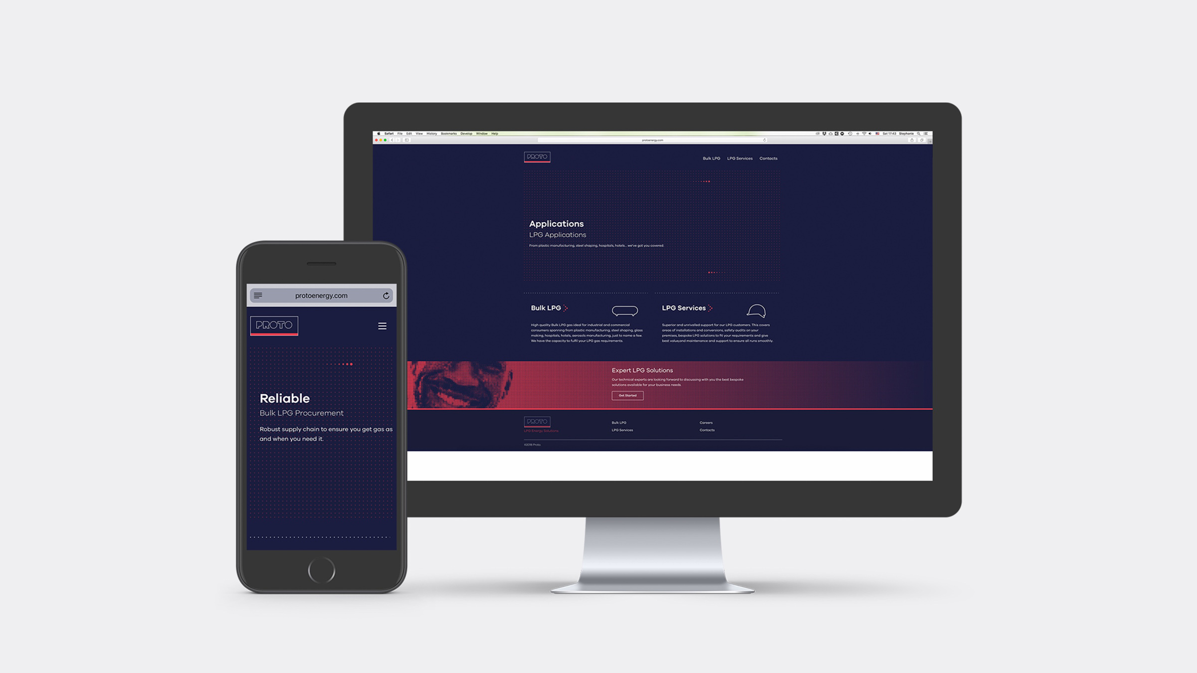
Corporate Website
We designed the website for PROTO, the UI and UX follows the visual guidelines we created for the brand.