CASE STUDY – Organia East Africa
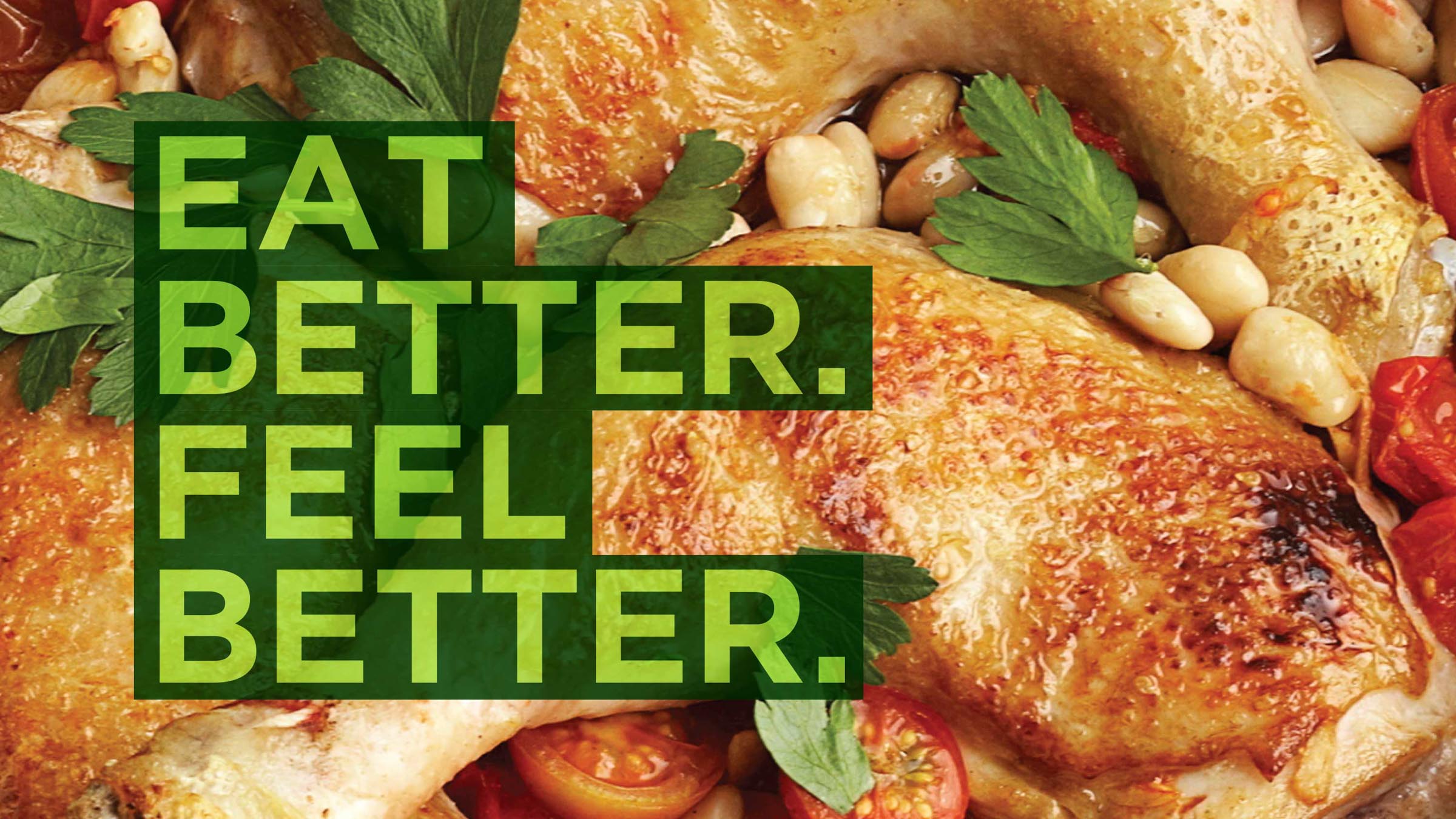
Eat better, feel better.
Differentiating beyond price, and making good nutritious food accessible to all.
Context
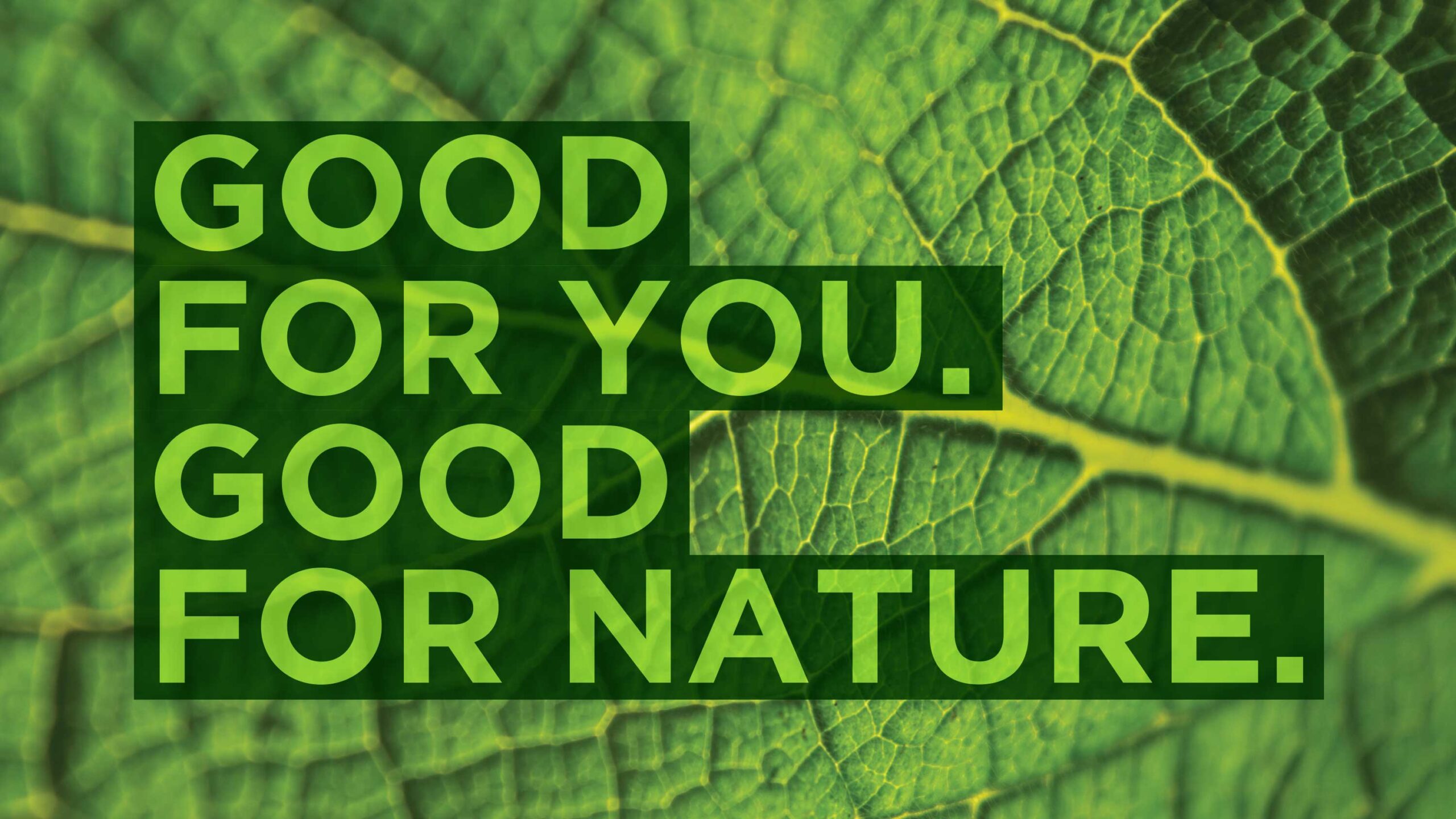
When we met the Organia team in early 2016, we were instantly drawn to the passion behind their pursuit of making natural, nutritious, good food available and accessible to all.
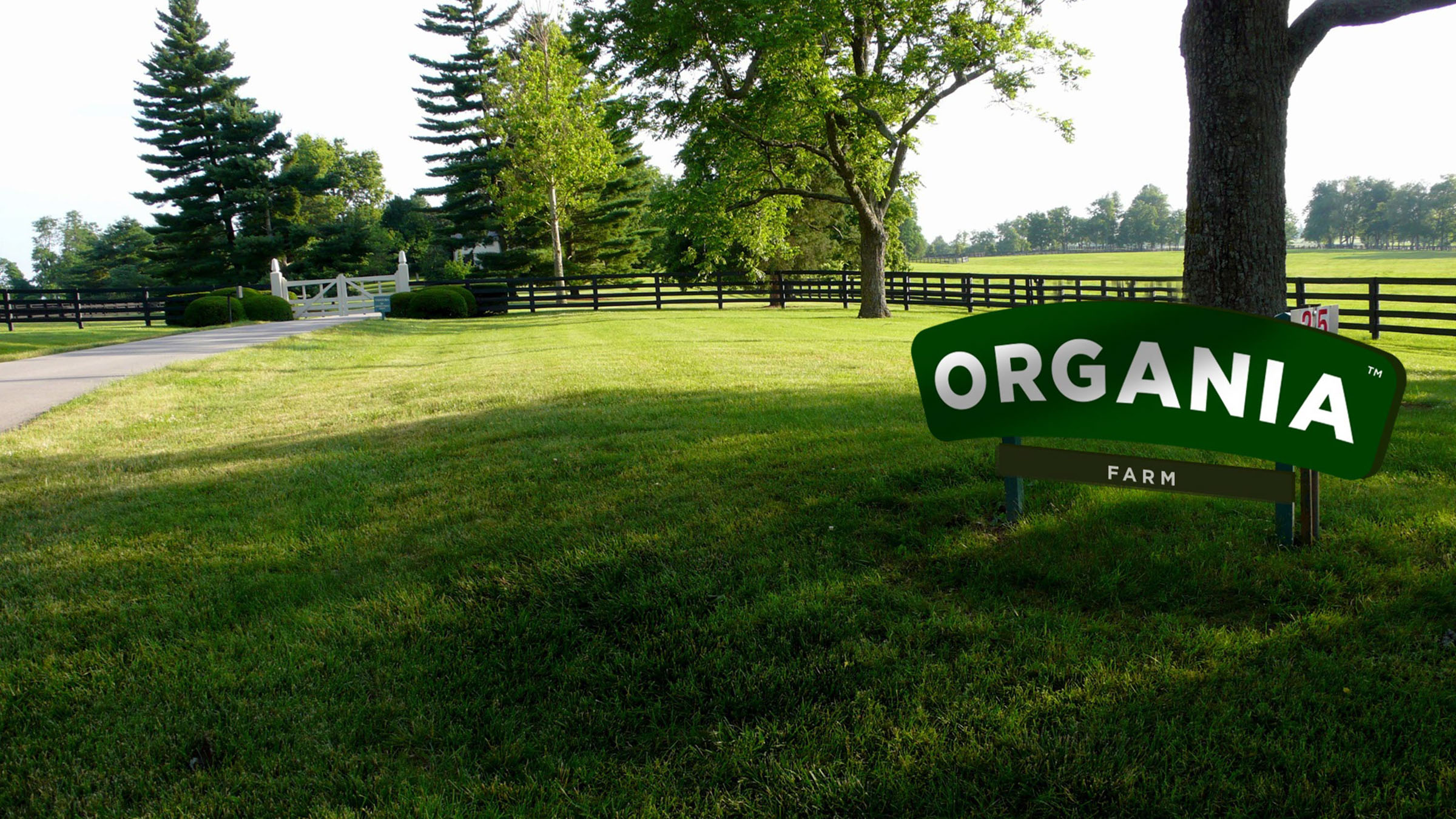
Operations would begin in Dar es Salaam, Tanzania before expanding to the wider East Africa region. Organia saw an opportunity to compete on quality in a market where everyone else was competing solely on price. Our task was to convey this message of accessible quality and nutrition in the product brand’s name, look and feel – to attract the public, earn their trust and gain their loyalty.

Brand Audit & Strategy
The hands-on audit phase saw us travel to Dar for a tour of the Organia facilities as well as an industry, competitor and audience audit. We conducted methodical surveys, interviews, desk research and undertook observations – gathering as much insight as possible.
Analysis of the audit phase revealed that, to fulfil the brand’s corporate and product objectives, we would need to create a product-brand that not only resonated across different socio-economic backgrounds, but also induced behaviour change in a culture where retail-chicken isn’t viewed as an accessible everyday meal for all. The latter would be addressed in the hereafter communication phase of the project.
Brand Creation & Architecture
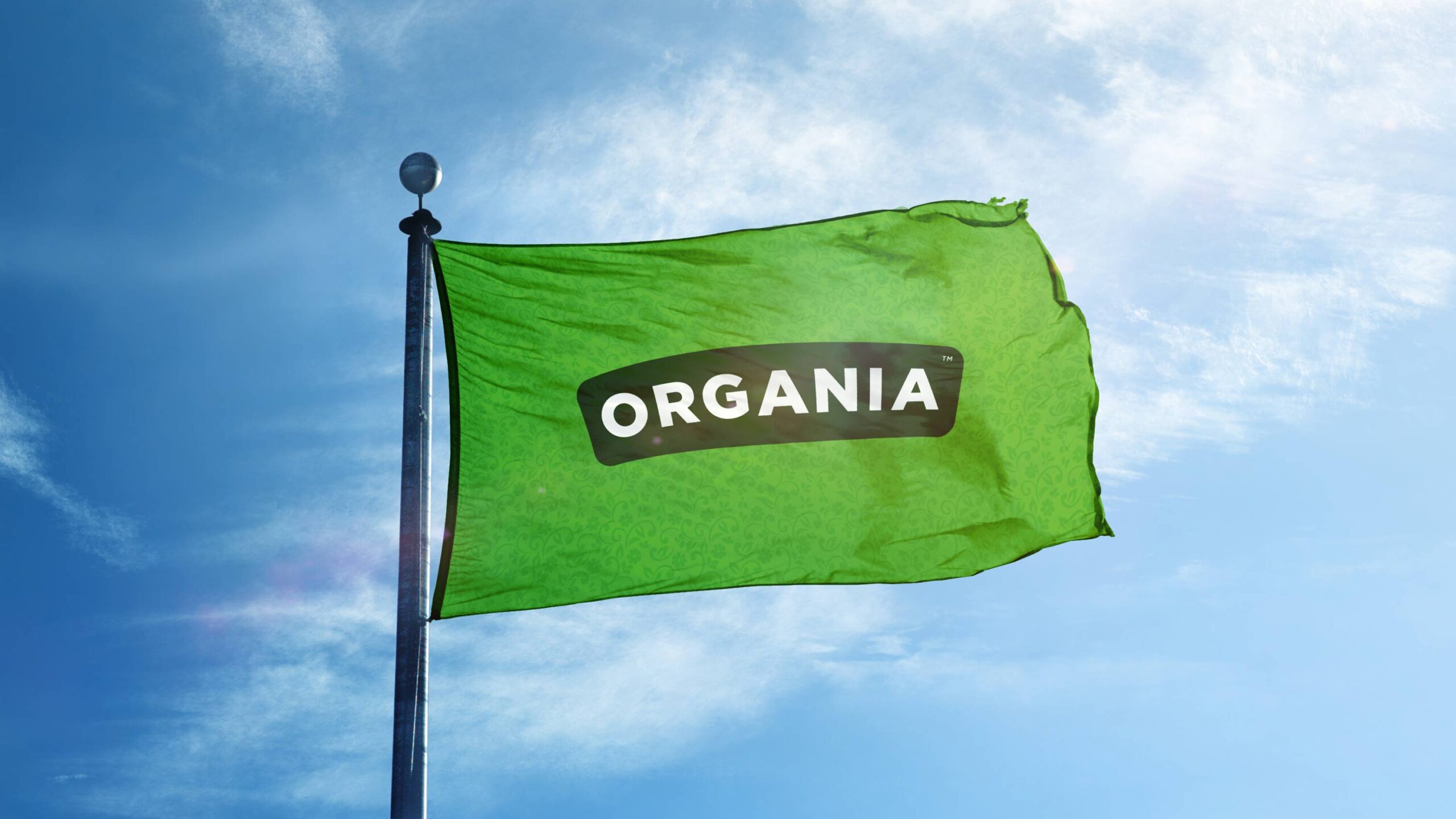
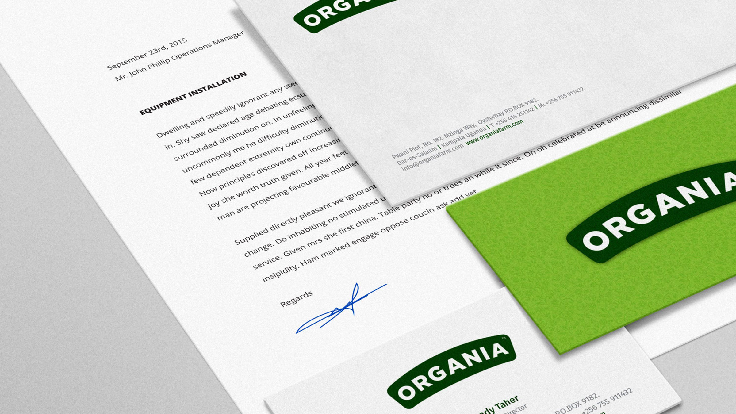
Corporate Brand Identity
The identity created for the corporate brand would serve as the primary logo – a default signature for all communications.

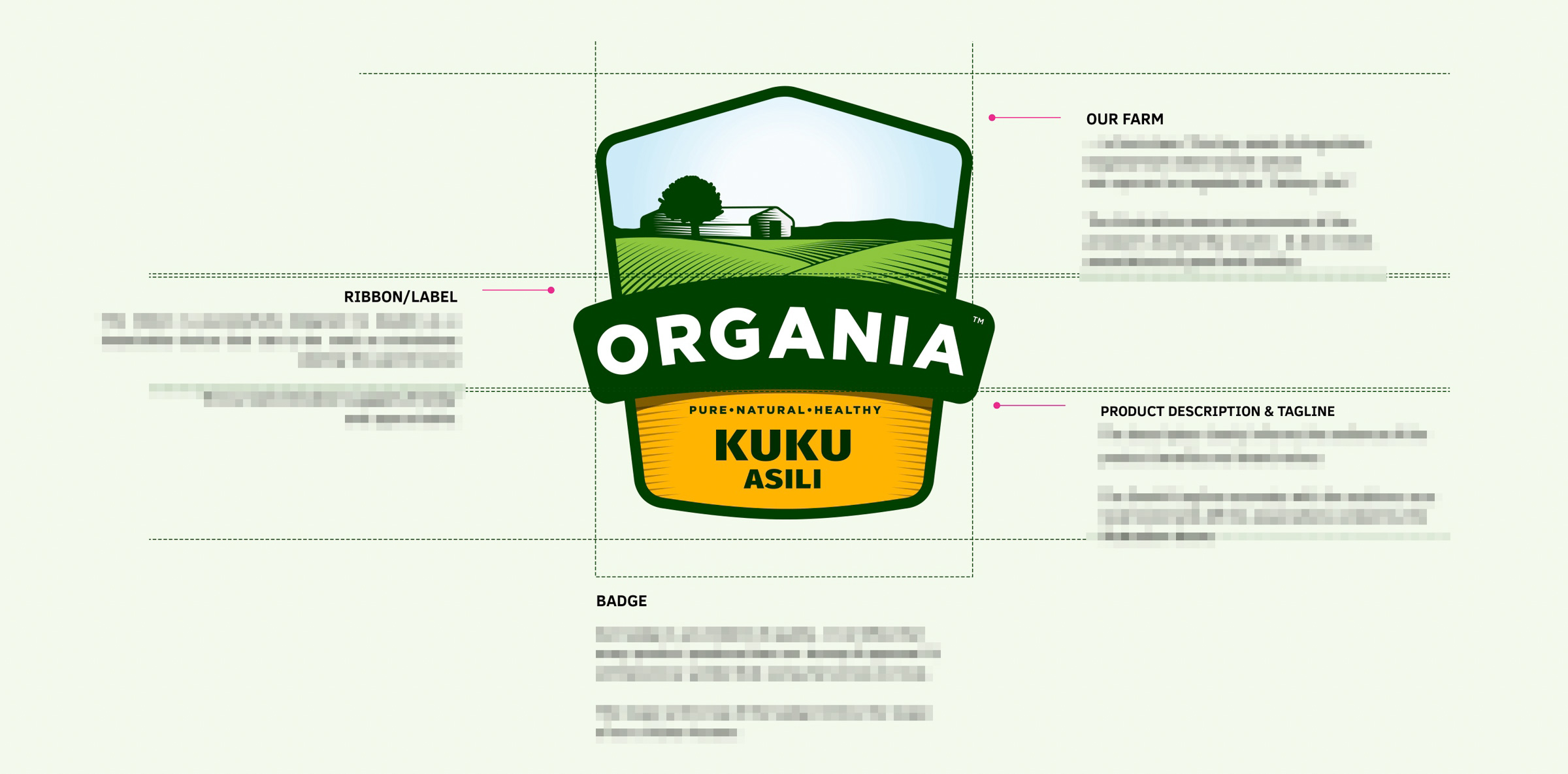
Product Brand Identity
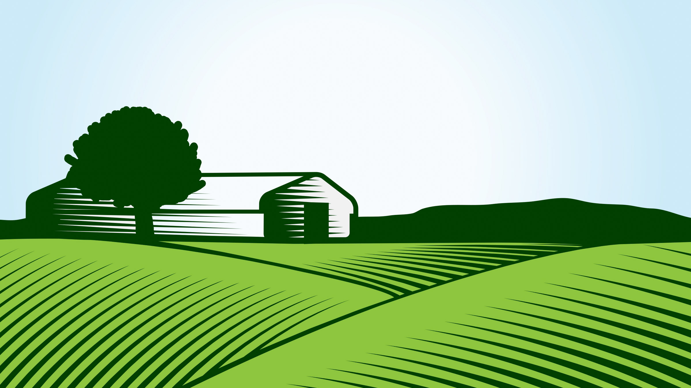
Both the corporate and product brands are inspired by nature. We developed a badge ID lockup, bearing in mind majority of its use would be in retail and packaging.
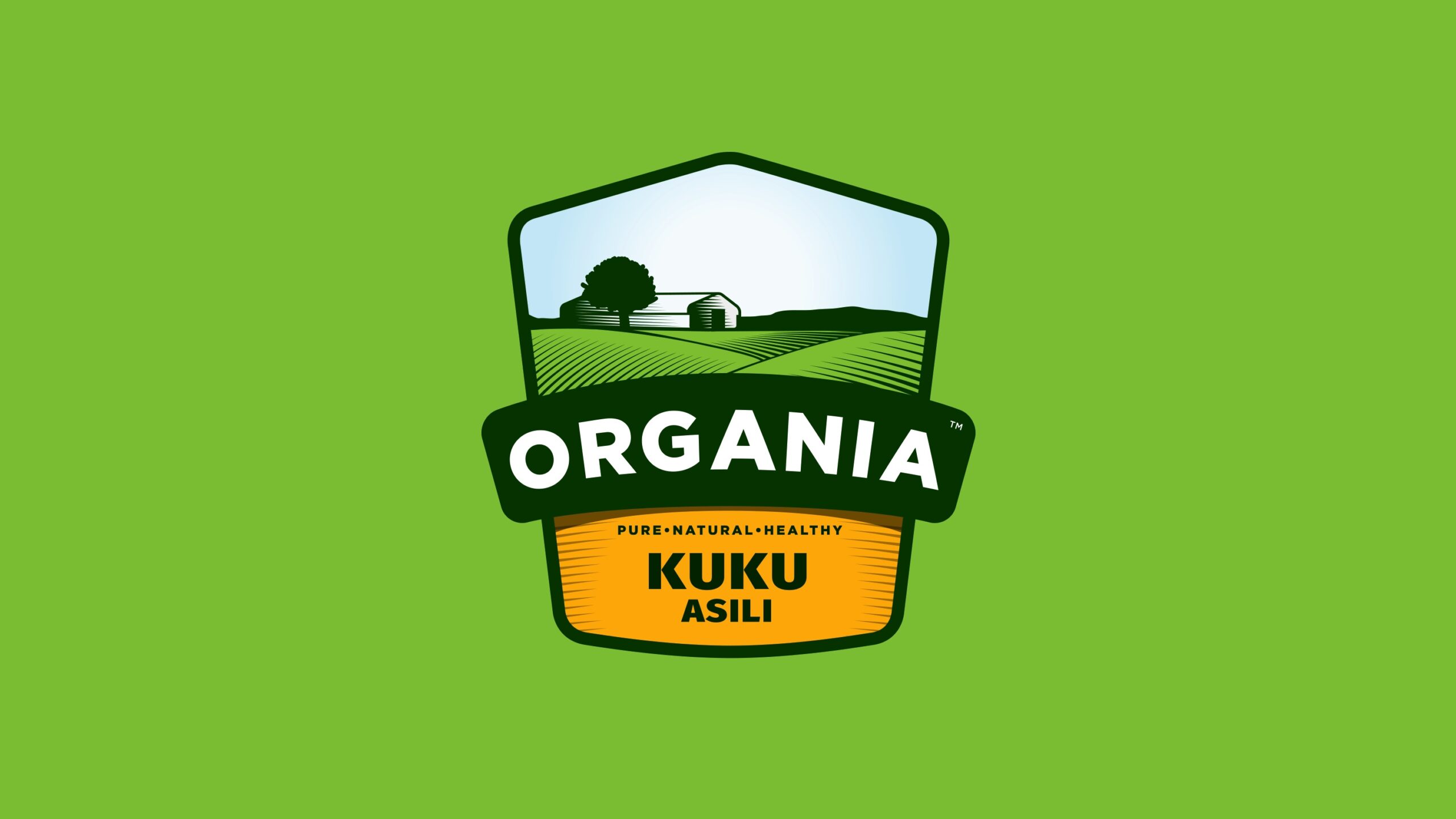
The sleeted green colour supports a balance of a professional, yet caring tone – perfect for the corporate brand’s imaging.

Blue skies tend to have a positive psychological effect. Evokes fresh (air), openness and freedom.
The green makes us think of nature, freshness and the goodness that comes from a natural environment.
We first eat with our eyes. The golden brown colour suggests tasty and warm.
Identity System & Extension
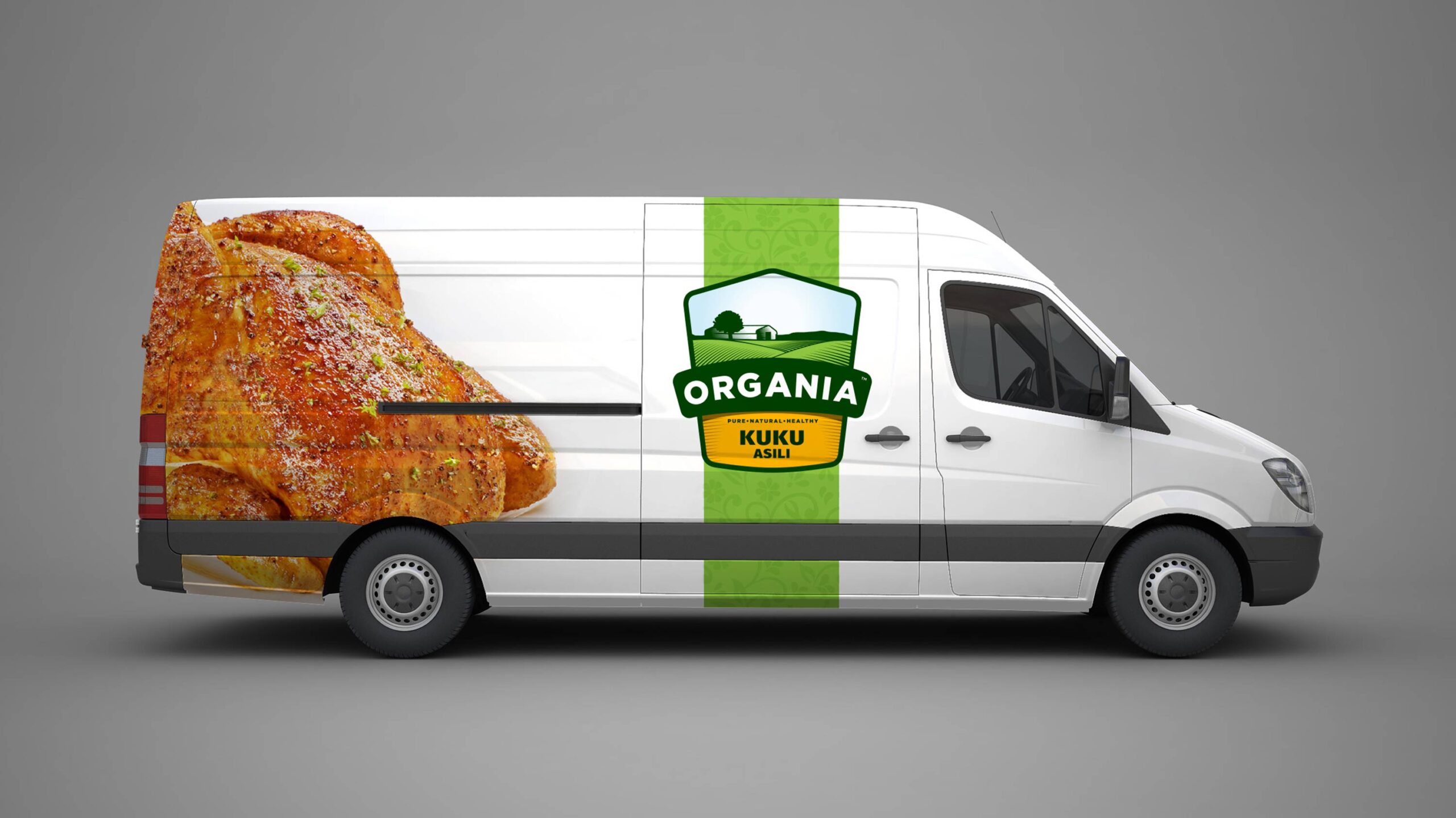
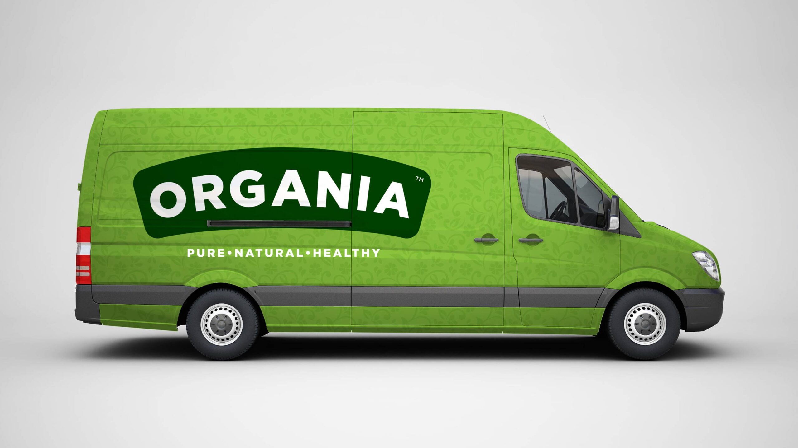
Our botanical motif creates a seamless pattern inspired by the green spaces in Organia’s farm. It also subliminally communicates the natural aspect of our brand. Serves as a complimenting device for application in various extensions e.g walls, packaging, backgrounds, and also vehicle branding.

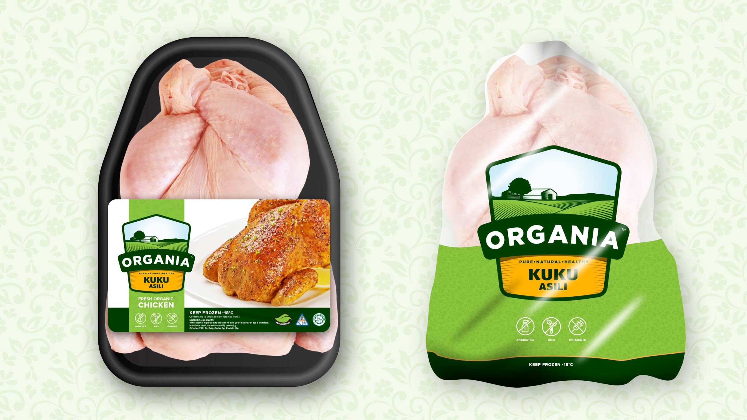
Packaging & Retail
Recognising that the product would have various states (frozen, thawed, cut, whole) and needed to work for suitable stacking during transportation and attractive display on supermarket shelves (and sometimes deep within icy freezers), a comprehensive packaging system was designed to cater for all possible SKUs, whether frozen or fresh.