CASE STUDY – Open Capital Advisors
An open and elevated corporate image.
Refreshing Open Capital Advisors' corporate image, unify its service offering and developing toolkits to help internal teams communicate and work seamlessly together.
In 2019, ARK was approached by Open Capital Advisors to help refresh its corporate image, unify its service offering and develop toolkits to help internal teams communicate and work seamlessly together.
Brand Identity
Naming & Refreshed Logo
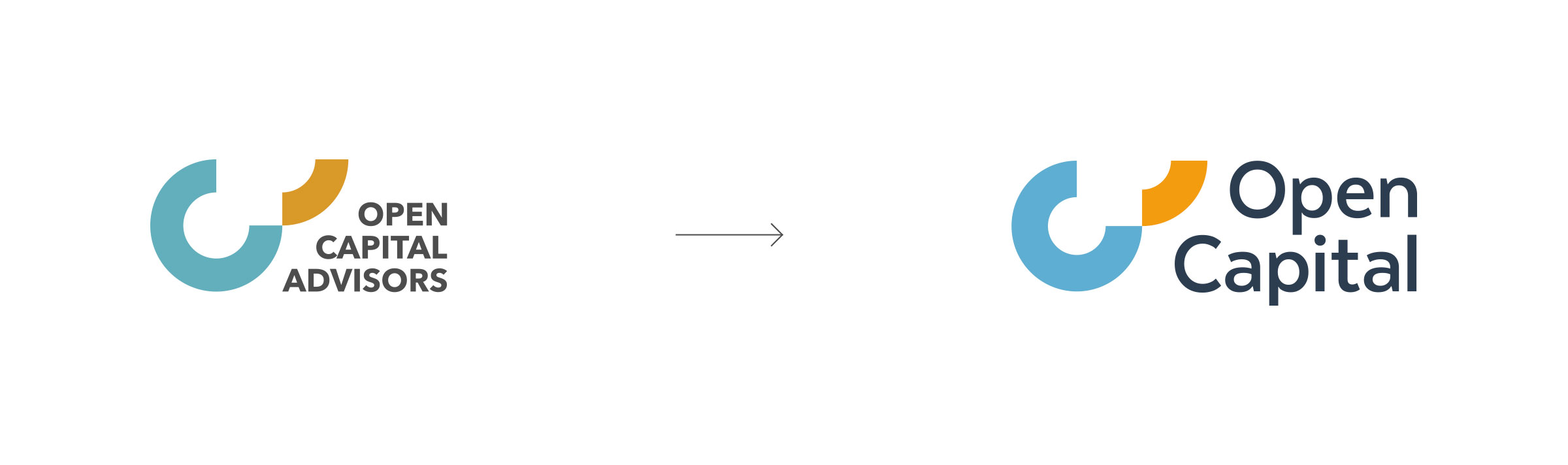
We proposed a subtle and simplified name change from Open Capital Advisors to Open Capital, to encompass a broader service offering beyond Advisory services, as well as embrace a more approachable spoken form of the brand which was already in use internally and amongst peers.
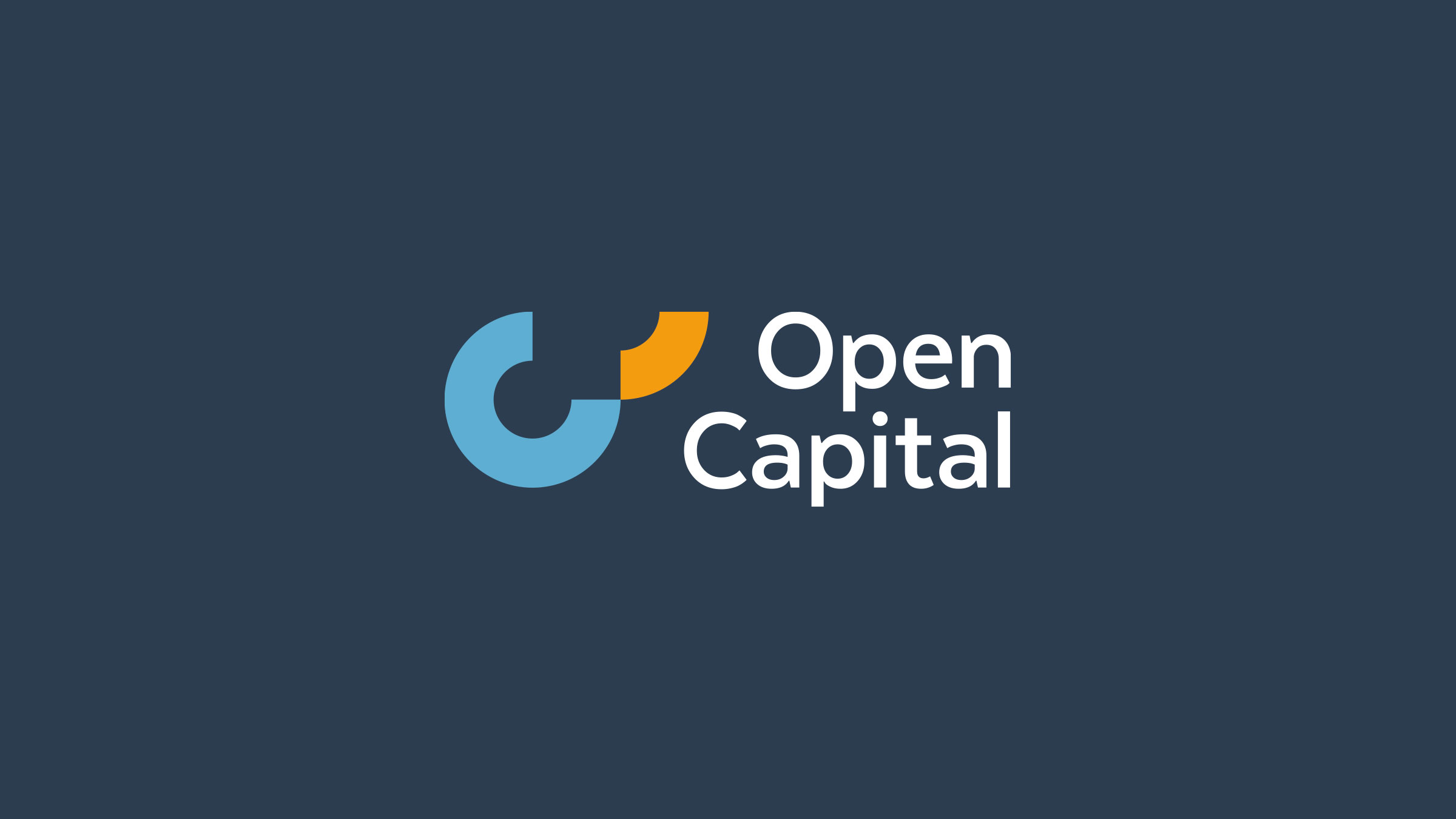
Our work also focused on refreshing the existing brand identity with a more modern and legible mark, shifting gestalt balance to the new wordmark.
Design System
Visual Language
As part of our extended design system, we introduced two stylistic devices to help give communication the Open Capital feel.
The primary device was affectionately named Exponia, a shape extracted from the main identity to symbolise exponential growth.


This primary device would play a key role in service line brand architecture, where key client-facing functions could be unified and presented within the same brand offering and system.
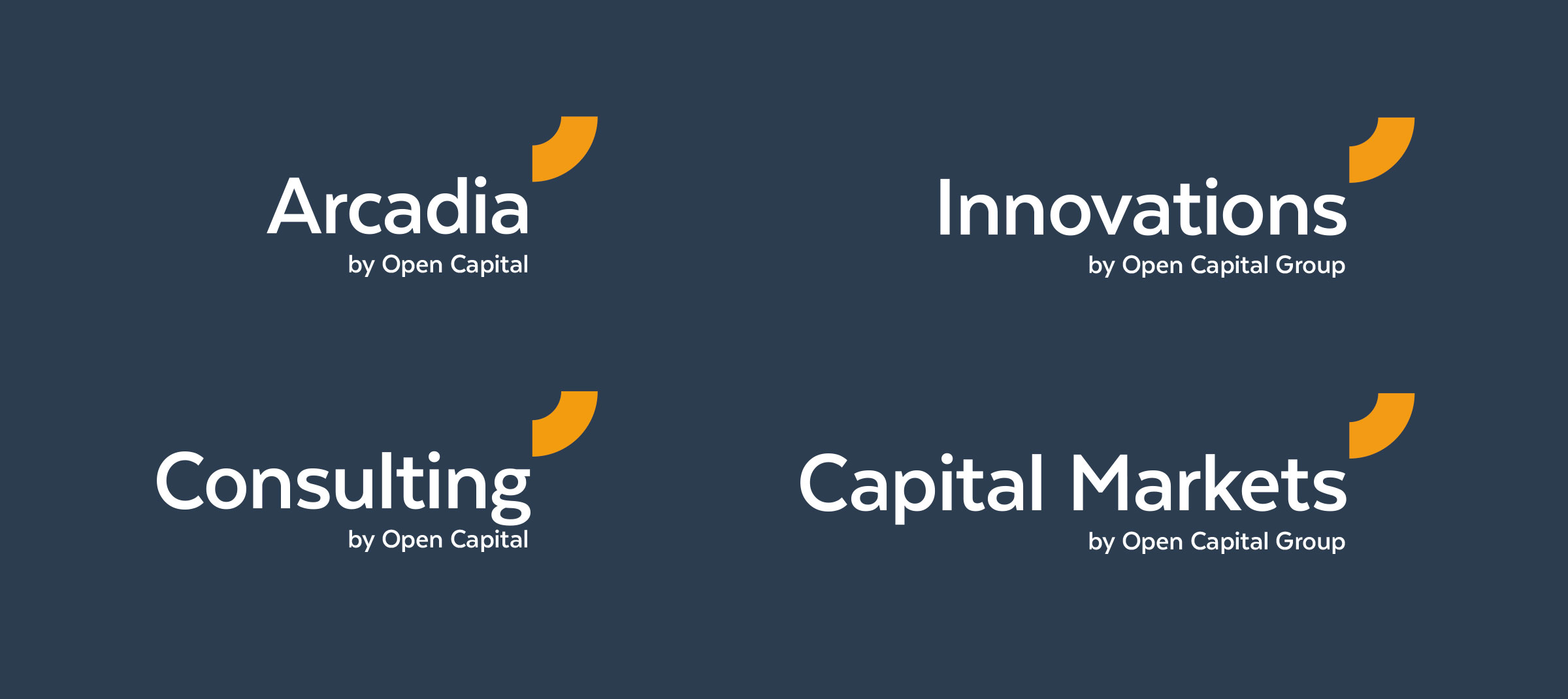
The second device developed was a baseline graphic, to underscore key elements.

Which in practice looked something like this…

Brandbook
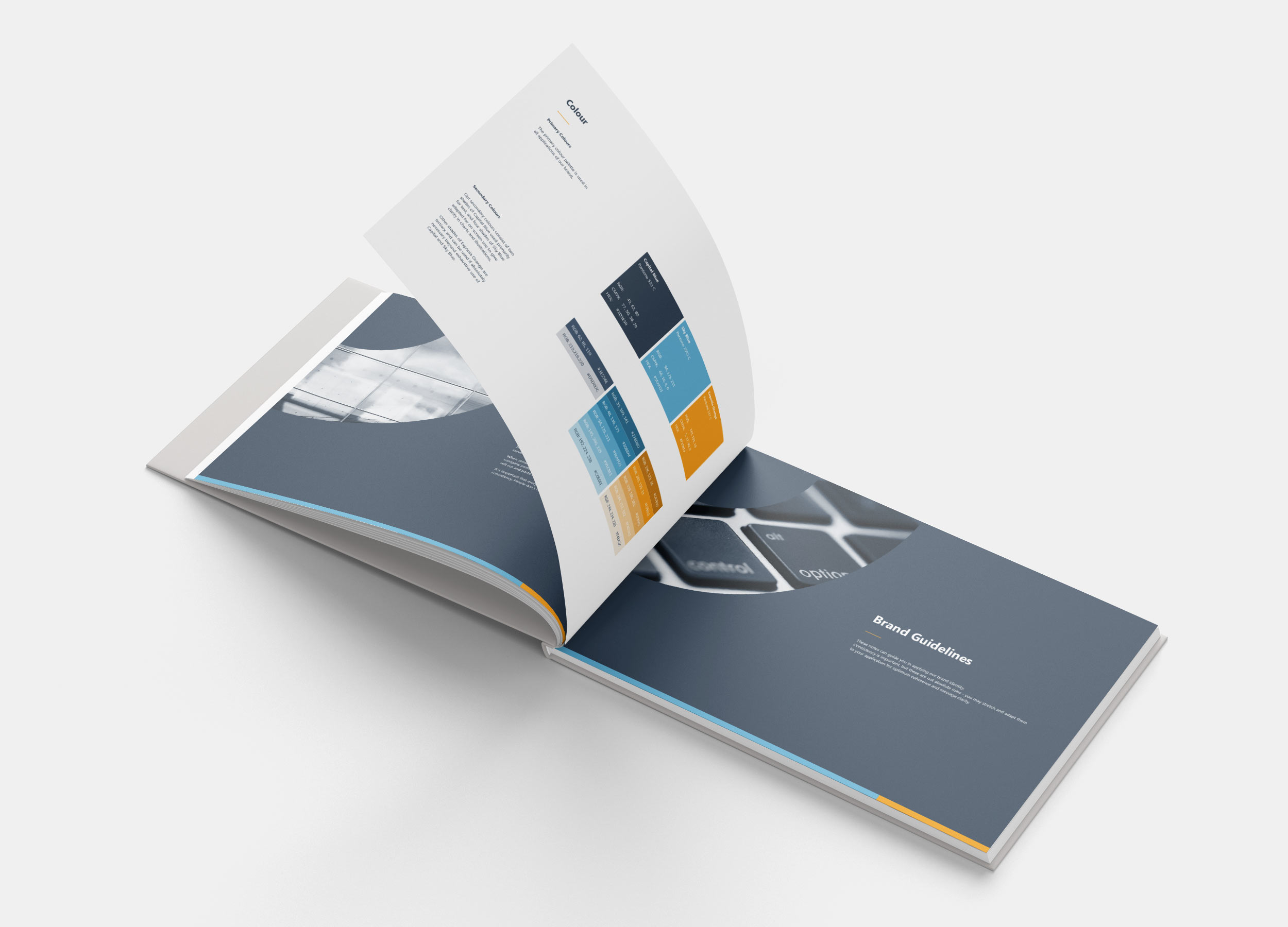
Finally, we documented our refined brand ethos, identity and new graphic system in a comprehensive brandbook to equip the organisation with the guidelines and tools needed to extend the brand in visual and editorial communication.
Additional extensions were developed in signage and wayfinding, as well as other visual brand applications.