CASE STUDY – Nike
The Circular Economy – Nike Better World
Telling the story of the strain of unsustainable manufacturing on socio-economic and global macro patterns.
Once in a while, a very interesting project comes knocking that gets you buzzing. Wieden+Kennedy, based in Portland, is the world’s largest full-service agency. They got in touch, and wanted us to develop an infographic for one of their biggest clients. We didn’t know who, but we were excited by the proposition and said yes. Turned out it would be for Nike.
The Circular Economy
Nike Better World is a campaign that uses innovate techniques to solve today’s production problems. It aims at using sustainable production methods and materials, to lessen the burden on our planet’s limited resources. As part of this drive, a presentation by Hannah Jones, VP of Sustainable Business and Innovation at Nike, would launch this at the South by Southwest festival in Austin, TX. The presentation was titled “Better Innovation, Design and Sustainability via Open Source”.
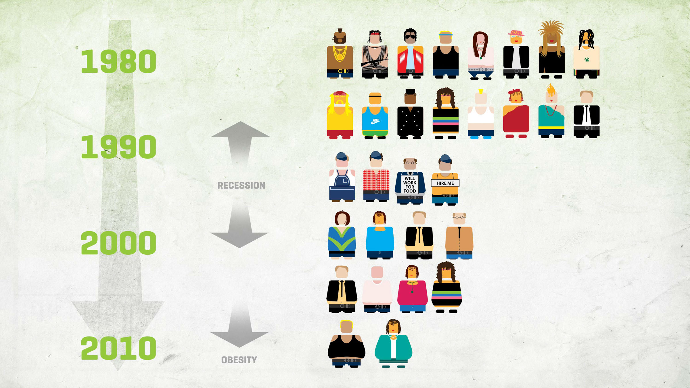
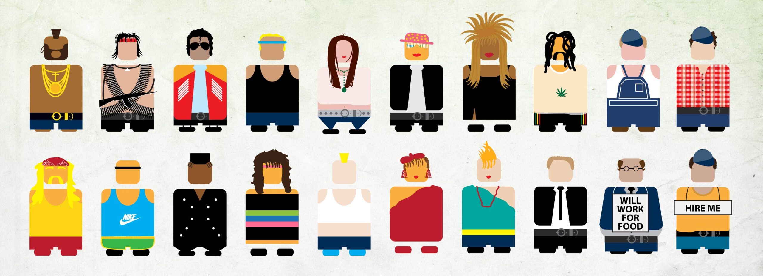
We were tasked with setting the context for this discussion, by focusing on the current state of the world, and the effects that the burden created by a growing urban population has on our resources.
Infographics
The project would involve unique collaboration between some of the world’s leading names in innovation around sustainable manufacturing. This meant some late dinners in the office to allow for the 11 hour time difference between Nairobi and Portland.
Data
Right away, we started collecting data on various environmental, natural and man-made attributes. We studied trends in the data, considering a 30-year epoch. After analysing this information, we narrowed down to the variables that we felt were most relevant to the campaign’s objectives, and refined that further.
The Details
Next, we moved to visualising this information, making it as clear & comparable as possible. Utilising the sequential nature of a presentation, we outlined the progression of how this information would be revealed, and proceeded with designing the various elements.
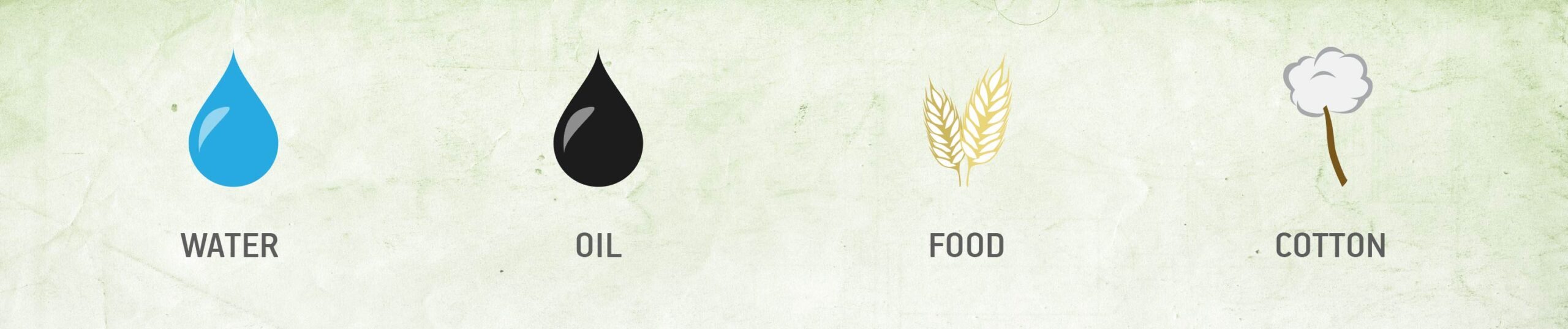
We considered commodity scarcity and its effect on their prices, mapped that to natural disasters and phenomenon, all being felt by a rising global population moving from rural to urban environments.
The Big Stage
The information would then be animated sequentially, to superimpose the various touchpoints being discussed.
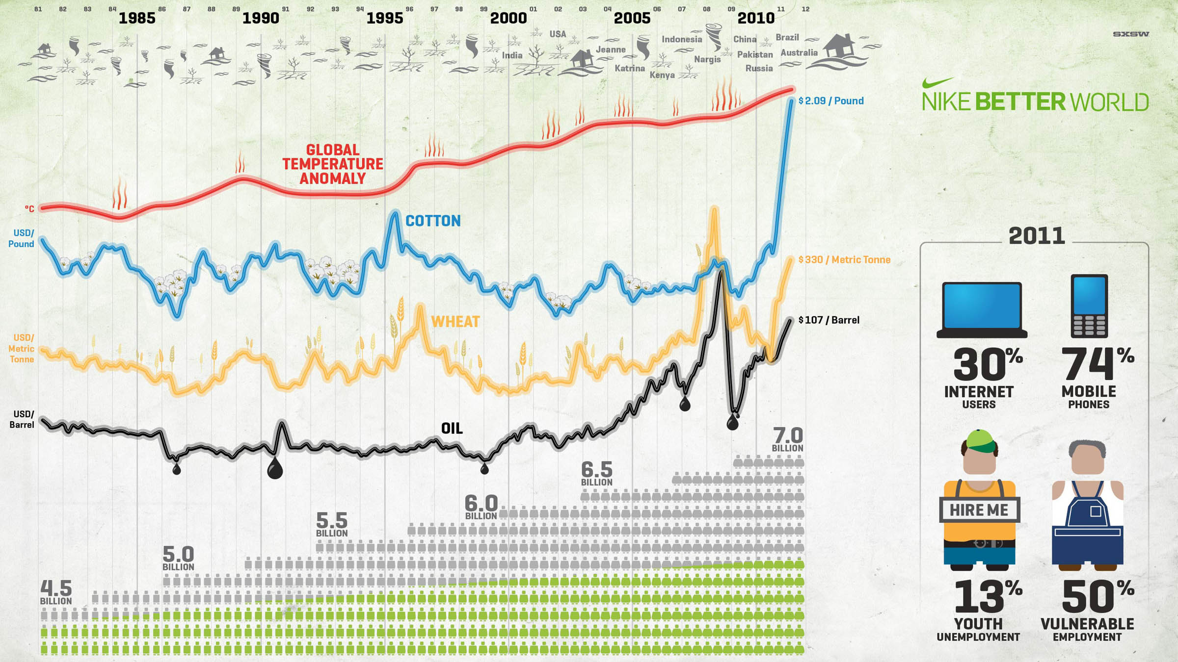
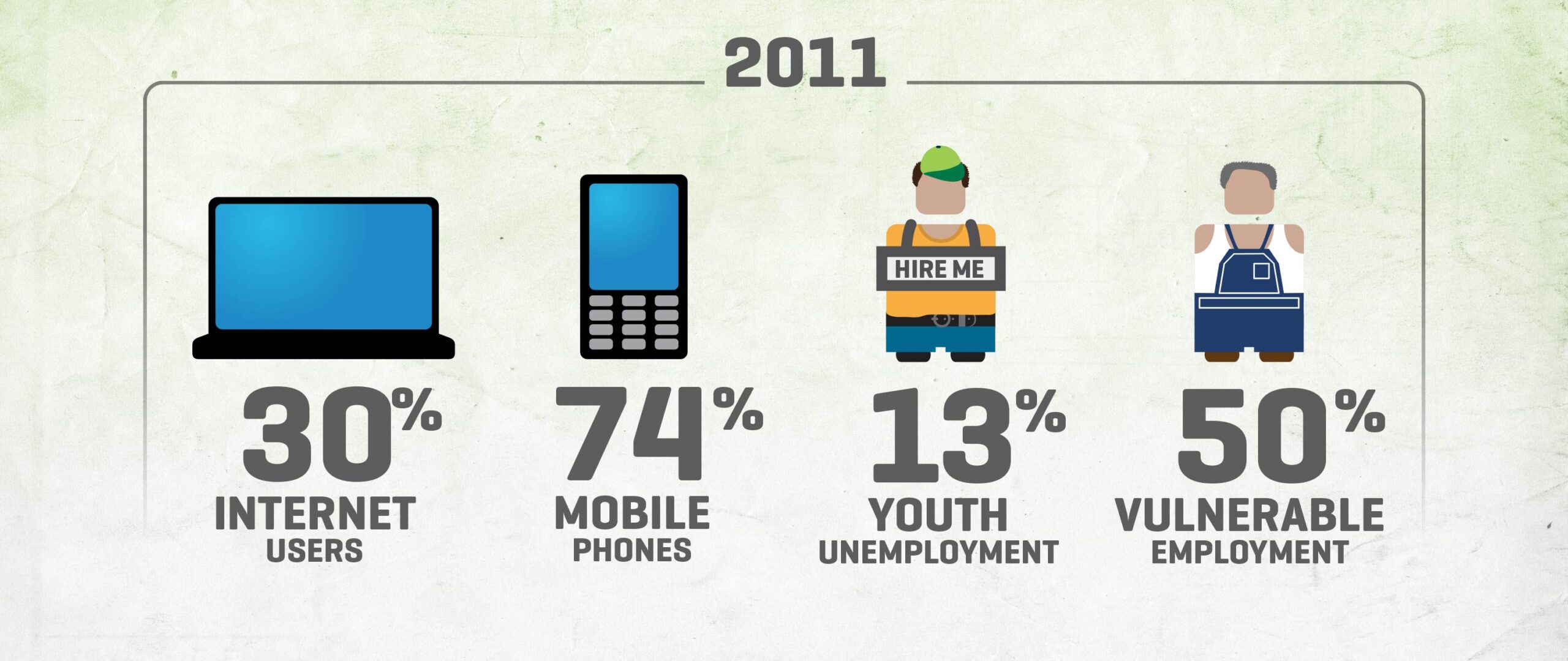
To conclude the segment, we talked about key considerations in the current year.
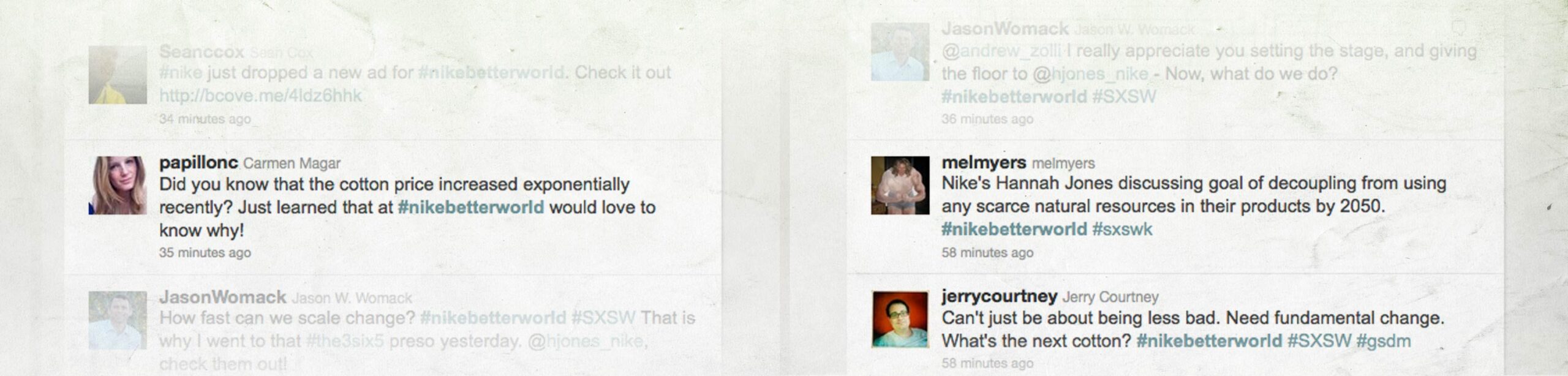
Reaction
Being 14,247km away from the SXSW event, the only way we could follow the it live was on Twitter – and sure enough, the reactions were filtering through…
Onward
A life of its own
A few months later, we got news that Andrew Zolli, executive director and curator of PopTech, used the same infographic during his keynote address at PopTech 2011.
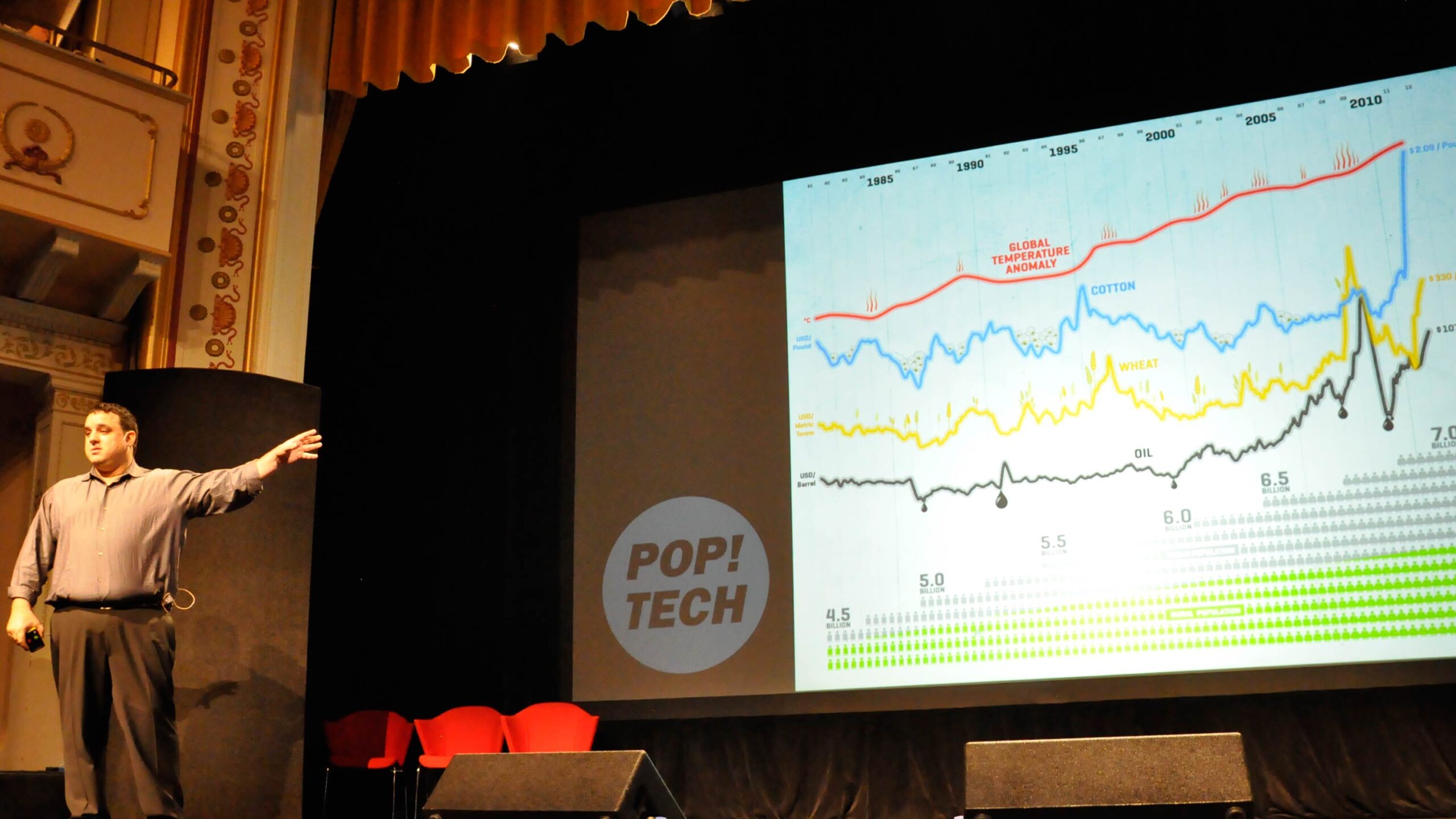
We’re always chuffed when a project has life beyond its initial use, thus knowing we played our part in a sustainable future – some call it recycling.