CASE STUDY – Mestil Hotel & Residences
Creating Uganda’s newest hospitality brand.
Creating a brand for Kampala's newest business & long-stay hotel, balancing ambience, style and function.
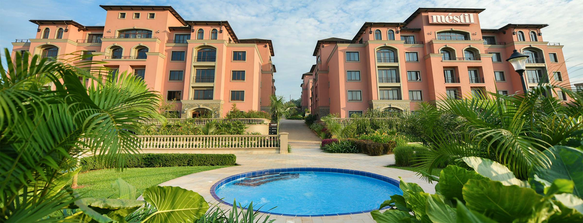
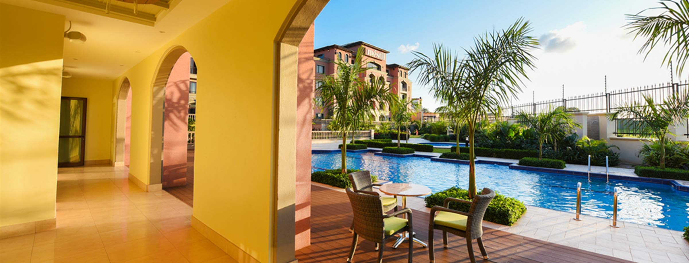
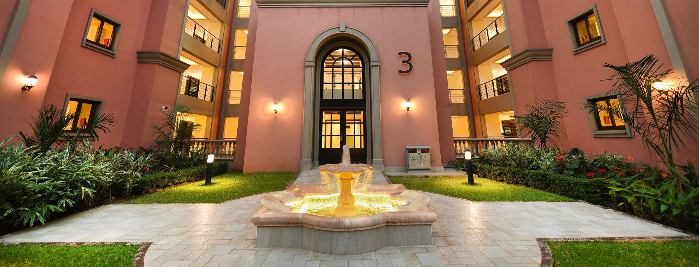
In 2016, ARK was approached to create the brand, extensions, and communications for a suite of Hotel Apartments located on the outskirts of the Kampala Central Business District. The apartments’ design was based on the community concept with aesthetics inspired by Mediterranean architecture. The design features adobe light exterior walls, curved ornamental doors, high arches, columns, and arcades, and central courtyards for each block of apartments.
Audit & Brand Strategy
We carried out an audit to study the site location, architectural plans, audiences, and the current hospitality industry in Uganda. We took note of factors like infrastructure, accommodation, service, rate, and location. Our approach helped define the opportunities for the brand which guided the creation of the essence and positioning, visual approach, pricing strategy, and unique selling proposition. We used our findings from our audience research to map out the needs of our target audience which informed the work on the brand promise, character, and identity.

Brand Creation
We set out to create a brand that was classic yet contemporary, simple yet elegant with an appeal that was reflective of the strong Mediterranean design influences in the architecture.
Naming
We wanted to create a distinctive name that alluded to the unique beauty of the hotel, one that communicated the structure’s aesthetic appeal, one that stood out but was relevant. We developed the name Mestil a Spanish influenced portmanteau that combined the M from Mediterranean with estil – Spanish for style. The name is disyllabic with the last syllable pulled which gives in a melodic and memorable ring. The suffix for the brand name is Hotel & Residences which serves the functional purpose of brand & establishment descriptor.
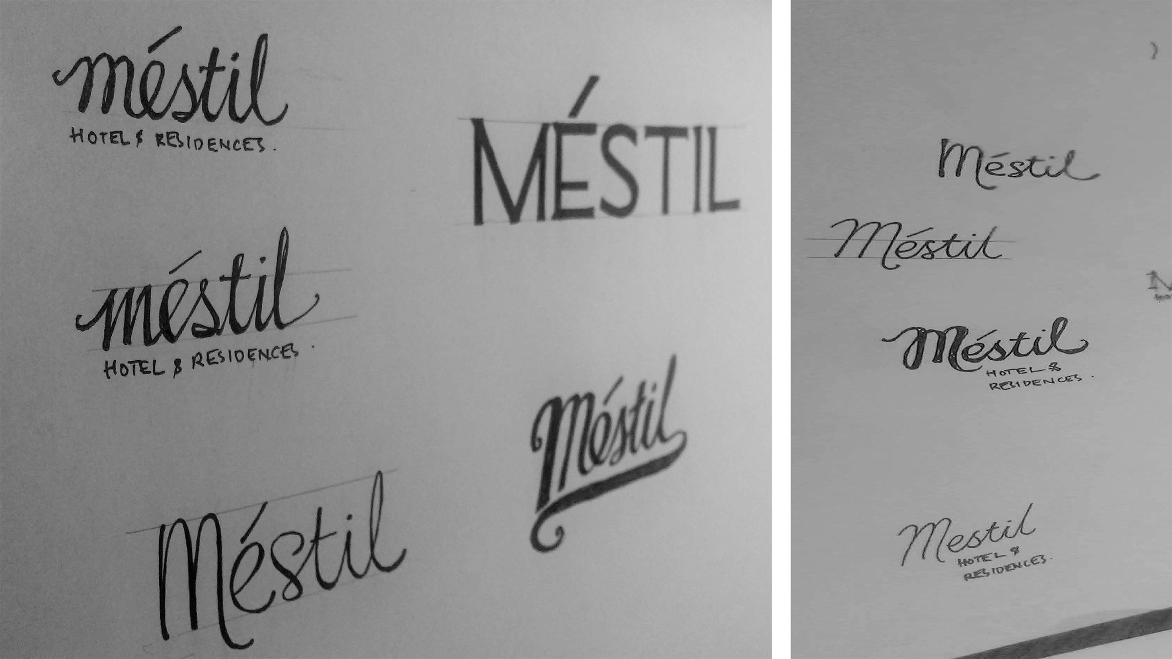
Brand Identity
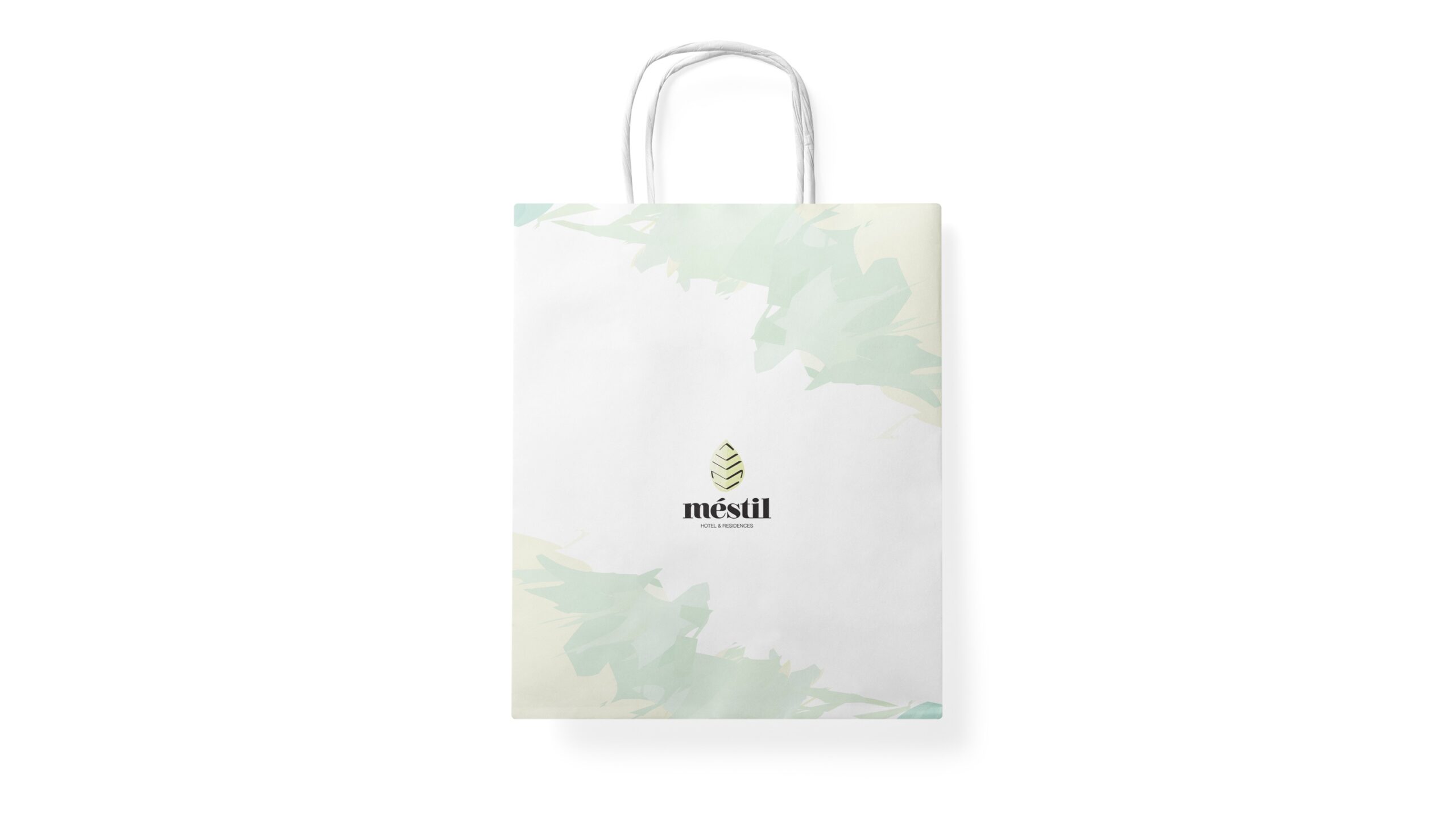
Like the name the identity was heavily influenced by the aesthetics of the structure. We created abstract patterning that was inspired by the colours of Mediterranean flora and fauna. The typography and calligraphic strokes in the mark are classic and sophisticated – a nod to the preferences of our audiences.
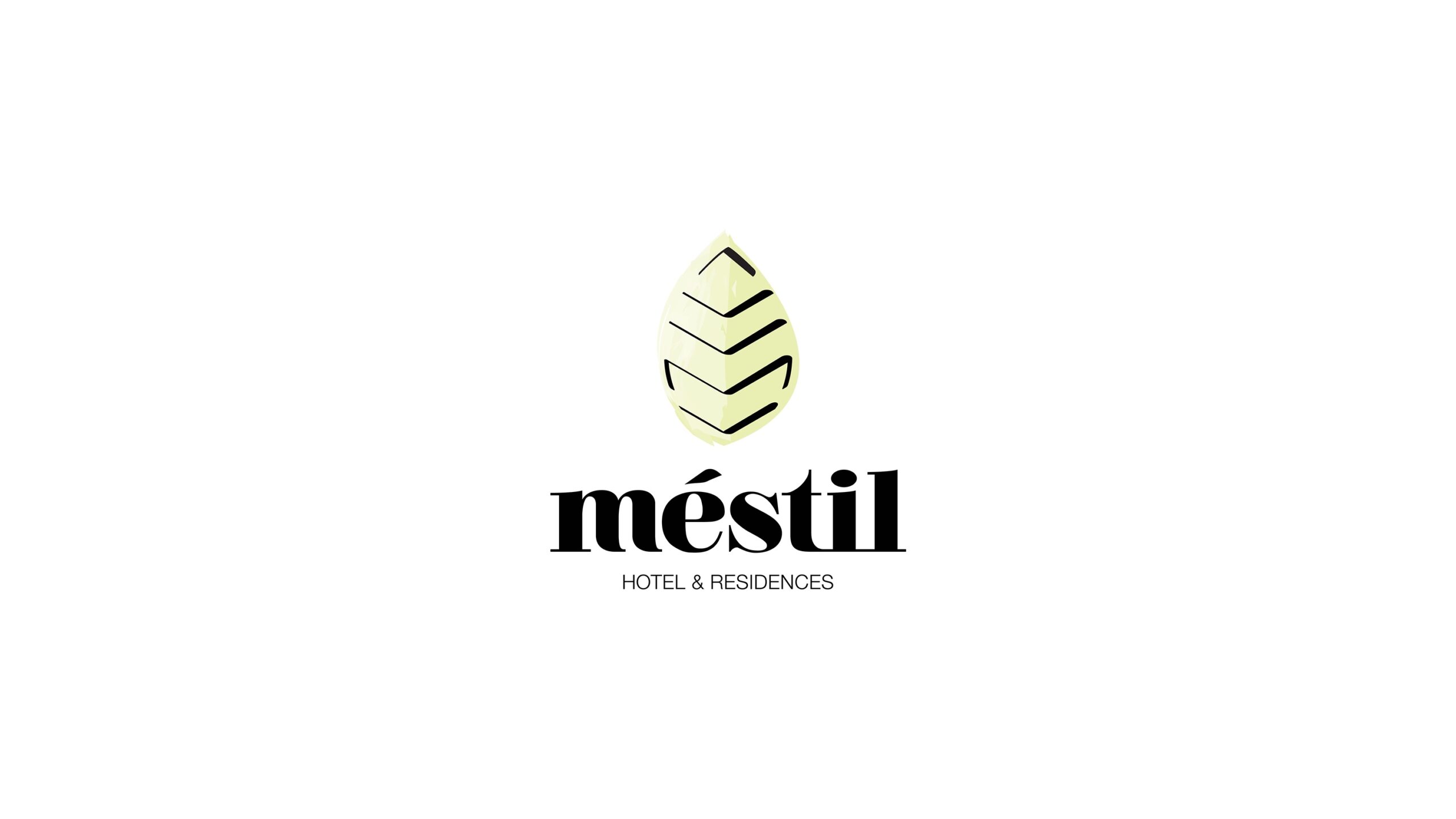

Design System
The design system is based off of the two defining traits in the mark; the calligraphic strokes in the foreground and the bright splashes colour that create the background.
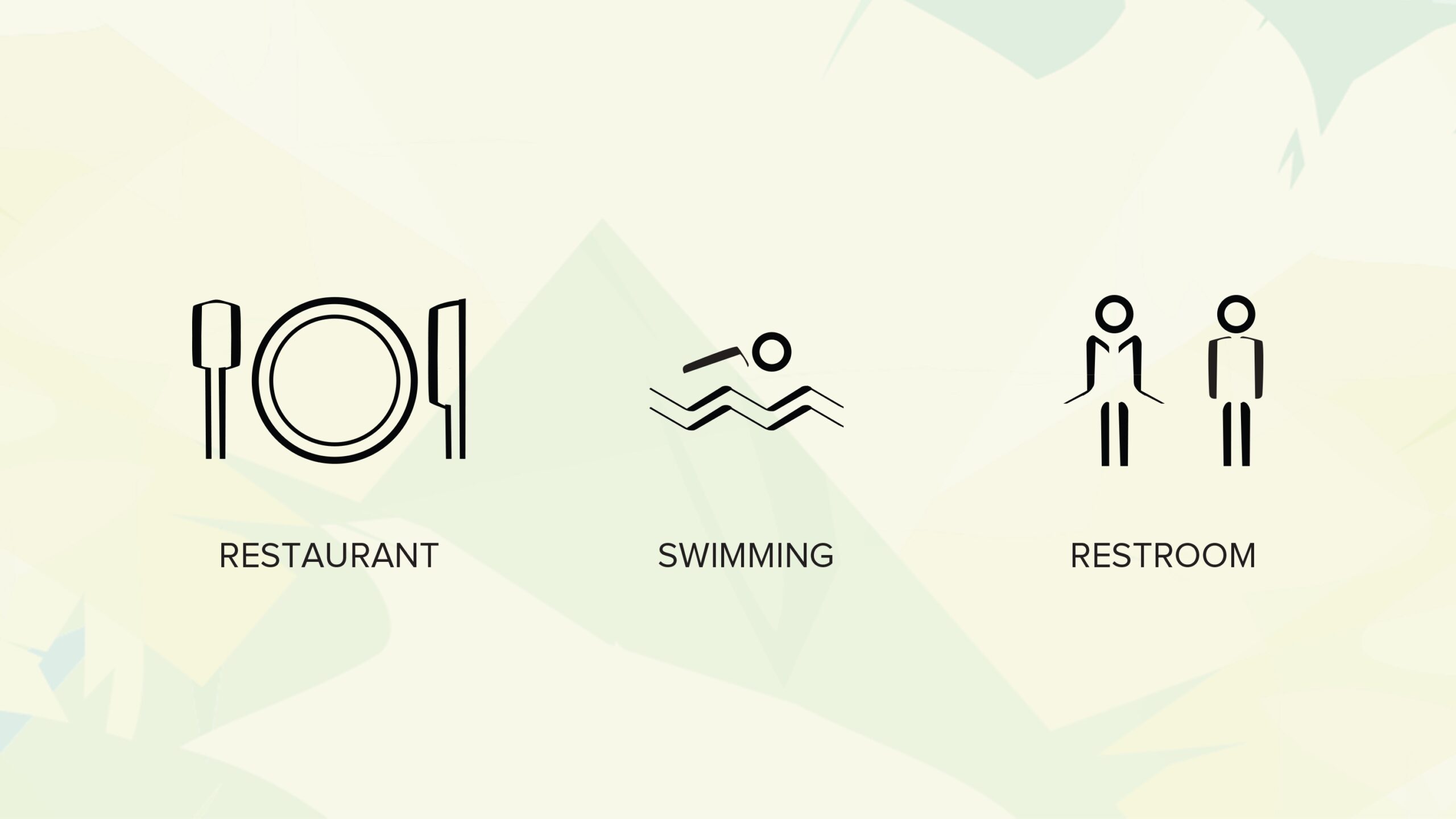

Brand Extension
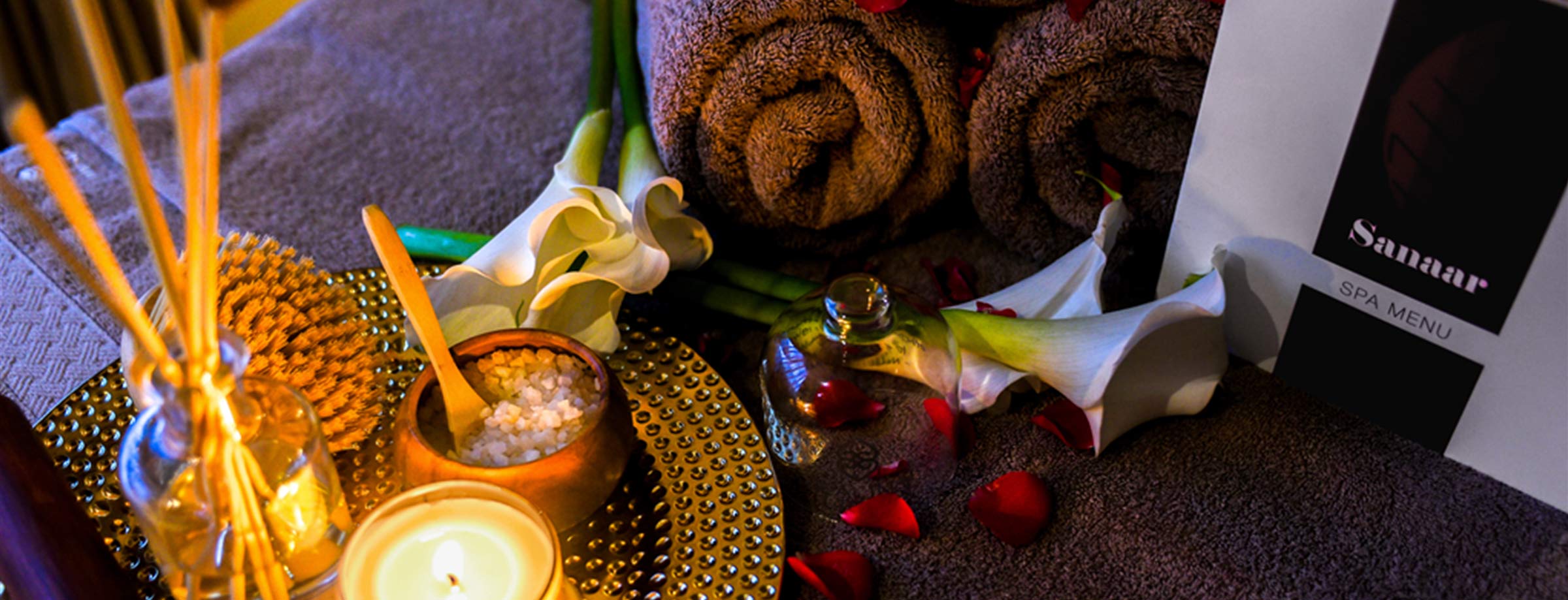
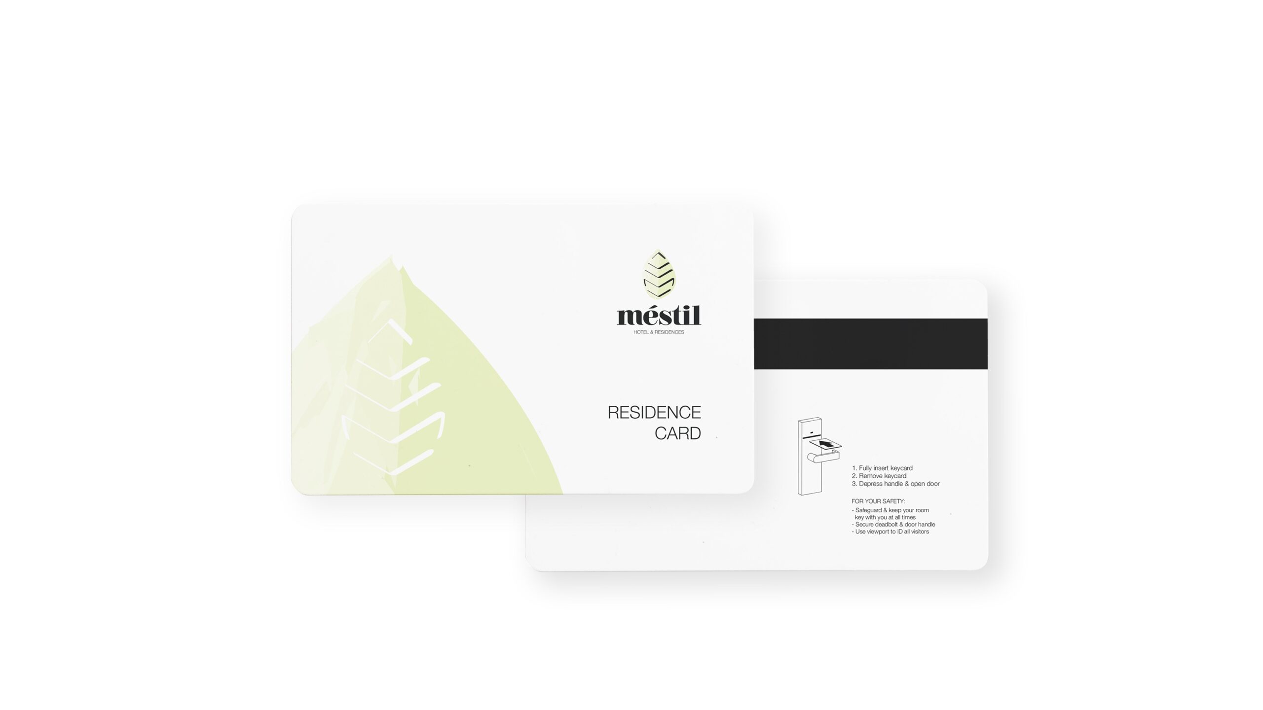
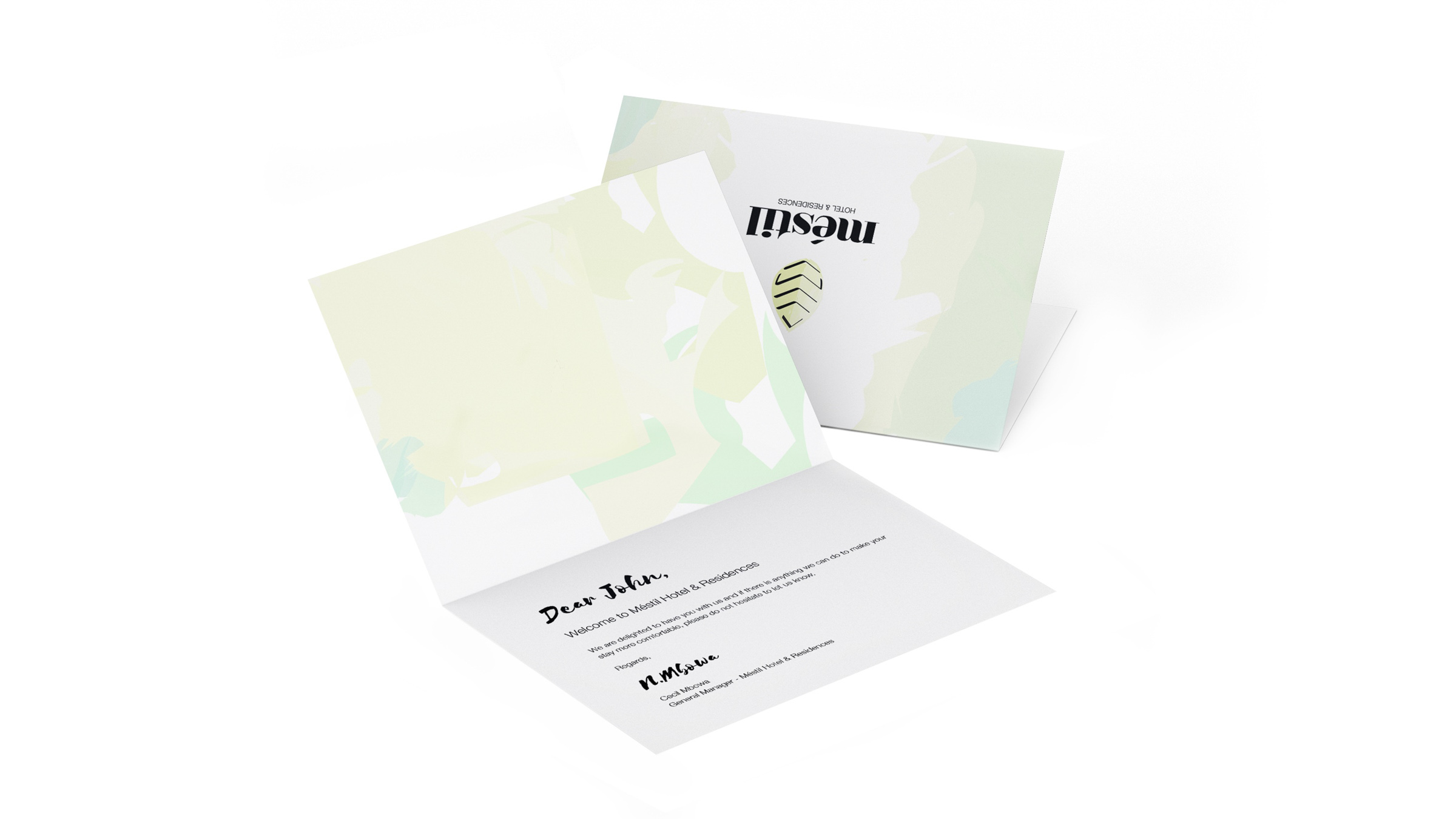
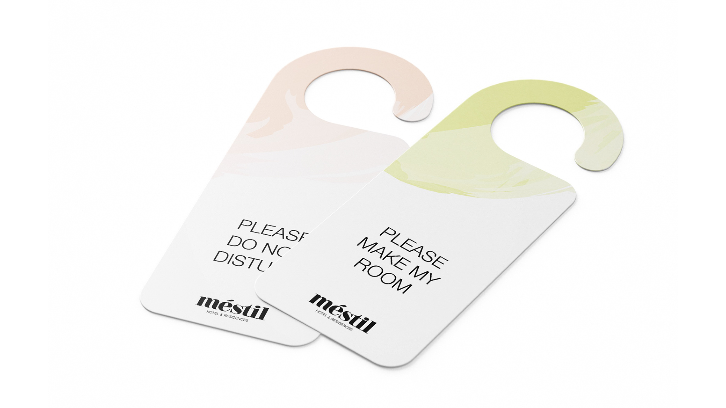
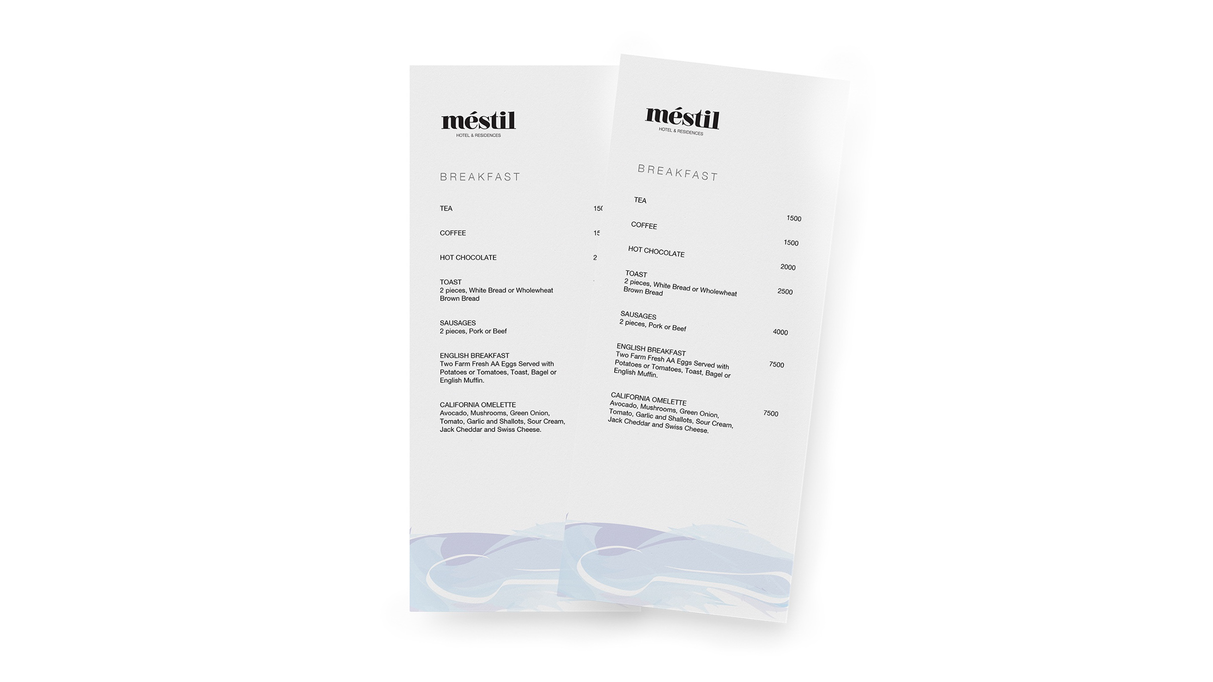
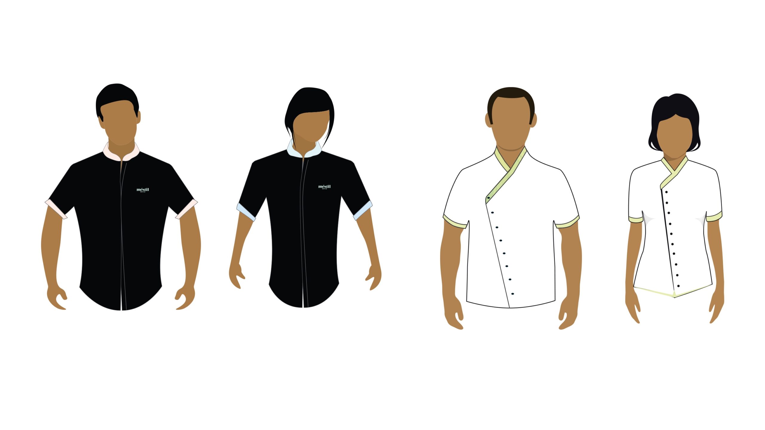
We then used this design system to create the different touchpoints for the brand. This included front office and guest services assets, as well as brand assets for the restaurant, coffee shop, and health club.
Wayfinding System
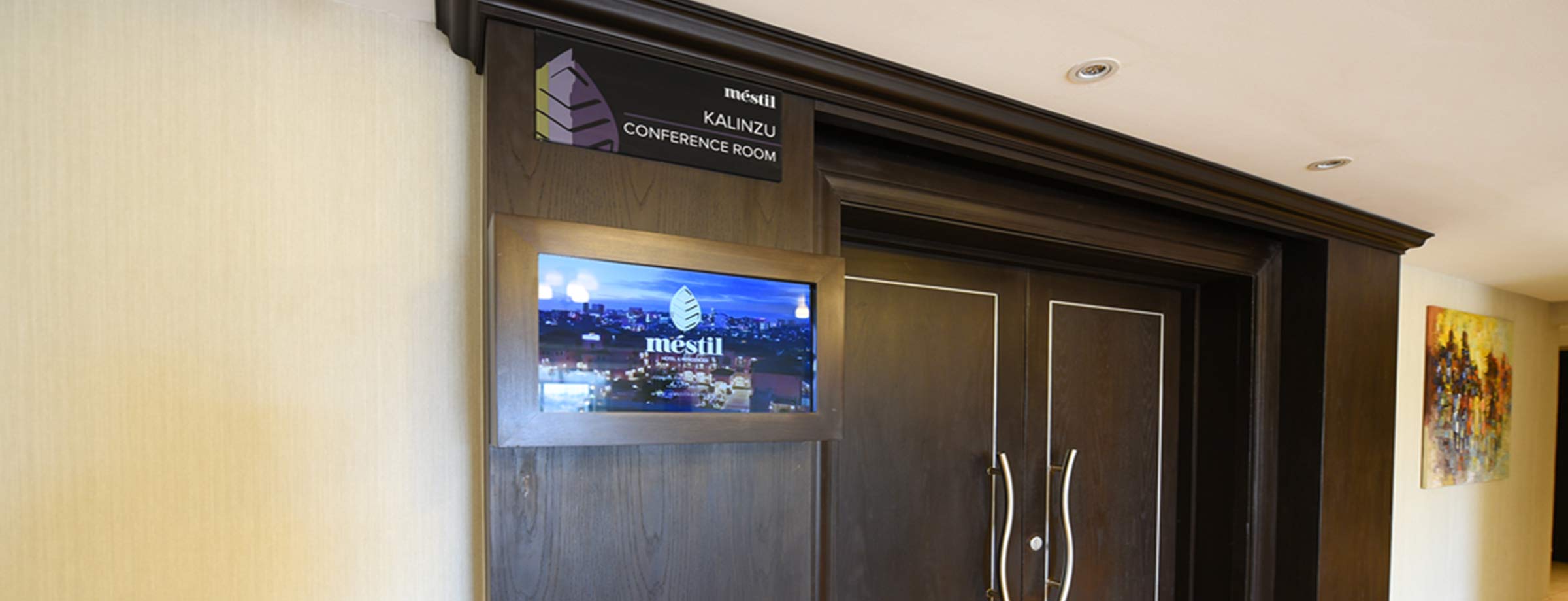
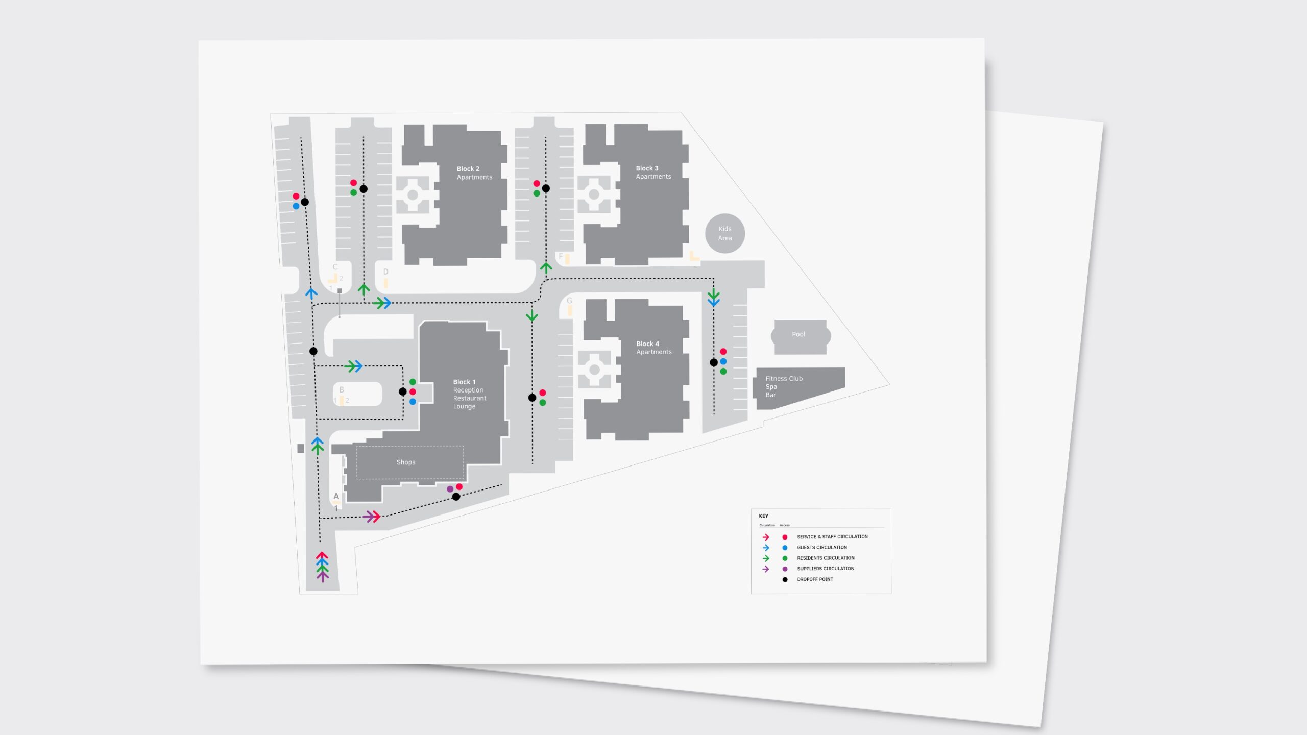
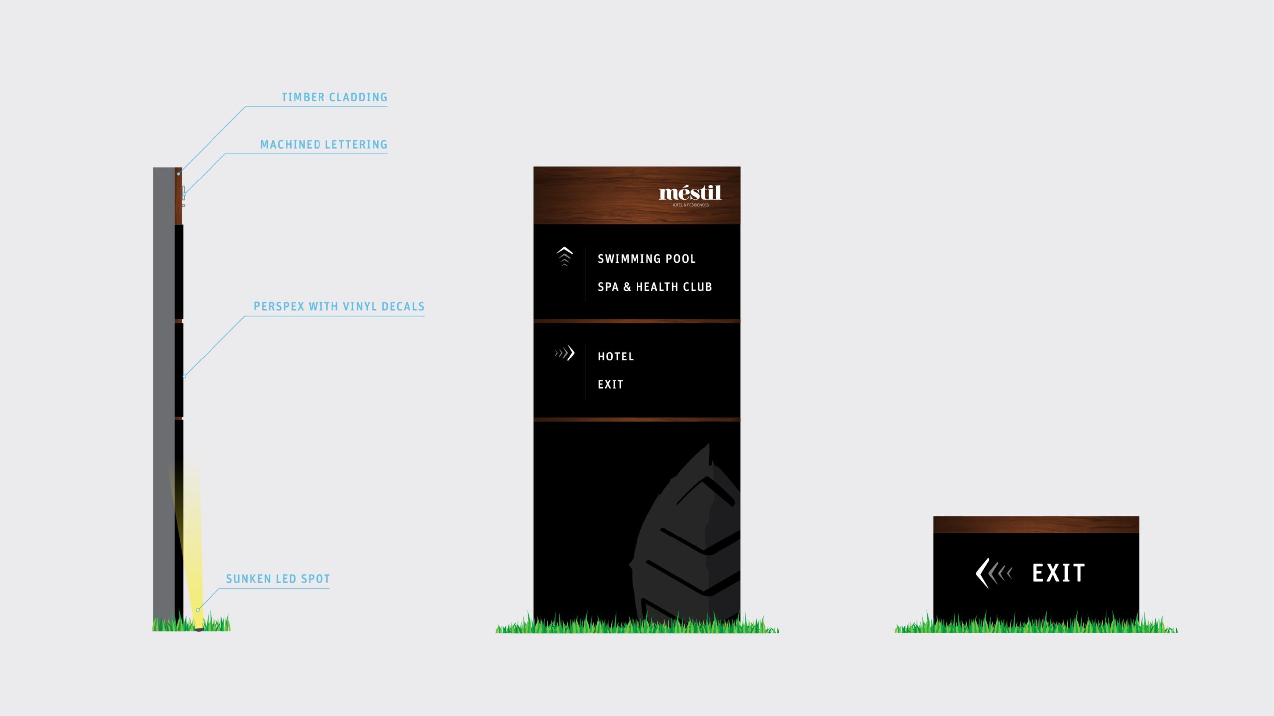
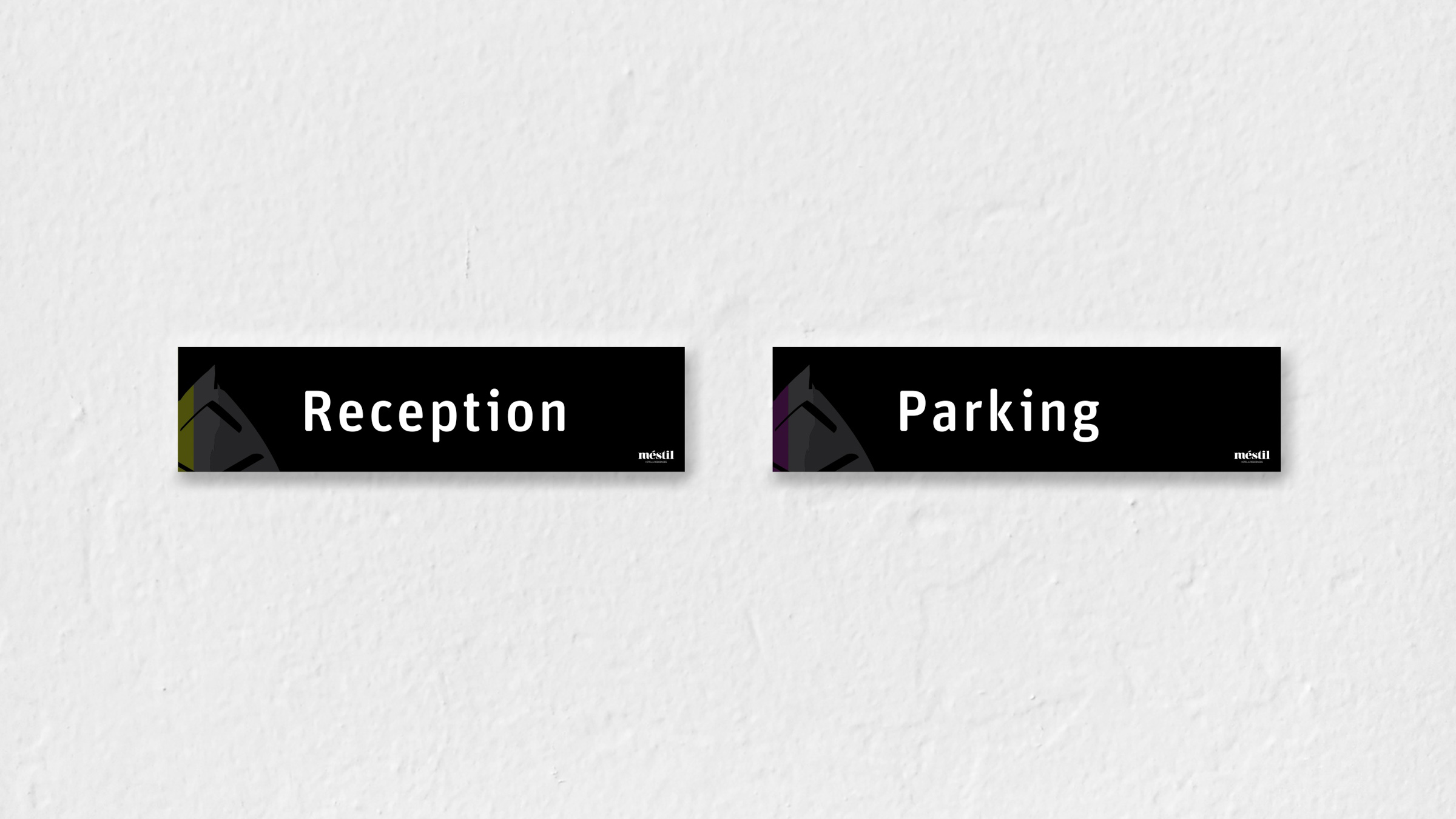
We created the signage and wayfinding system for the property, this involved mapping the user groups and circulation routes, defining the design vocabulary and sign types, and creating the designs for each sign.

Mestil Hotels is now one of Uganda’s leading hospitality brands attracting guests from around the world and taking centre stage in hosting Kampala’s headlining events. In 2020, Mestil went on to win several global awards including the World Luxury Hotel Award in 2020.
