CASE STUDY – Mawingu Networks
Opening Opportunity across Kenya.
Rebranding Kenya's fast-growing ISP Mawingu to clarify its key essence, purpose and product offerings, and equipping it with a new strategy, brand identity & marketing toolkits to increase reach across Kenya and East Africa, enabling millions of rural customers access new opportunities for work, education, entertainment, and social connections through the power of the internet.
Mawingu Networks approached ARK in mid 2022 to develop a rebrand and positioning strategy to introduce an internet service provider to rural Africa.
Our goal was simple:
• Create internal clarity and focus
• Enhance and streamline product offerings, and
• Build consumer awareness and brand affinity
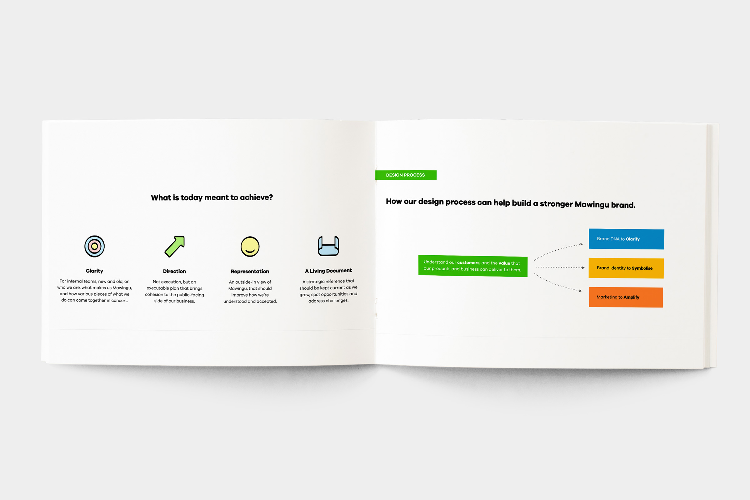
We set out to assess the rationale and extent for a rebrand, noting the benefits of a new brand positioning strategy and unified design system to differentiate amongst competitors.
Brand Audit & Strategy
We carried out a brand audit addressing basic brand and business objectives, developing audience and persona’s to identify who we are designing and speaking to. Next, we conducted competitor analysis, identifying points of differentiation and outlined global bench marks. This allowed us to understand the nature of the market identifying opportunities and challenges to inform the strategy.
Further analysis around the the customer and employee experience across different touch-points enabled an approach, defining the possibilities for the brand. This guided the creation of the brand DNA, brand architecture and unique selling proposition.
Brand Creation
We carried out an identity audit across current communication and branding relative to Mawingu’s reformed brand DNA and essence, informing a unified identity system around the Mawingu’s secret sauce, opening opportunity. Utilising this modern need and democratising opportunity for all.
Brand Naming
We identified the name Mawingu resonated well within the small towns the service was available in. However came across as clunky when paired with ‘Networks.’ The name was shortened to Mawingu, meaning cloud, reflecting the service offering, while complementing the essence of opening opportunity and reaching for the clouds.
Brand Story
After developing the Brand’s Positioning Strategy, we crafted a Brand Story for Mawingu around the essence of opening opportunity. We asked a simple question:
Does a young child growing up in a remote village in Kenya stand the same chance at success as a child growing up in one of Nairobi’s suburbs?
We built on this thread and looked at real life inspirational stories from across Africans, showcasing stories from people who created real life-changing opportunities for themselves and their communities, despite having less – proving that “given access to basic opportunity, anything is possible.”

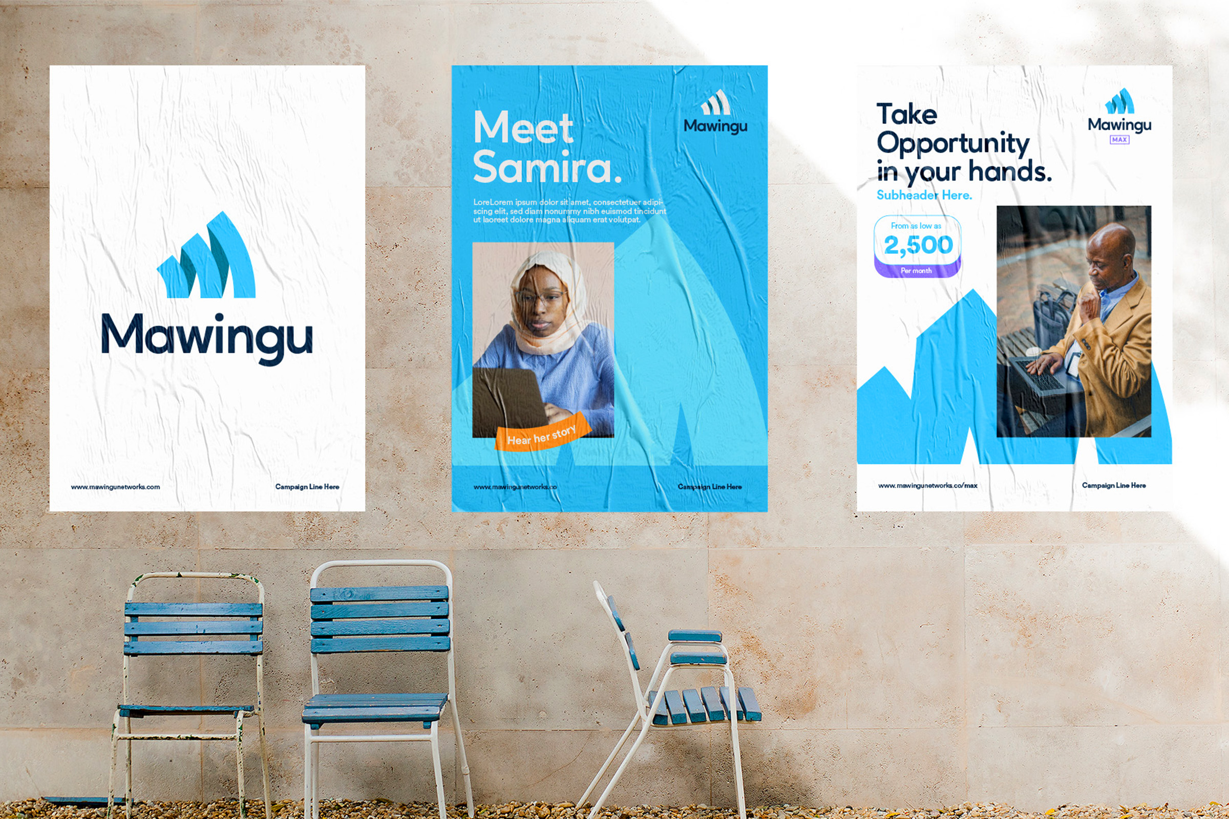
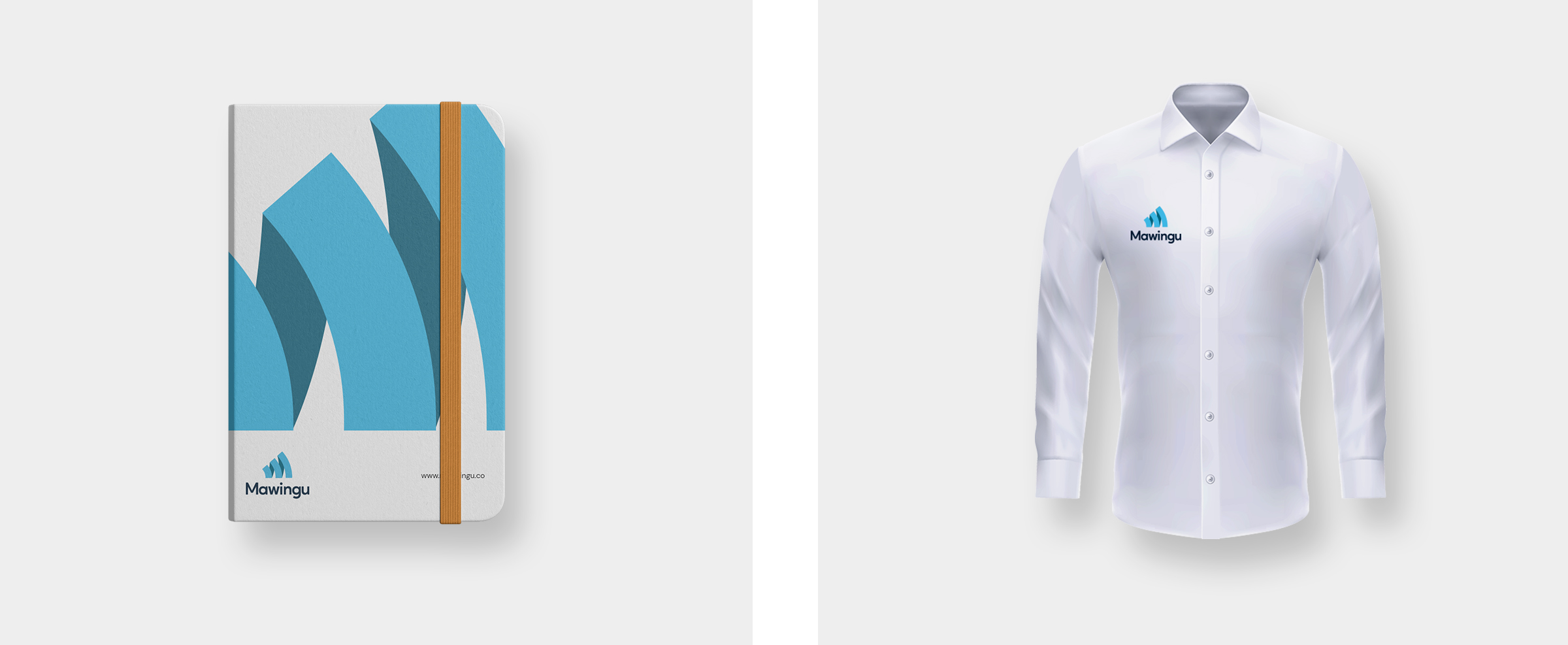
Identity
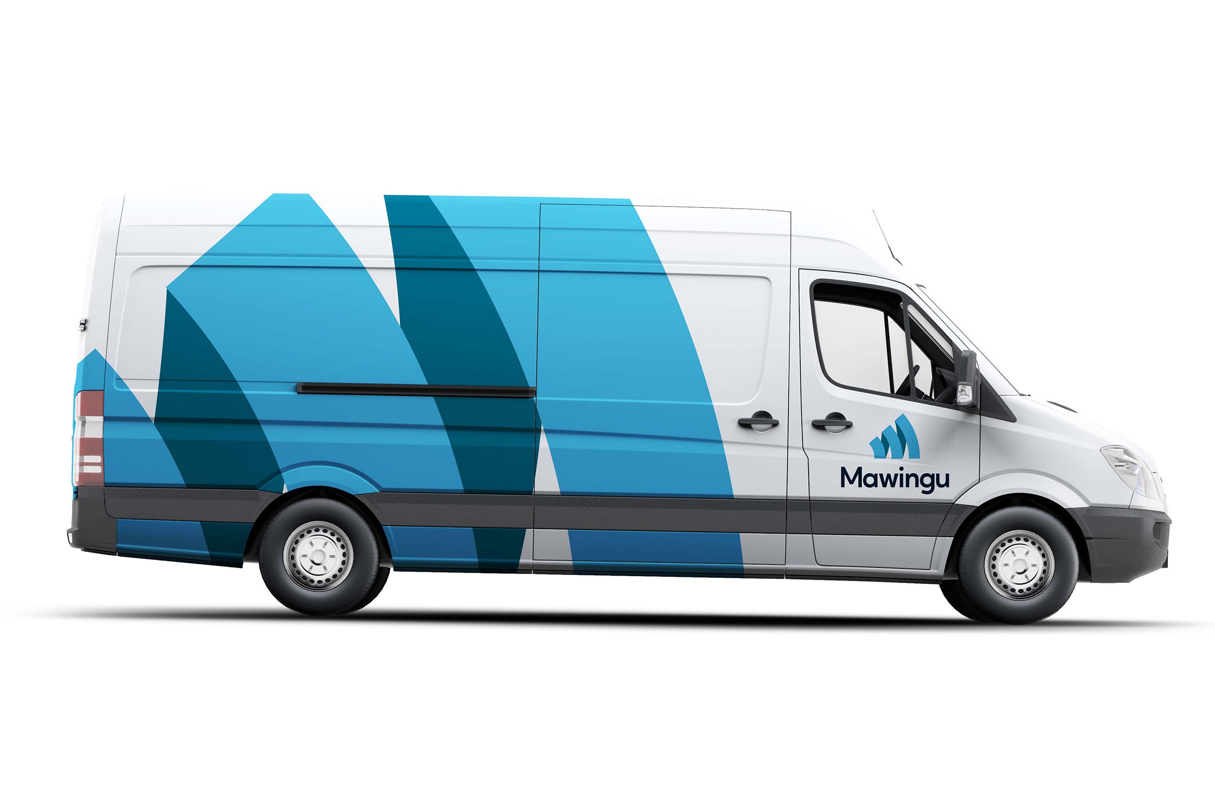
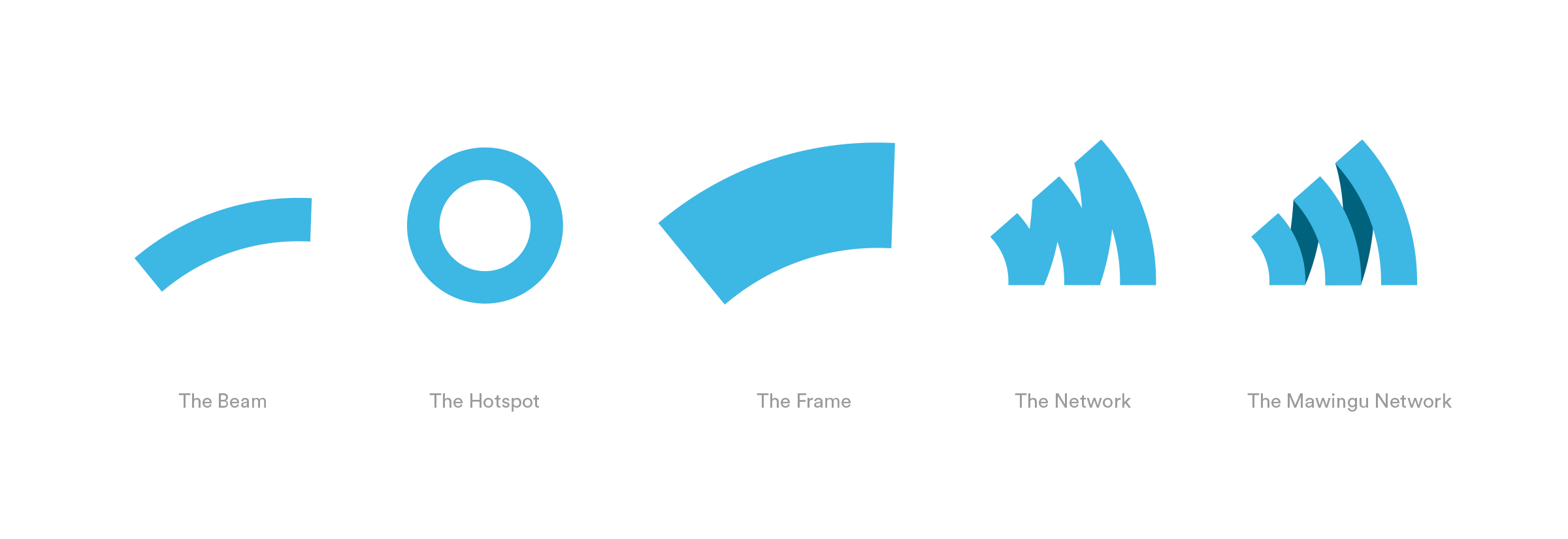
The Mawingu identity takes colour from the existing, taking that essence that resonates with existing consumers. It takes elements, such as the wifi symbol from the old, composing an ‘M’ resembling Mawingu in a professional and reliable service with Pan African scalability for the future.
Brand Architecture
Mawingu had various product and service extensions, which were technical and not easy to distinguish. We created an identifiable brand architecture to make sense to how we present to everyone we engage with. Optimising for clarity, value and efficiency.
Visual Language
To communicate the Mawingu Identity, we came up with unique stylistic devices the brand to create consistency and recognisability across communication, clearly representing Mawingu. It creates a sense of professionalism and ease of identification unifying elements such as typography, stylistic devices and colour.
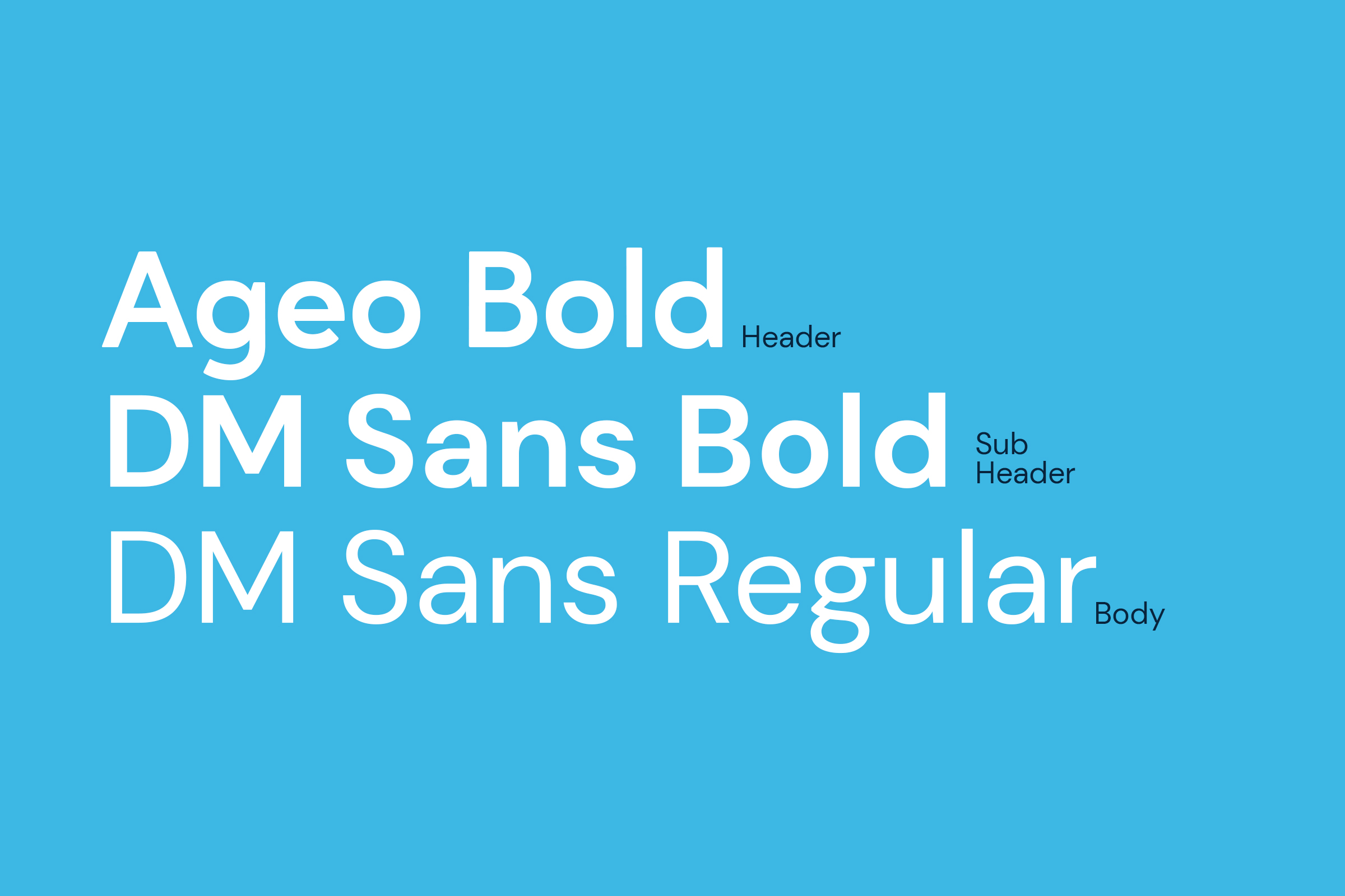
Typography
Ageo and DM Sans are part of the Mawingu identity because of their warm, approachable, legible and modern sans serif appearances.
Stylistic Devices
Graphic devicescreate a consistent, unique and recognisable Mawingu identity
across communication and various brand touch points..

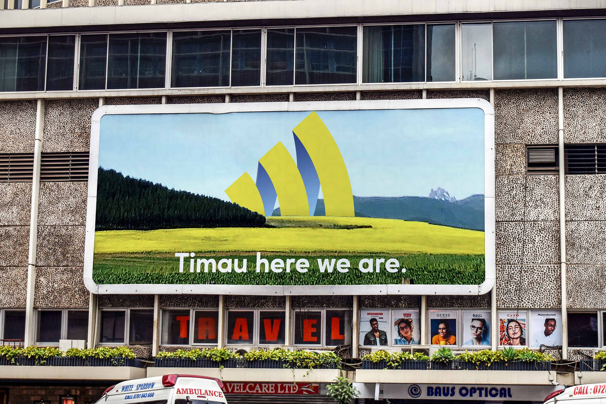
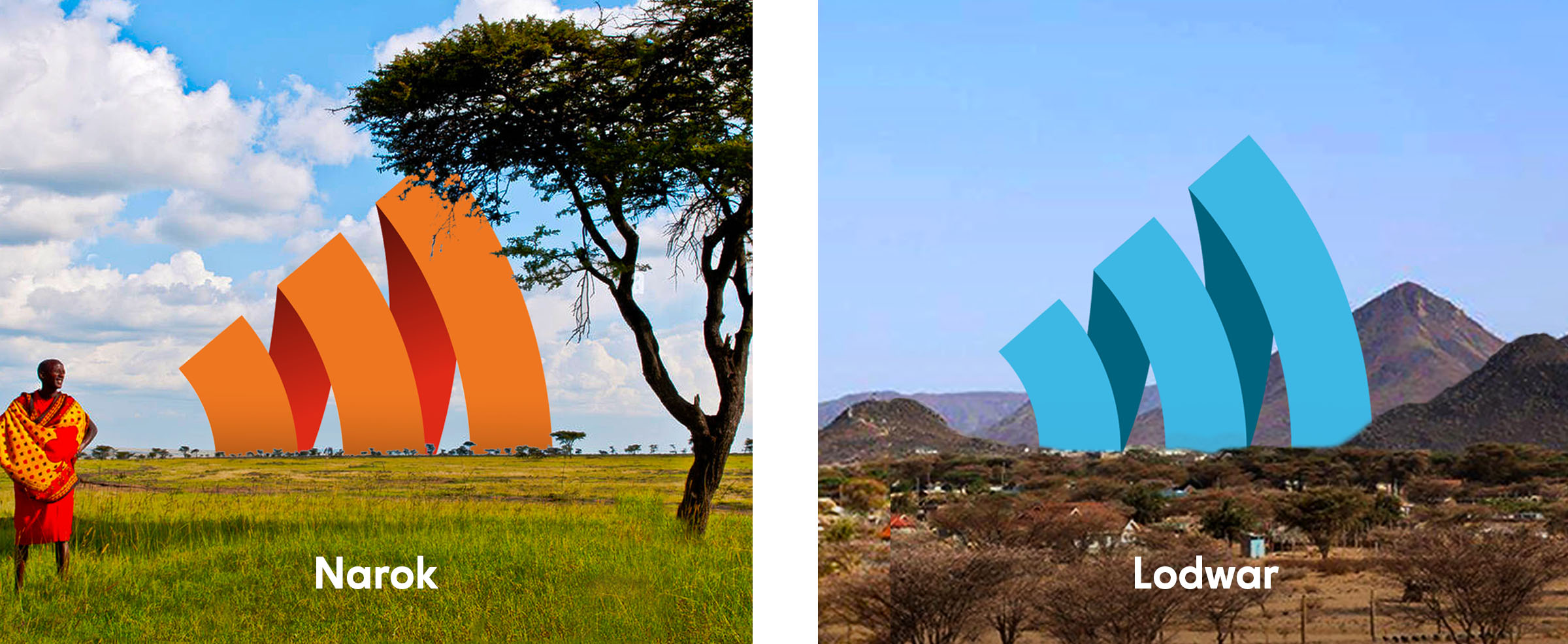
Localisation
Offering it’s services in rural Kenya, the Mawingu brand mark can be used as a dynamic identity system to sit and feel like the environment it sits in for localisation purposes. Appreciating the rural nature and culture and beauty where the brand offers its services.
Growth
Series B
Mawingu has recently announced its Series B investment round, enabling accelerated roll-out to an additional 25 counties across Kenya in 2023.