CASE STUDY – Dojo
Creating a luxury wellness centre brand.
Branding and positioning Kenya's first luxury wellness centre.
DOJO is an upscale health and wellness centre located in Karen, Nairobi on the same property as The Talisman Restaurant. The DOJO founder approached us in early 2019 to give the brand life and position it for success. The brief was clear – they needed an identity, design system and interior feel that embodies the spirit of DOJO. A health, wellness and teaching centre that caters to the full being – the mind, body and soul.
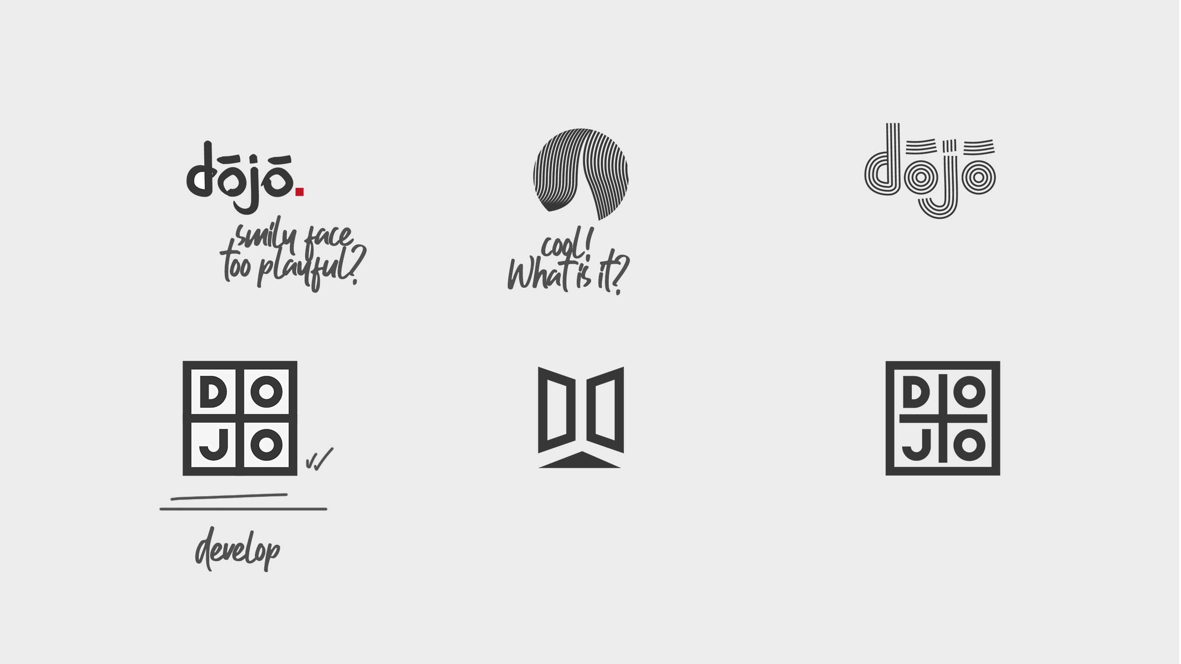
In line with our process, we carried thorough, on the ground research in the area to ensure the brand stood out and spoke to its target market. Initially we explored a broad range of ideas, some of which can be seen below, before settling on a direction.
Brand Identity Design
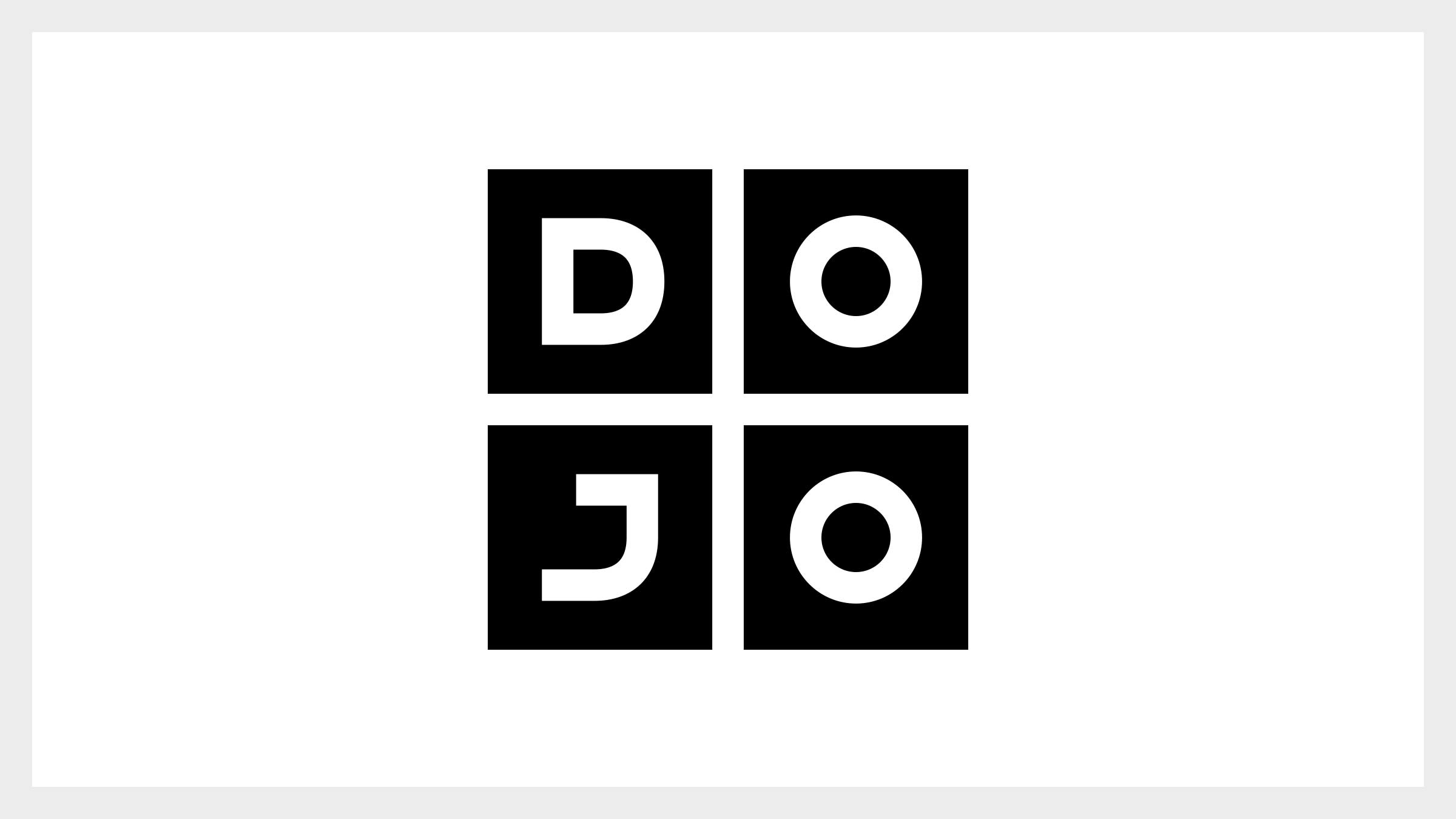
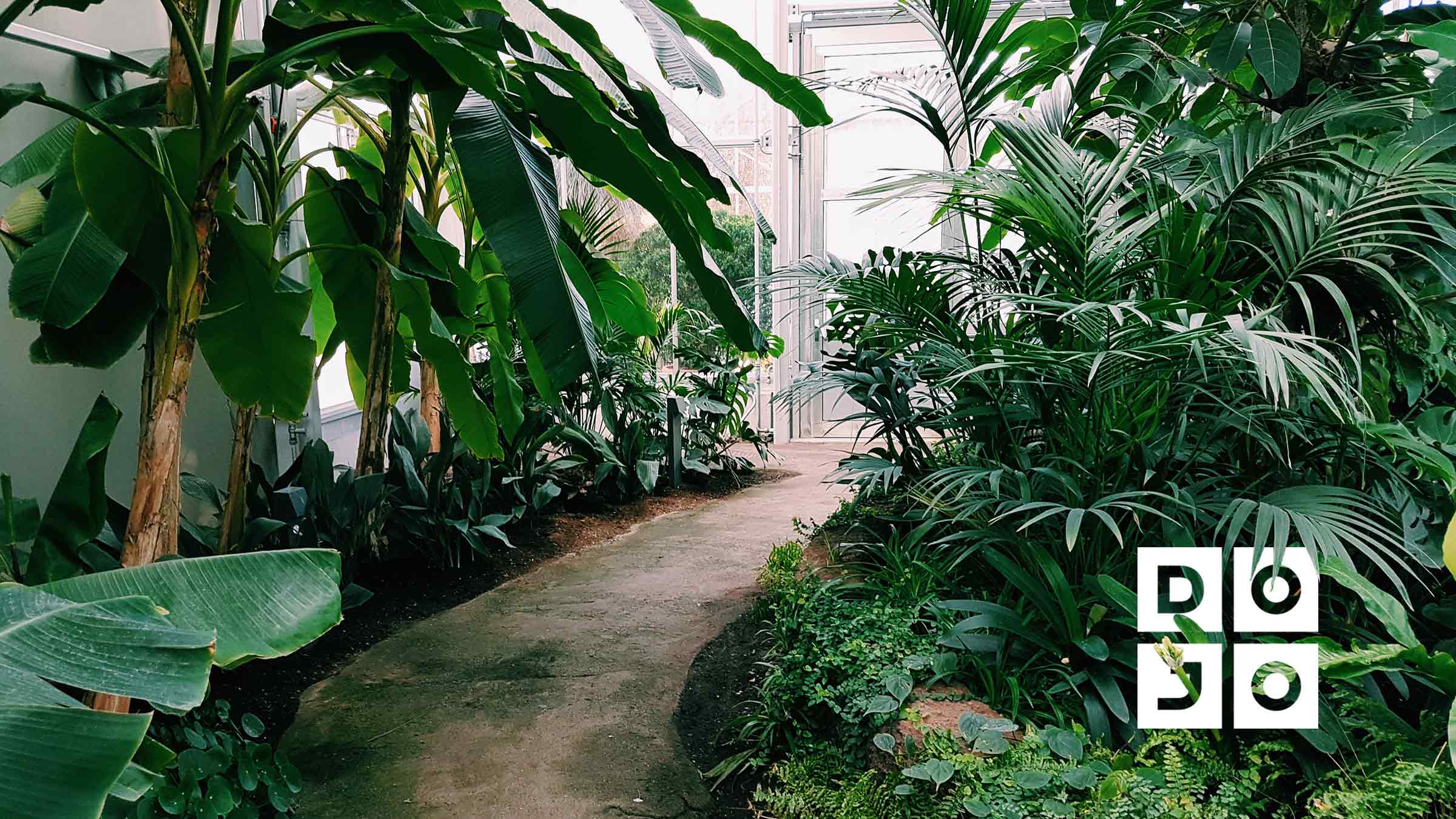
Our final solution borrowed inspiration from the rectangular(and sometimes square) patterns on partitions found between rooms inside a traditional Japanese dojo. These simple shapes and lines combined with a hand-drawn sans serif typeface presented a bold foundation through which the true personality of the brand could extend and shine through using complimentary symbols, patterns and colours.
Brand Positioning
Additionally, the word DOJO on its own is fairly ambiguous – It could be a restaurant or a hotel etc. This meant that the brand needed a qualifying statement. One that clearly communicated it’s high end positioning and its focus on not only physical wellbeing but mental as well. After brainstorming words and word-combinations, we settled on ‘WELLNESS CLUB’
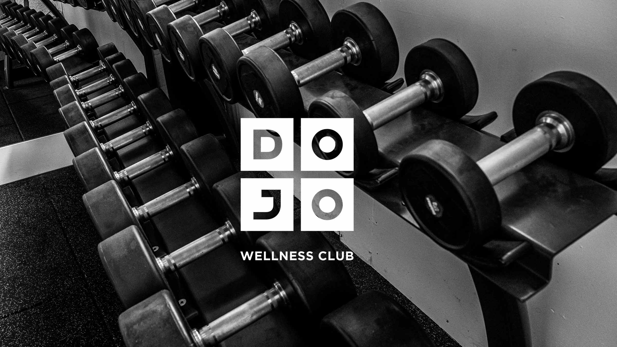
- WELLNESS – Clearly communicates a desirable outcome for all members. Whether thats through lifting weights, attending a yoga class or chilling in the steam room.
- CLUB – The word helps introduce the idea of exclusivity and the expectation of a high standard of service.
Product Design
Dojo offers over 30 unique services to its members. As such we needed an elegant way to classify and simplify the product offering to better address business and audience needs, as well as communicate to new and current tailored activities based on their needs or interests.
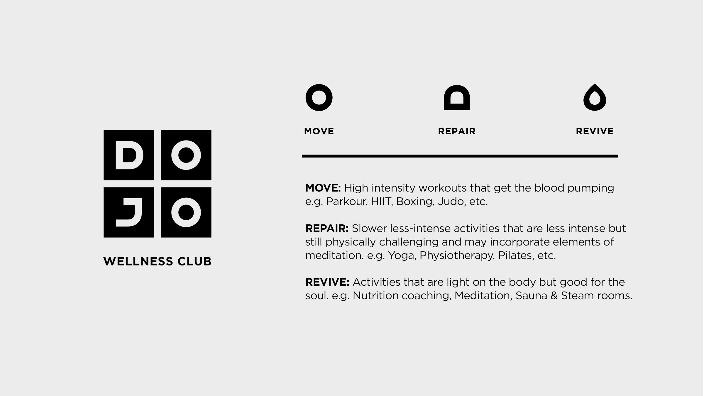
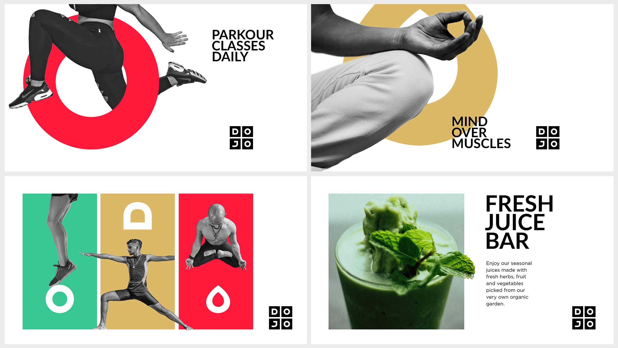
We came up with 3 pillars that, together, represent the entirety of DOJOs offering – Move, Repair and Revive
These pillars were incorporated into the brand’s graphic system to present the offering and connect purposefully and closely with diverse audience needs.
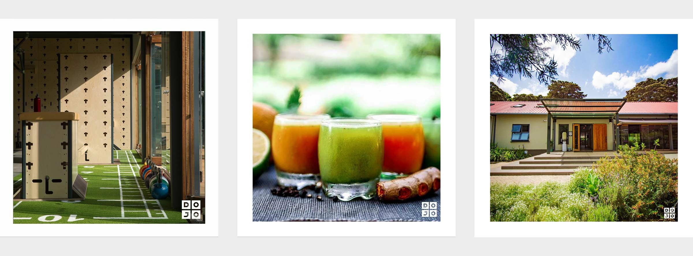
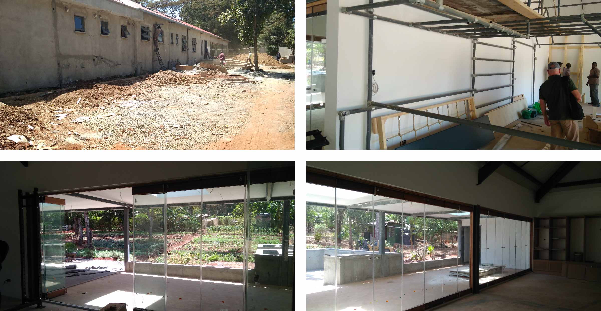
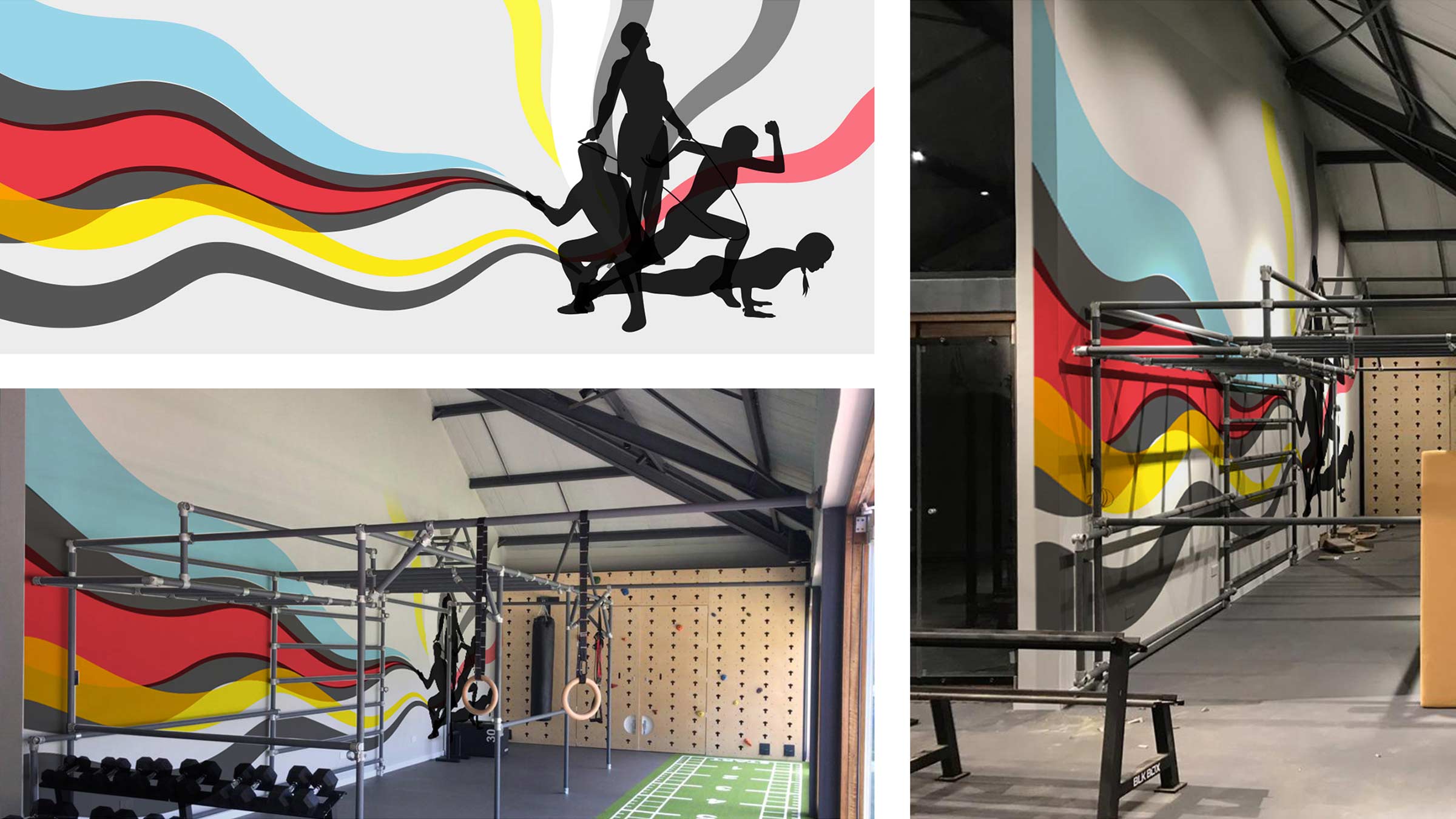
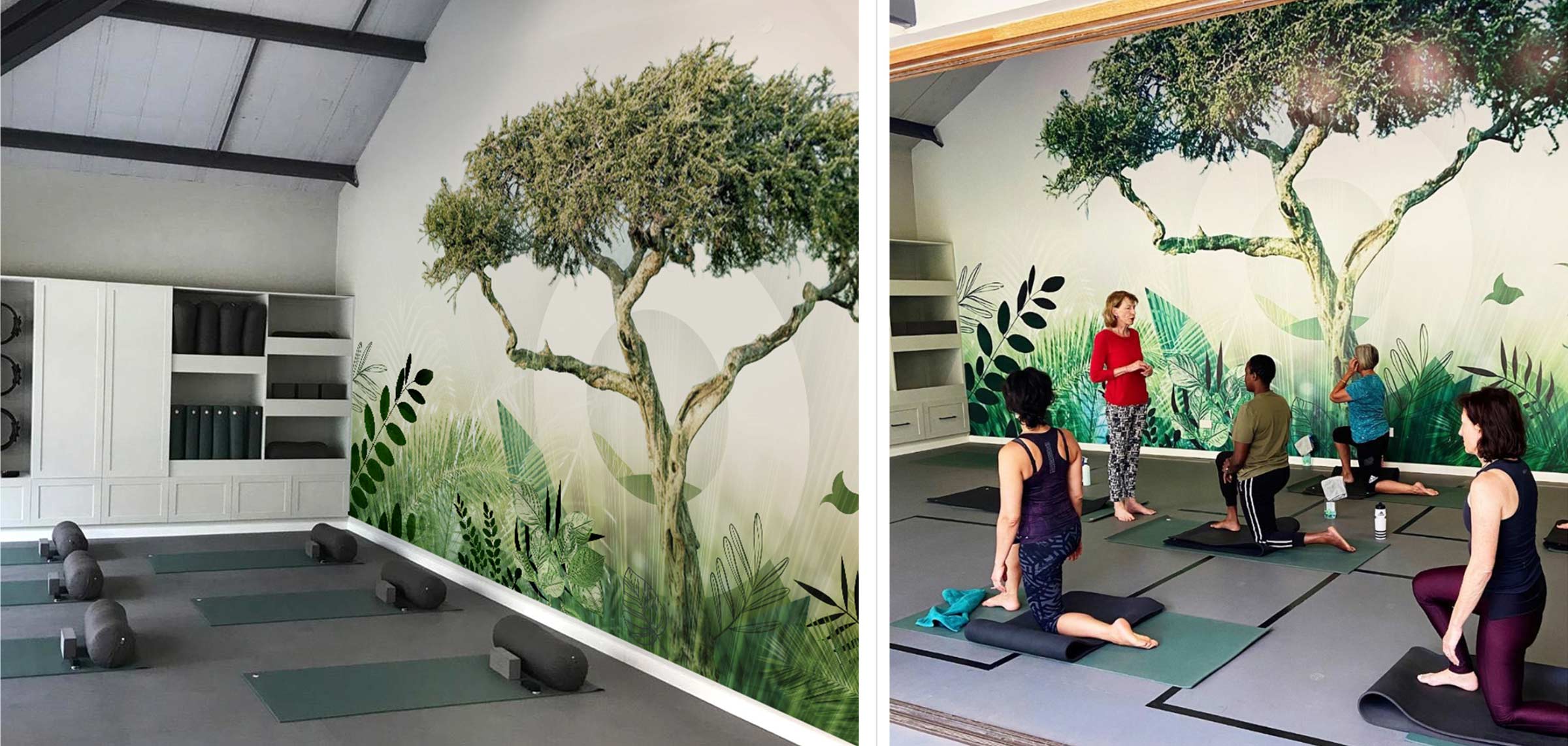
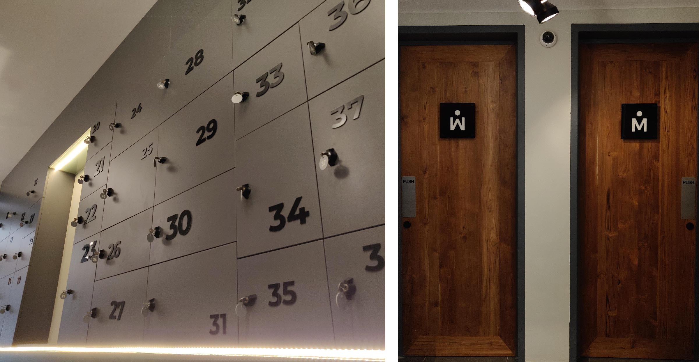
Spatial Design
Interiors and Environmental Graphics
Working on a project from an early stage always presents opportunities to develop a seamless brand experience. Working with the project’s Architect and Interior Designer, Nikki Barlow, we developed a number of environmental graphics and wayfinding elements to help bring the space to life.
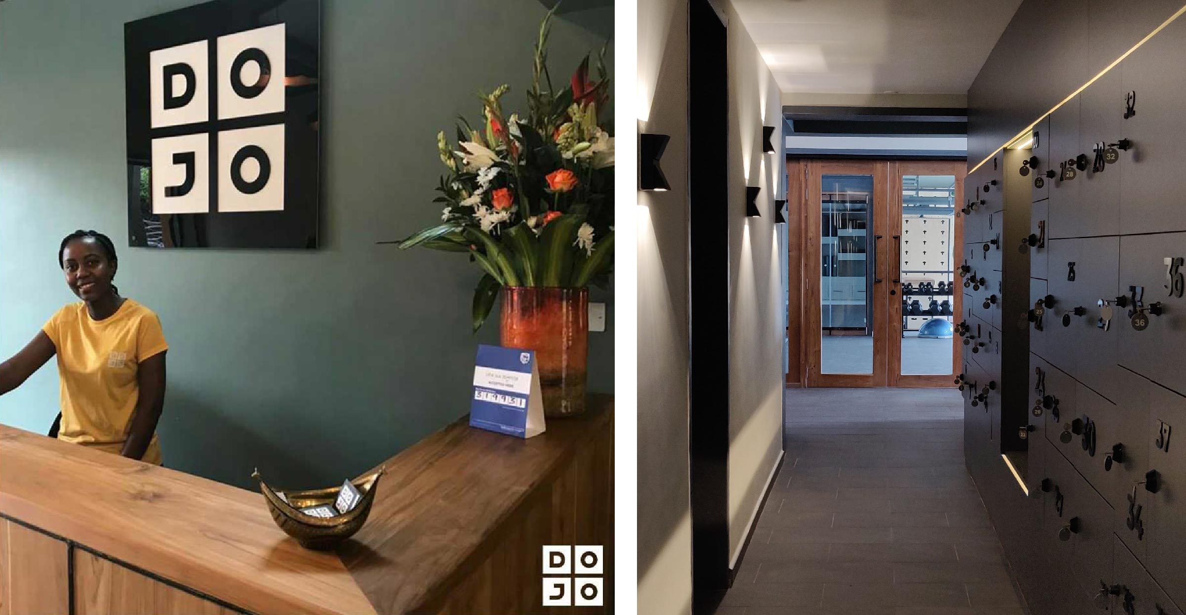
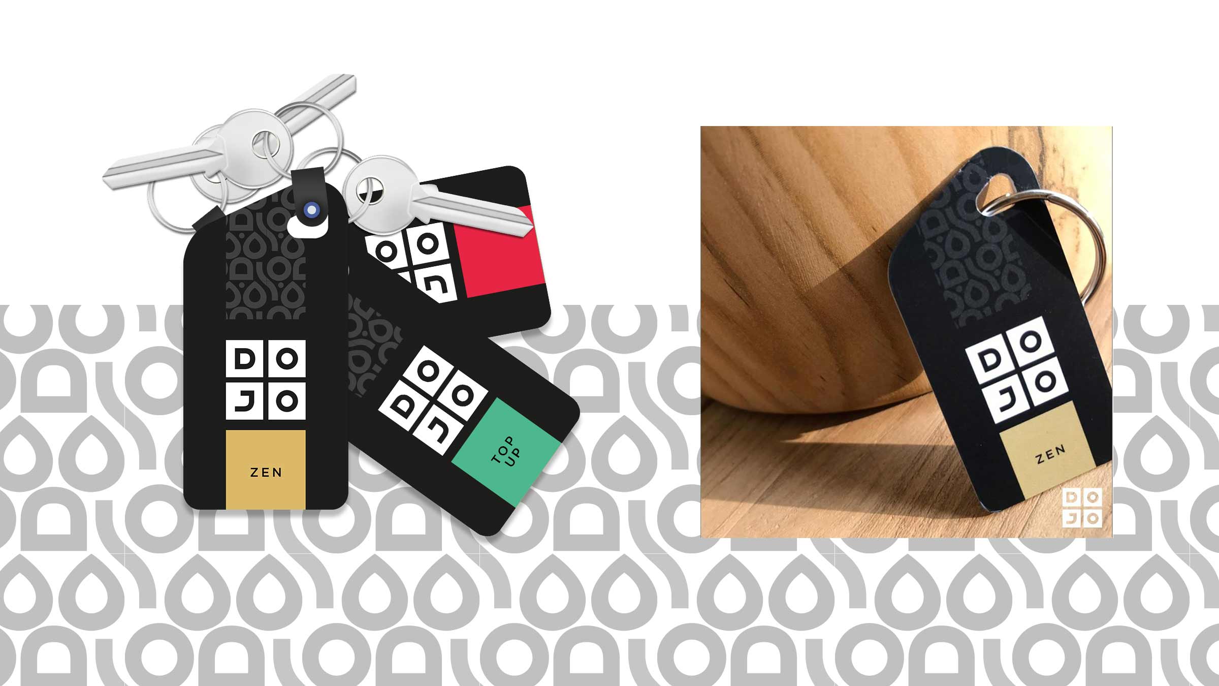
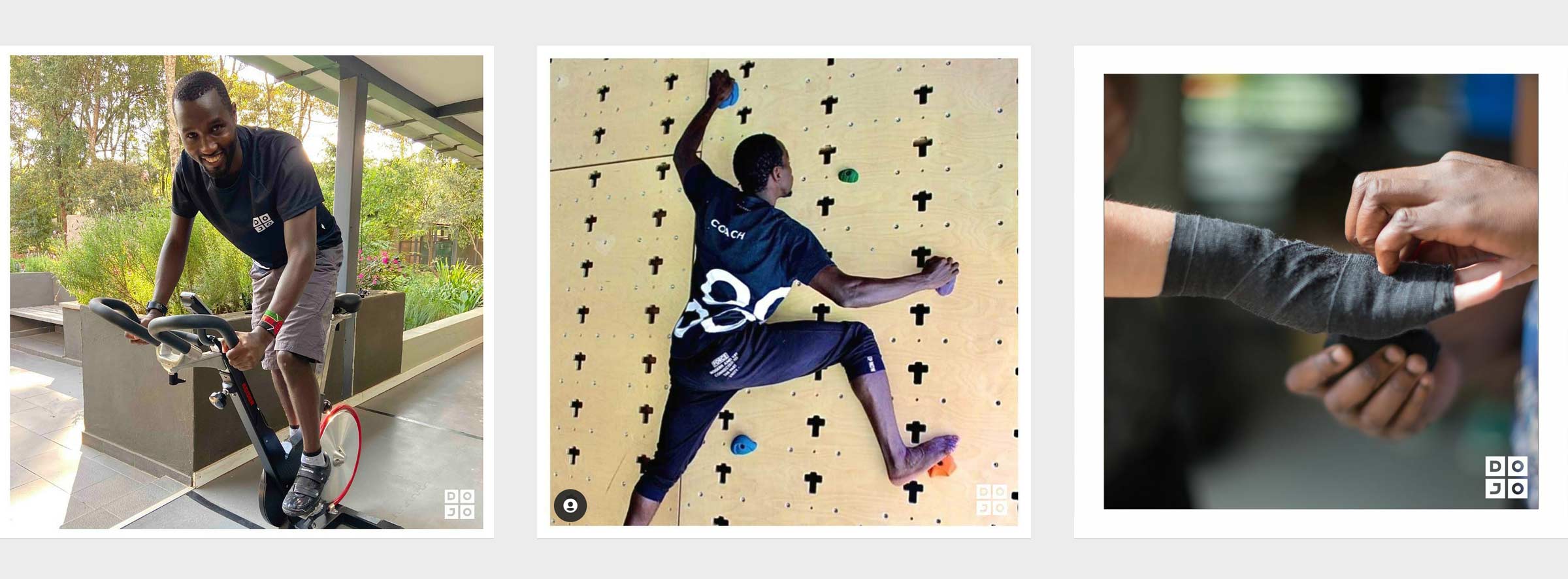
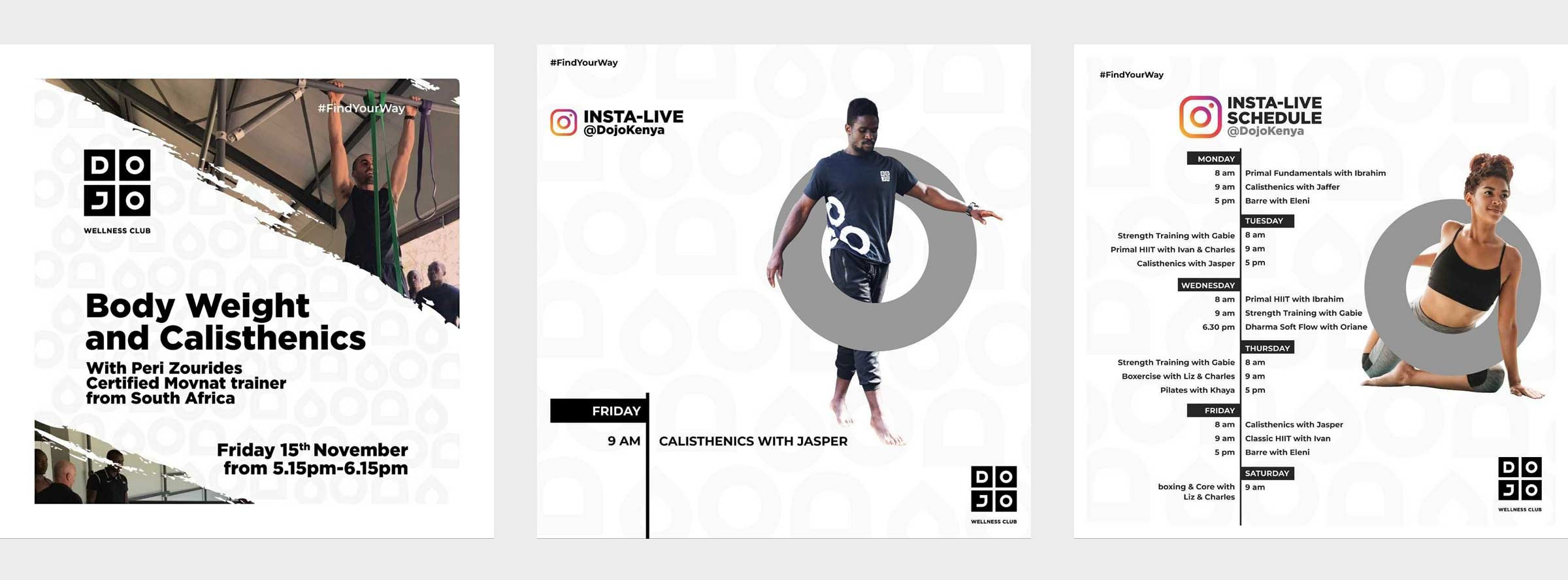
A few additional brand elements such as RFID access key cards, uniforms and ephemeral were designed in time for the big opening. Post opening, the client beautifully adapted the design system and brand toolkit for social media communication.