CASE STUDY – Wananchi Group - Zuku
Creating Africa’s first triple play brand.
Introducing and launching a triple-play broadband, communication & content network - a first in Africa - and driving it to market dominance achieving a 10x growth in capitalisation, as well as being one of the most recognised household brands across East Africa.
One sunny morning after devouring some hearty chapatis in the office, we received a call from the MD of the Wananchi Group. He needed a partner to help them brand and market Kenya’s first triple-play service. This was going to be exciting, we dove in straight away.
Brand Strategy & Creation
Prior to our engagement the brand was called Wi-Life. After a few meetings, it became clear that we needed a new name for this amazing product. One that would resonate with the audience, and provide a strong platform for the brand and future communications.
Name Creation
We tested different words and shuffled various sounds until we had something that hit the spot – Zuku.
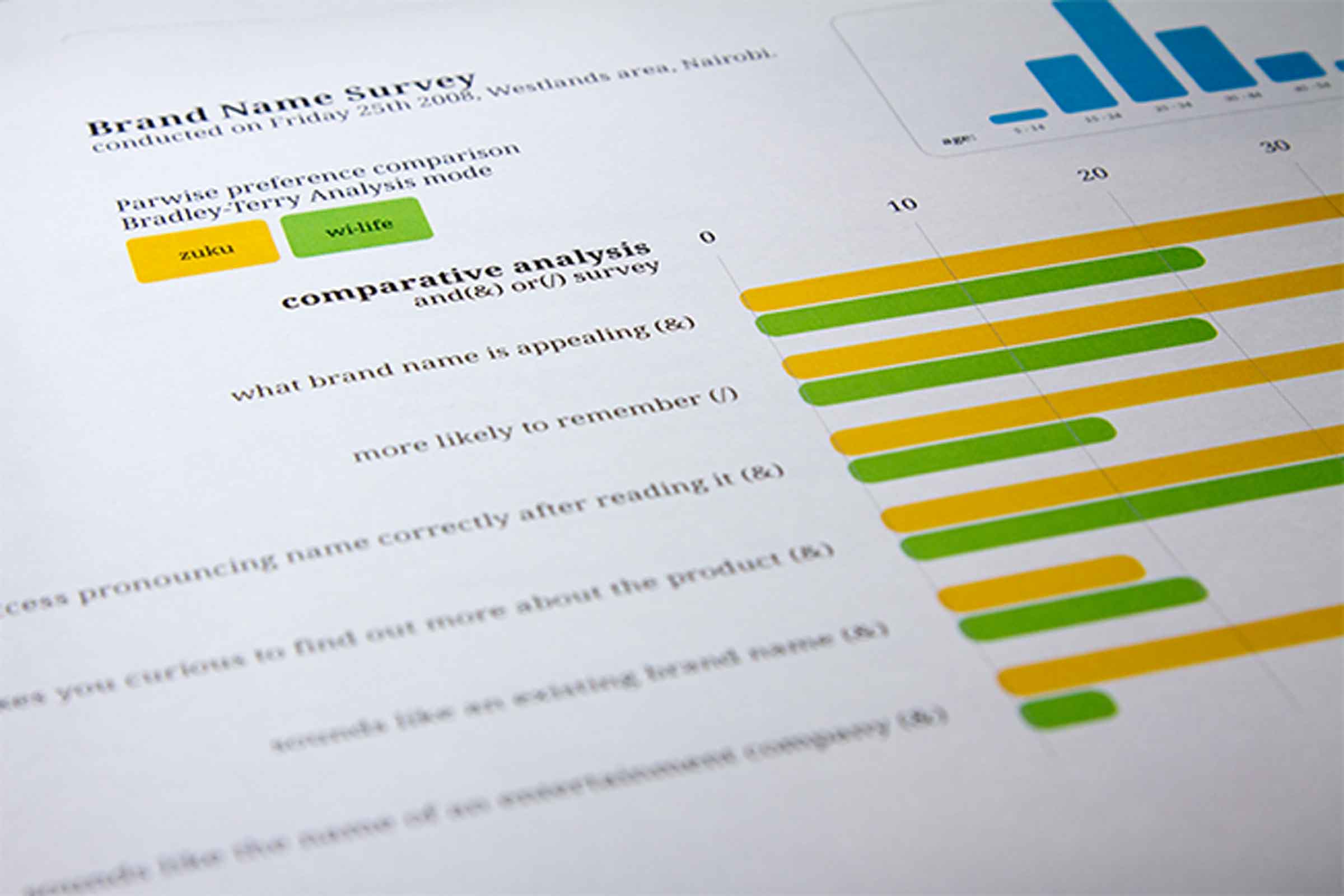
Zuku is an ancient word from the crevices of WeMadeItUp. Seriously, it means absolutely nothing, zilch, nada. We strategically coined a word to create a suitable character for the product. The new name allowed us to create desired new meanings and associations with the word, and had an African ring to it. It was unique, memorable, sounded fun, and was easily pronounced.
Brand Identity
The brand identity was designed to be fun, and casual. The structure of the letterforms were recreated from an existing font to have smoother flowing curves.
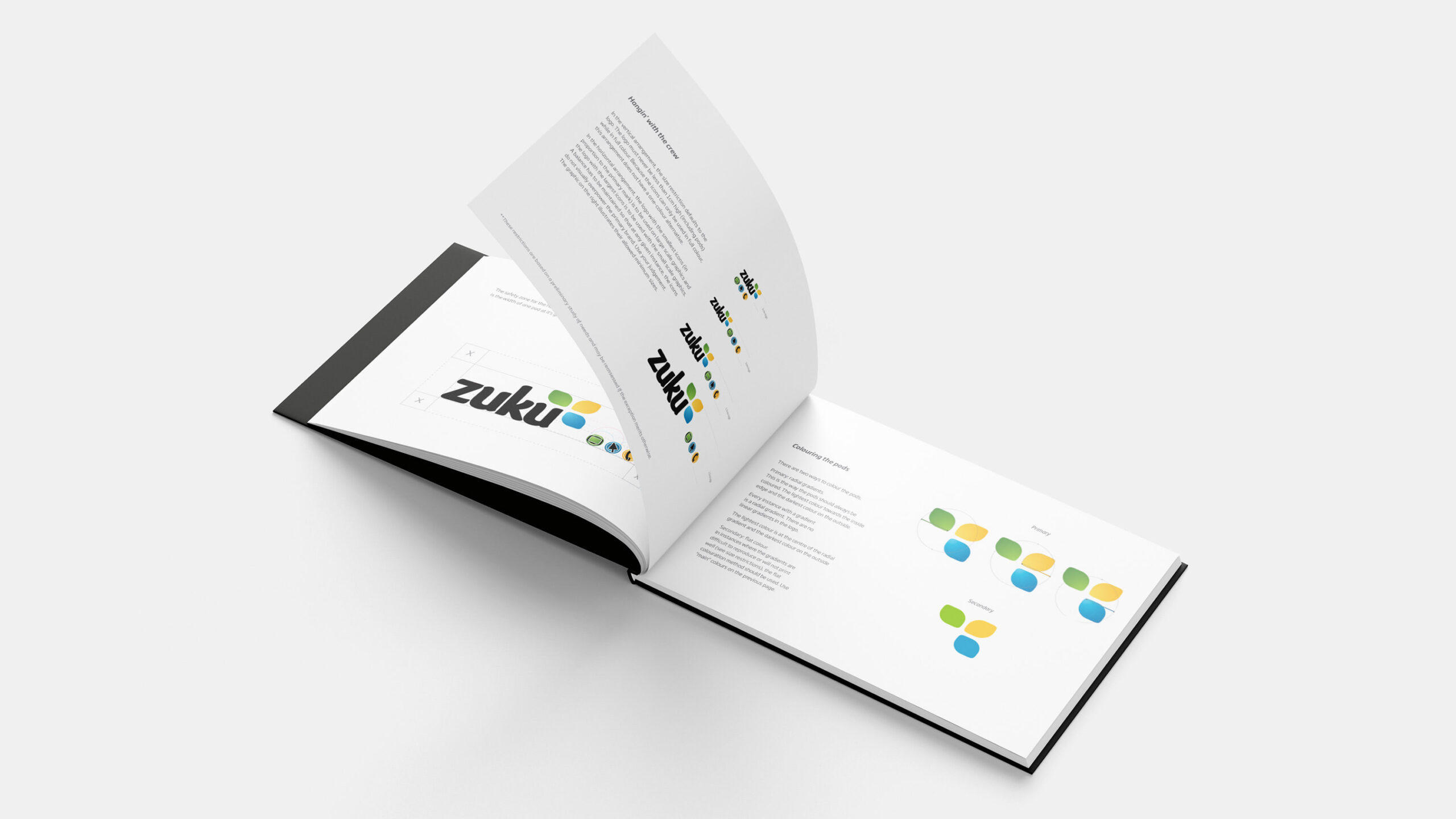
Colour Systems
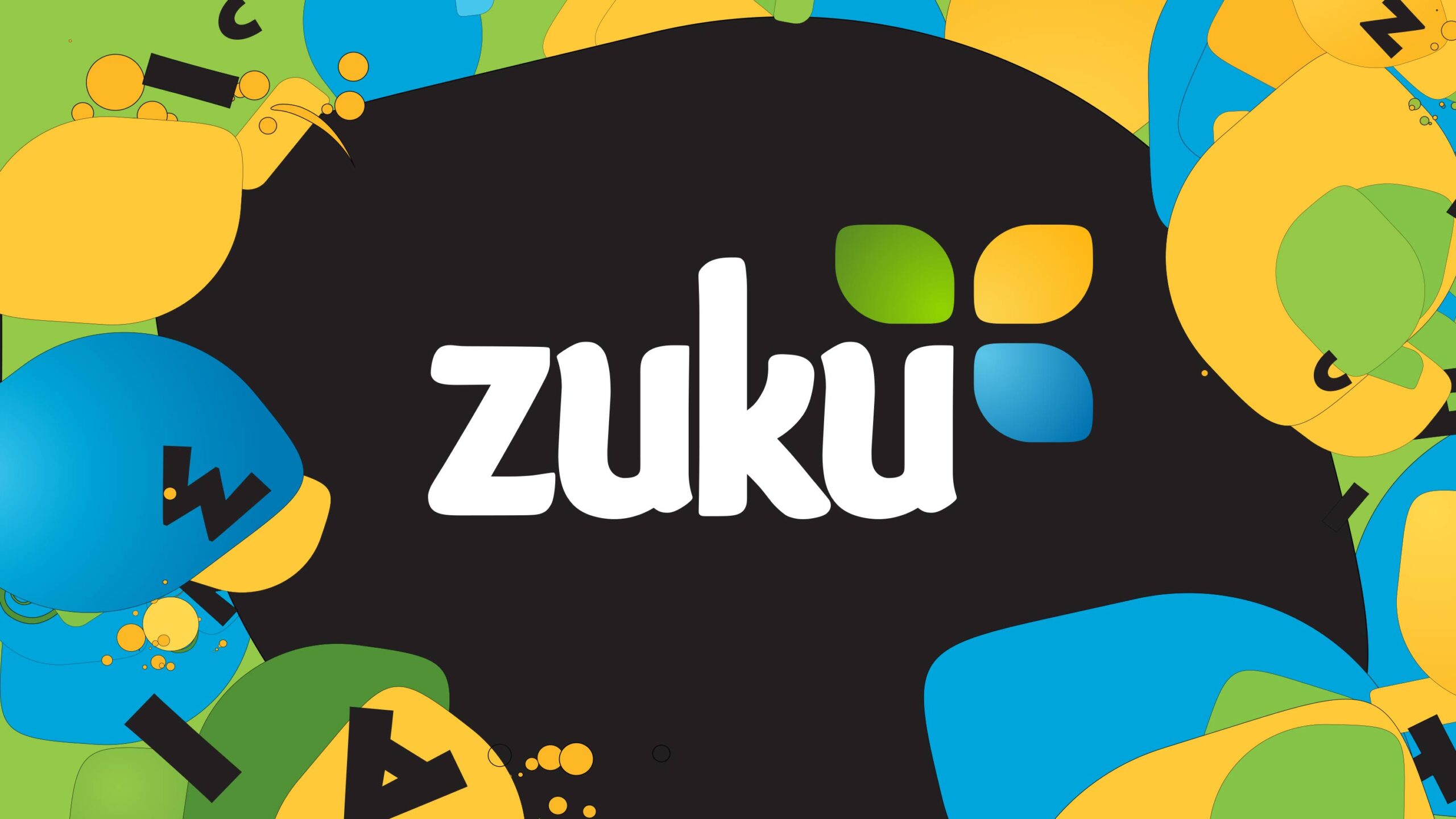
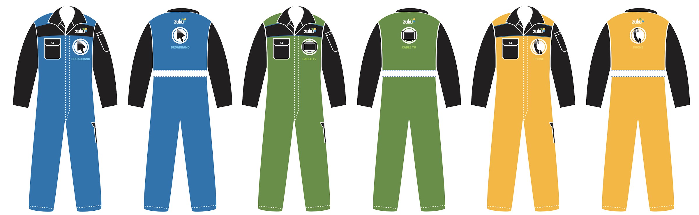
Three bright & colourful pods represented the triple-play offering were crafted. Blue for broadband, green for TV, and yellow for phone. The colours for each of these were chosen carefully considering competitor products and their main brand colours. This differentiation made Zuku visually distinctive.
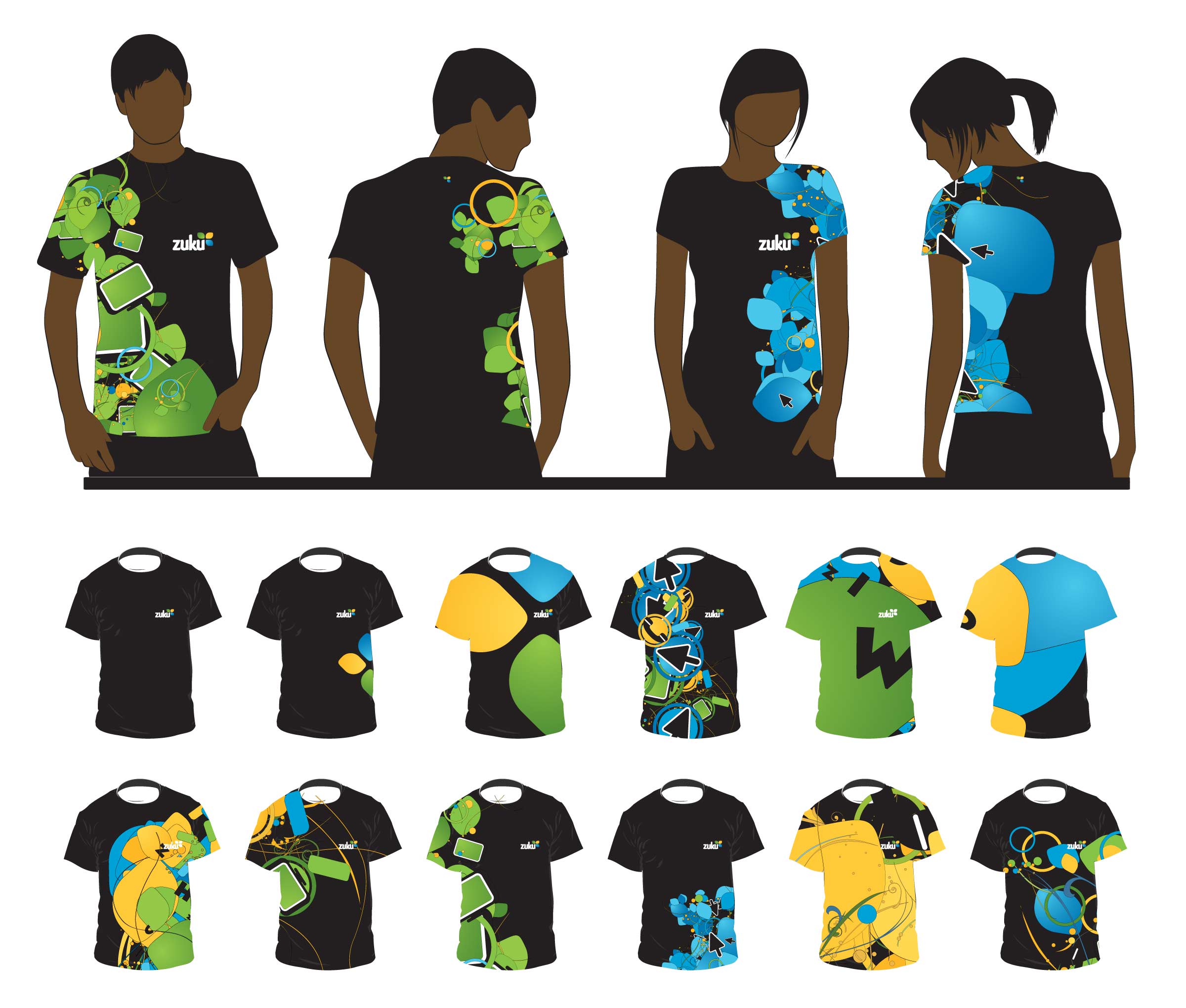
Dynamic Identity System
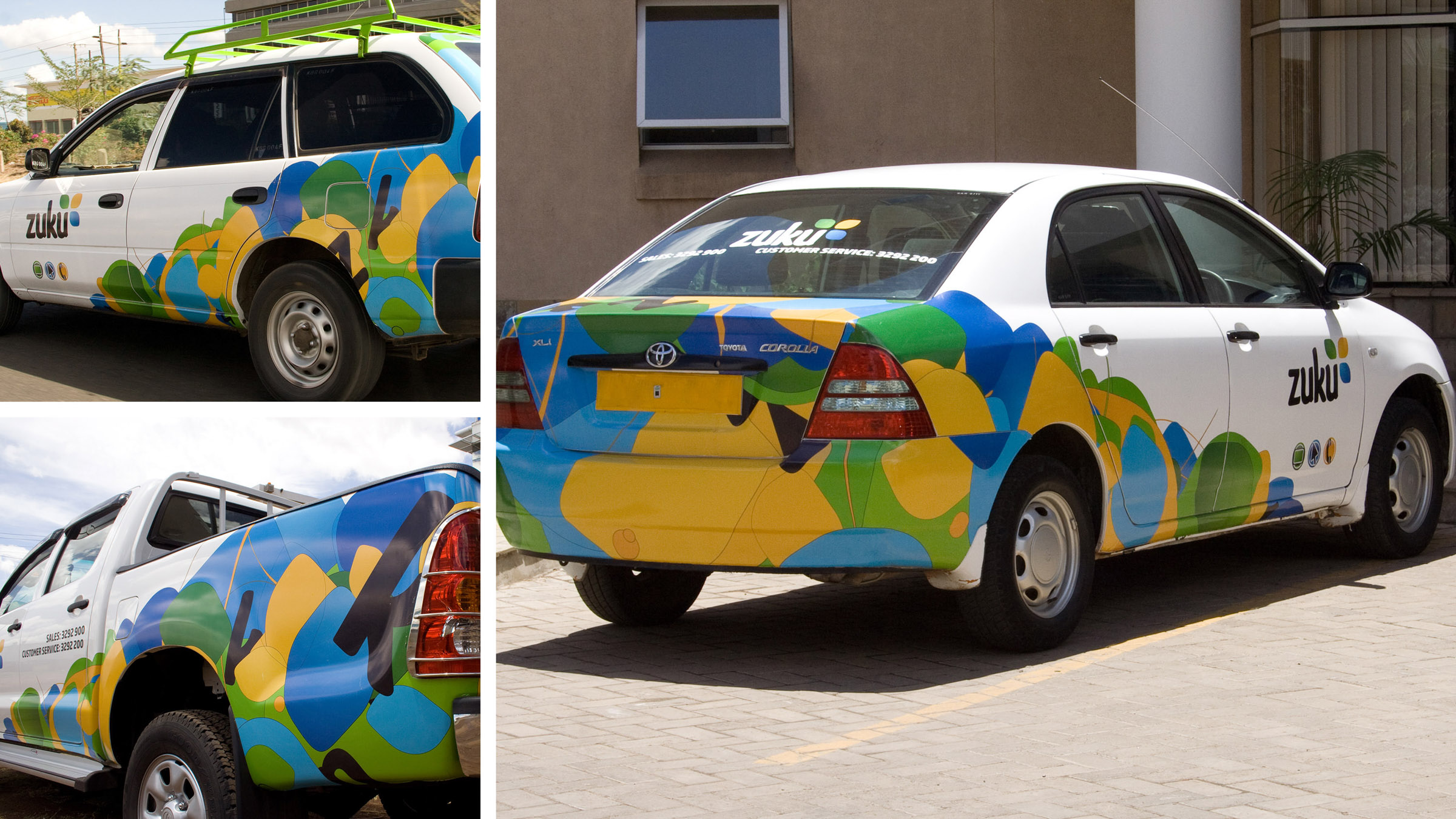
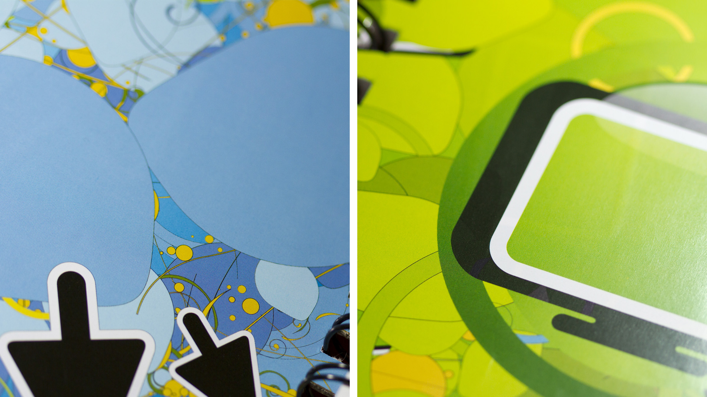
The Zuku brand had a special high-energy buzz to it. It’s all about vibrance and dynamic content. We had been dabbling with generative programming for some time, and this was the perfect opportunity to flex our geeky muscles. We wrote code that created randomised patterns generated by the custom algorithms. We split the individual graphical elements into specific clusters for the creation of certain patterns, and after some long nights tweaking variables here & there, we finally got the mix right, and the result was simply stunning.
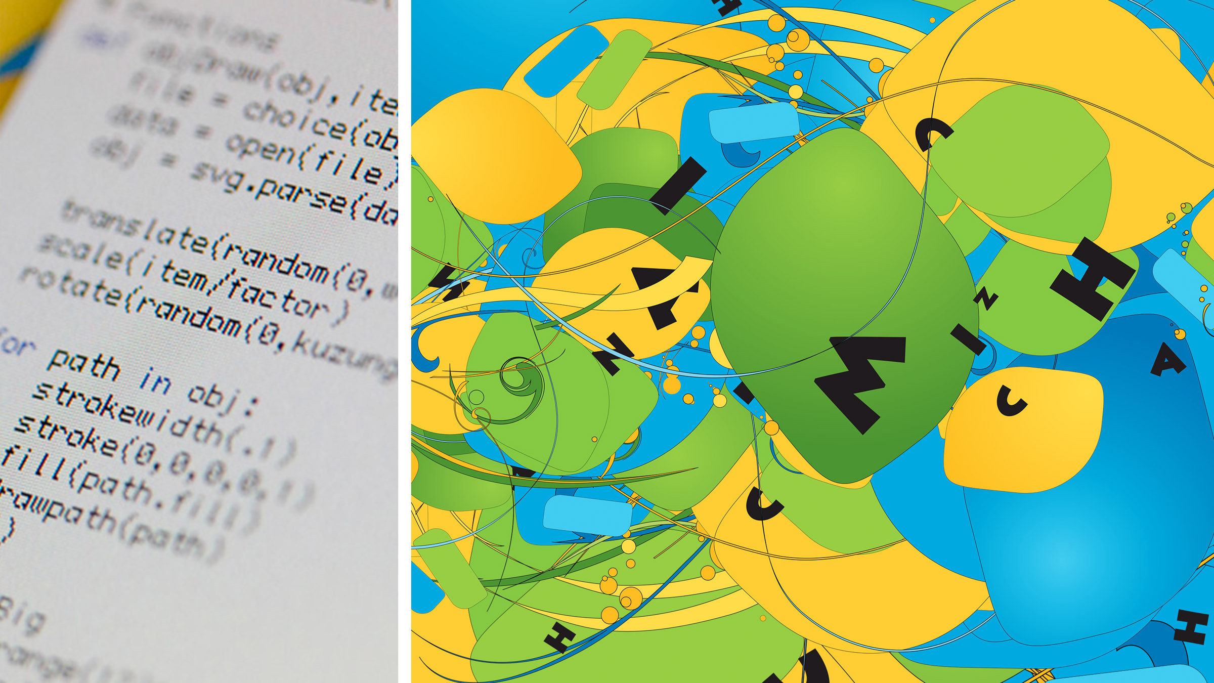
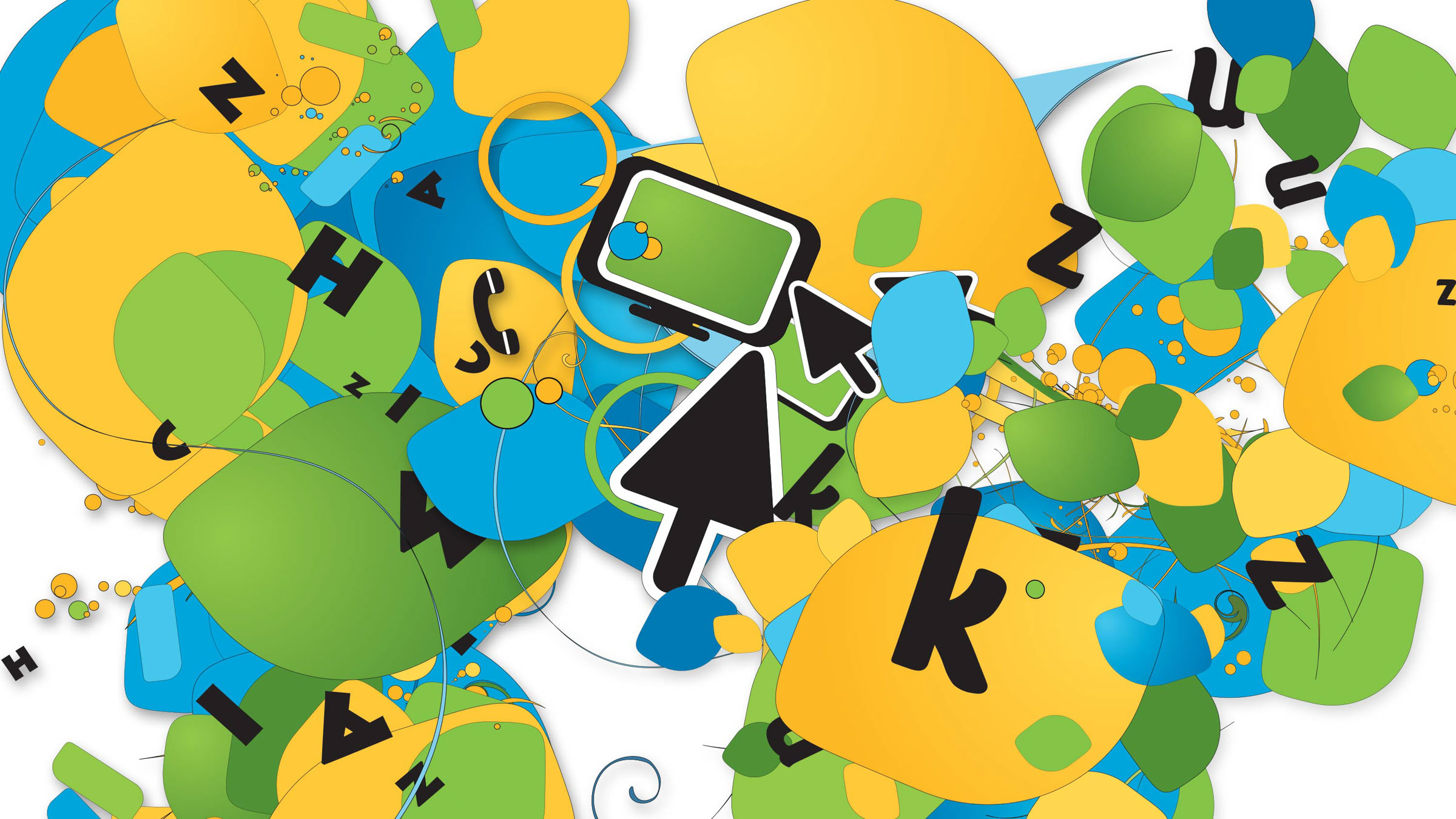
These generative patterns were then used as the main stylistic devices for the brand, in advertising, vehicle branding, uniform design, stationery, and other communication media.
Brandbook
Once we completed the naming & main logo-mark development, the next step was to implement the brand across the company’s communication & working tools.
As with every identity developed at ARK, we create a complete brand manual to accompany it, ensuring the brand is presented accurately and with the same visual language. These guidelines defined the mechanics for brand usage in various scenarios across several mediums.
Environmental Graphics
Once Zuku’s brand personality was defined, we worked closely with Wananchi Group and their vendors to ensure that its application was seamless, including in their brand new offices. The environment needed to be full of energy and make its people feel proud to work there.
Communication
Oftentimes, the character of a brand owes more to visual things such as logos, corporate colours and fonts. But the more nuanced and expressive brands are those that also use words in a way that conveys their distinctive essence.
Zuku’s brand communication system was developed on that basis – that the visual and the verbal work hand in hand to communicate, coherently and compellingly, that the brand is young, cheeky, cool and embodies the friendly guest who is welcomed into people’s living-rooms.
The Brand Language
Zuku’s brand language breaks down the technical terms to their simplest form, while speaking in an informal, chummy tone. This went a long way into actually dispelling myths about having, the then novel, triple-play technology in the home.
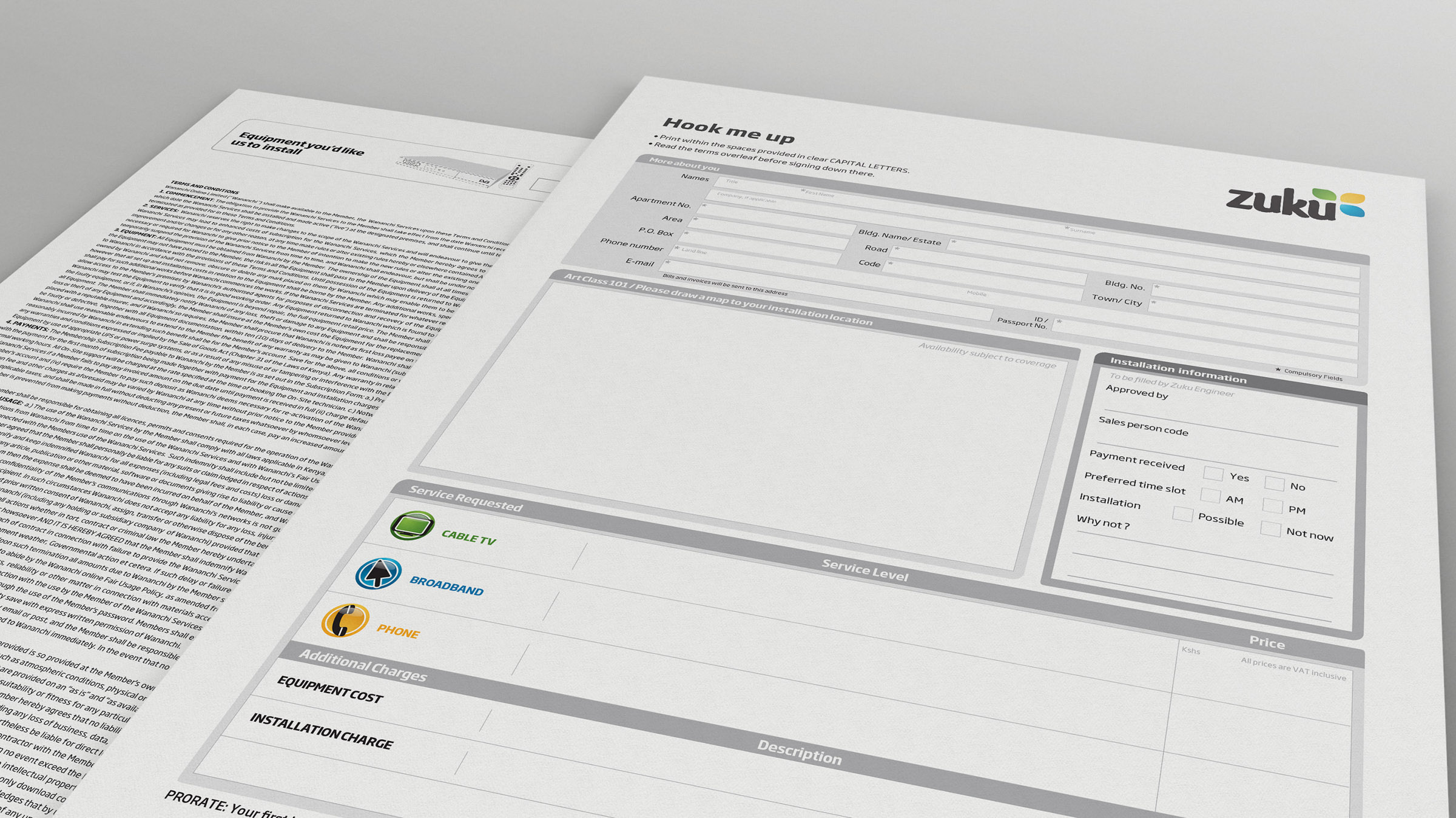
Special Focus: Form Design
Many people’s experiences would echo the numerous studies about short customer thresholds for filling out forms. Simply stated, no one likes filling out forms – especially the frustrating ones where it’s not really clear what is expected of them.
For Zuku we designed the forms, and more importantly, the business processes that sit behind them, to be as straightforward and as friendly as possible.
Bills and Statements
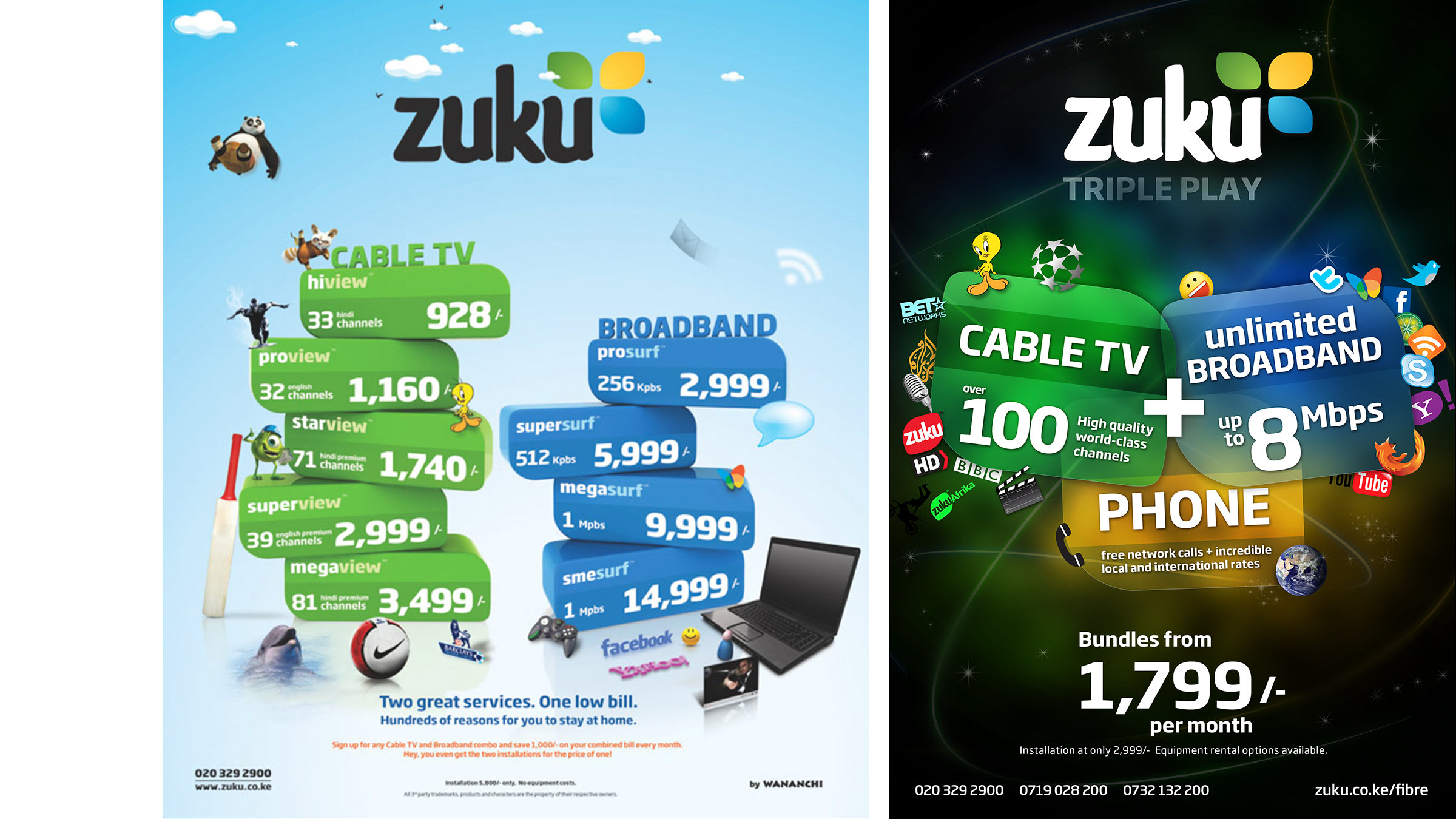
Bills are the most frequent and key form of customer communications sent by an organisation. Yet everyone we know hates getting and dealing with them. This results in a situation where an organisation alienates its customers with its only brand touchpoint. For Zuku, intelligent bill and statement design was supported by illustrative documents, shedding light on the items on the document. This resulted in; reduced customer queries, increased brand loyalty and quicker payments.
Hello world, meet Zuku!
Launch Campaign
In 2008, Kenya was eager to get onto the global fibre optic network. Most people saw high speed internet connectivity as the only benefit this would bring – we sold three, making Zuku stand way above the competition.
Triple play was a brand new offering in Kenya so we had to educate people on what the service was all about. ‘One cable, three services, one low price’ summarised the new offering. ‘What does Zuku mean?’ Back then, nothing. Today, it’s one of Kenya’s most equitable brands.
Another salvo in the Zuku armoury was price. The low price model was carried from Wananchi’s belief that world-class entertainment and connectivity shouldn’t be the reserve of a few individuals. This became a big selling point, with Cable TV and internet packages priced lower than 50% of what the competitors were advertising.
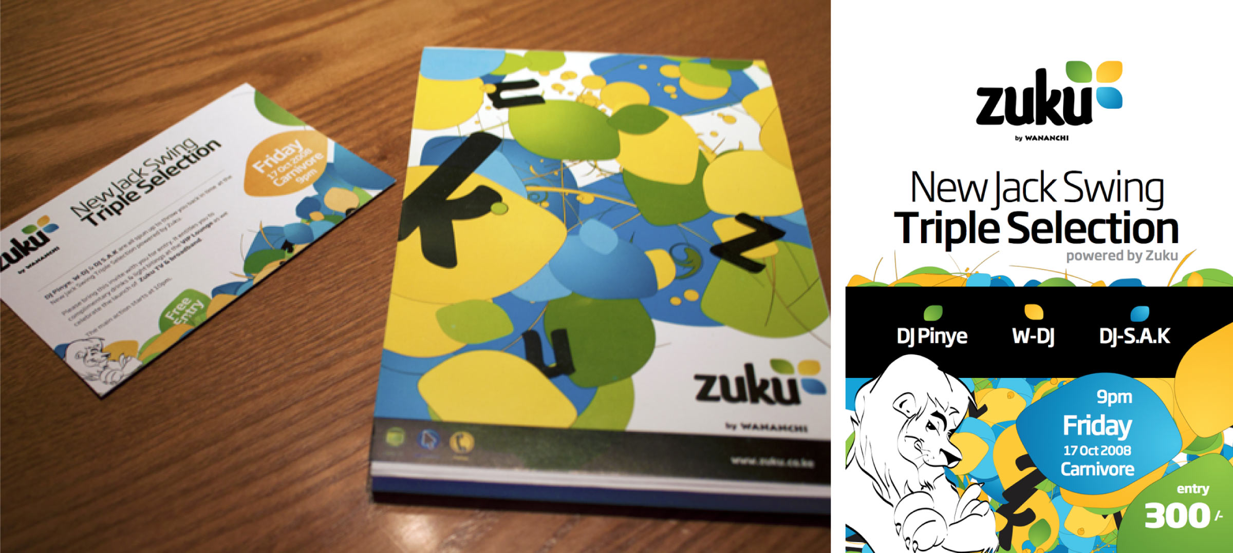
Many product launches are held in stuffy hotel ballrooms away from the true product users. We didn’t want it to be this way. We held a launch party at Carnivore’s Simba Saloon that coincided with their popular New Jack Swing party. It was a successful event organized in conjunction with The Energy Source that introduced the brand to its target audience in a fun environment and style.
Go to Market
Advertising
Built on Zuku’s positioning as a home product, we showed the lengths to which people would go to to go home and enjoy Zuku. We targeted young urbanites who were influencers on matters internet and entertainment.
Please don’t judge the 480p resolution, this was before any of us mere mortals had smartphones.
We shot these with Big Ideas at Wananchi offices over two days. As usual, we had lots of fun at the shoot, especially doing a few extra retakes for the slapping bit.
Outdoor
The Zuku brand was first rolled out outdoor, because of many becauses. We used each advertising medium’s unique strengths to communicate a different aspect of Zuku. We also had a plan that we never stuck to for good, profitable reasons. The demand created by radio, press and outdoor outstripped supply and so the TV campaign was taken off the media plan.
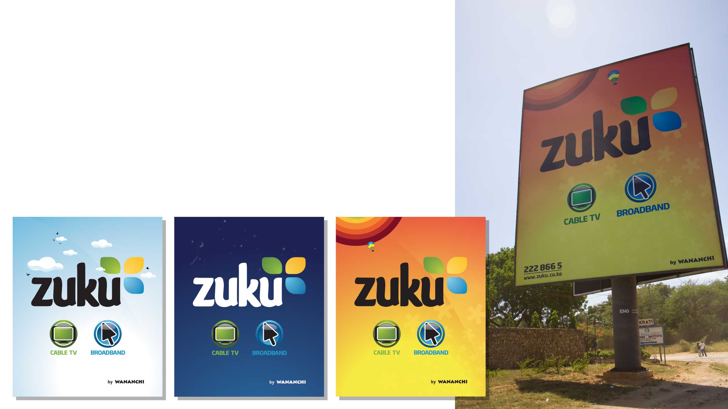
For three months, we used billboards’ memorability to introduce the new product with a new name. There were different executions of the same idea which were rotated on a monthly basis to keep the message fresh. High-traffic locations were selected for the billboards.
The street light signs served to introduce Zuku’s variety in TV and low price offering for internet. And because coverage for both was limited, space was bought only in areas with coverage. Parklands and Highridge areas of Nairobi which are predominantly Asian carried Bollywood, cricket and English football signs for TV, as well as internet packages. Kileleshwa, Westlands and Lavington signs advertised Hollywood blockbusters, series, children’s shows, English football as well as internet because that is what attracted the residents.
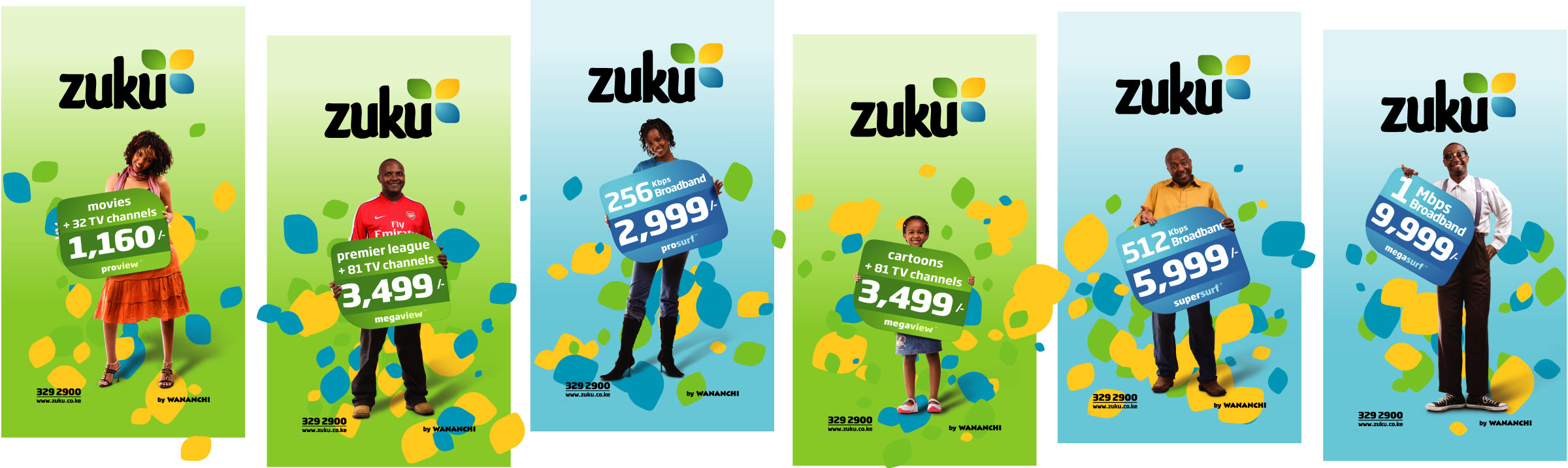

All placement was planned in a way that as one drove on a street with the signs, they would leave having fully absorbed what Zuku had on offer. Interestingly, this planning didn’t excite the media owners Magnate Ventures too well. While many brands simply came up with a few designs and printed hundreds of signs which were randomly placed around Nairobi, our plan complete with placement maps made Magnate politely ask us to ‘Do fewer designs next time’. Ha!
We also developed a number of ads running in the dailies and magazines.
Leave-behinds, Reminders and Guides
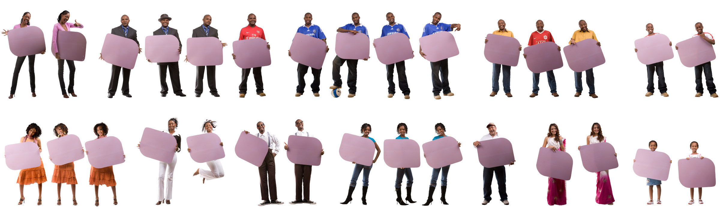
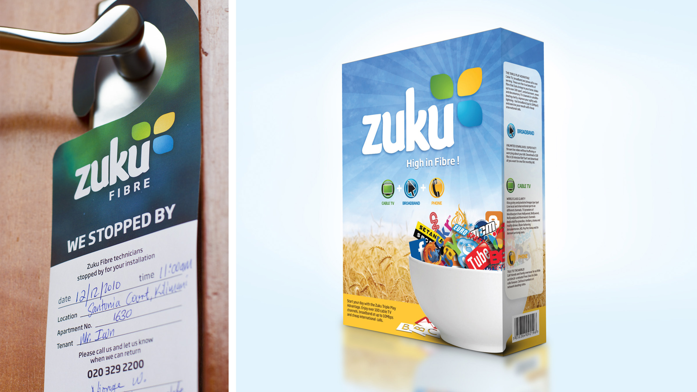
The sales strategy necessitated teams making visits to prospective clients homes and leaving behind materials aimed at maximising sales opportunities. This kind of geo-targeting meant that the communication could be tailored to be more personal than mass media advertising.
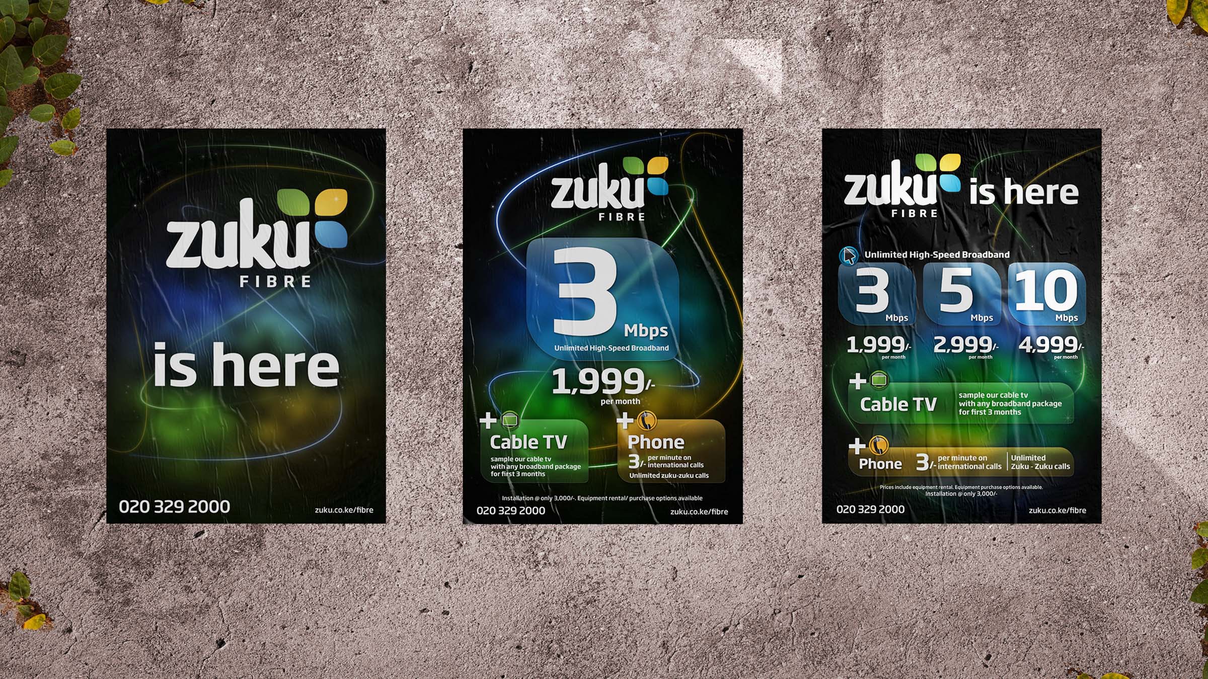
The release of the new Zuku fibre connection was going to happen in phases. The communication had to be geocentric to target only those who would have immediate access. We had already learned the benefits of this from previous Zuku campaigns. So no TV or radio ads. Instead of distributing flyers or other traditional handouts that would just get lost or thrown away, we decided to give a cereal box to advertise the new Zuku Fibre. It would be intriguing and much easier to accept. We made the contents and packaging informative and engaging. Zuku Fibre was a home product, the box contained something for everyone. Our client loved the concept!
The sales team used the cereal boxes to pre-sell the zones that were ready for activation and gather data from those who were interested ahead of time. The main message was simply “Zuku Fibre is here!”
Website
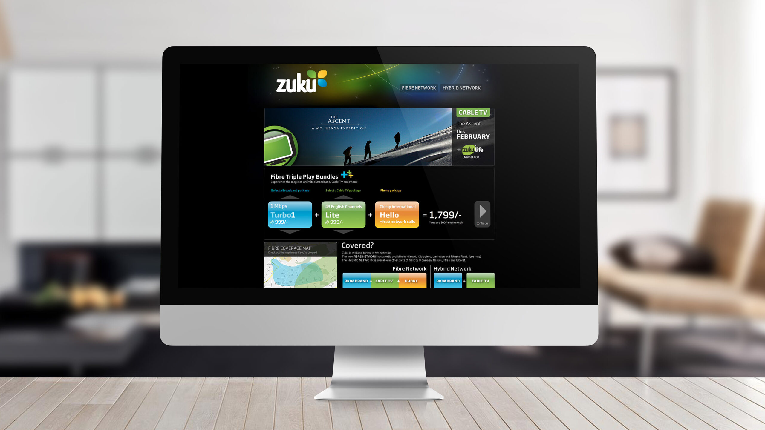
Throughout the 3 years we worked with Zuku, a few website versions and mini-sites were developed corresponding with the fast pace of the brand’s growth, and new products being rolled out in various markets.
We launched Zuku with a campaign fuelled by creating curiosity, and was based on generating interest in the brand. The Zuku website was the perfect place to tell Kenya about Zuku and what was on offer, as well as point users to the campaign’s online viral ads.
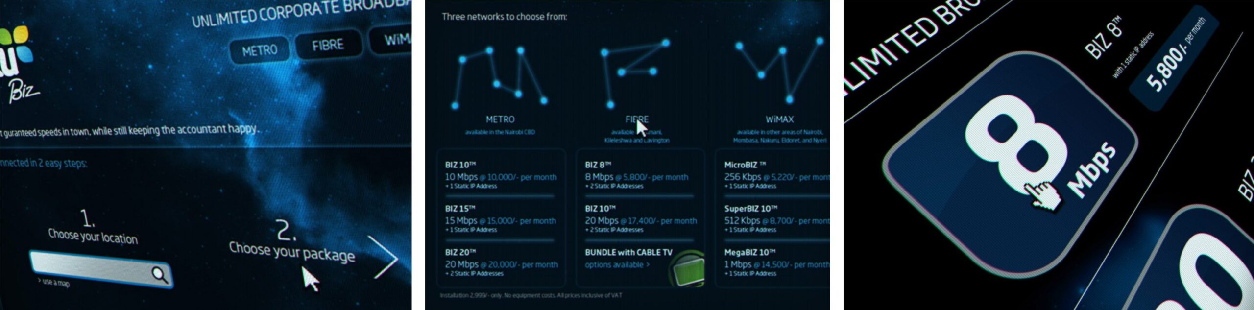
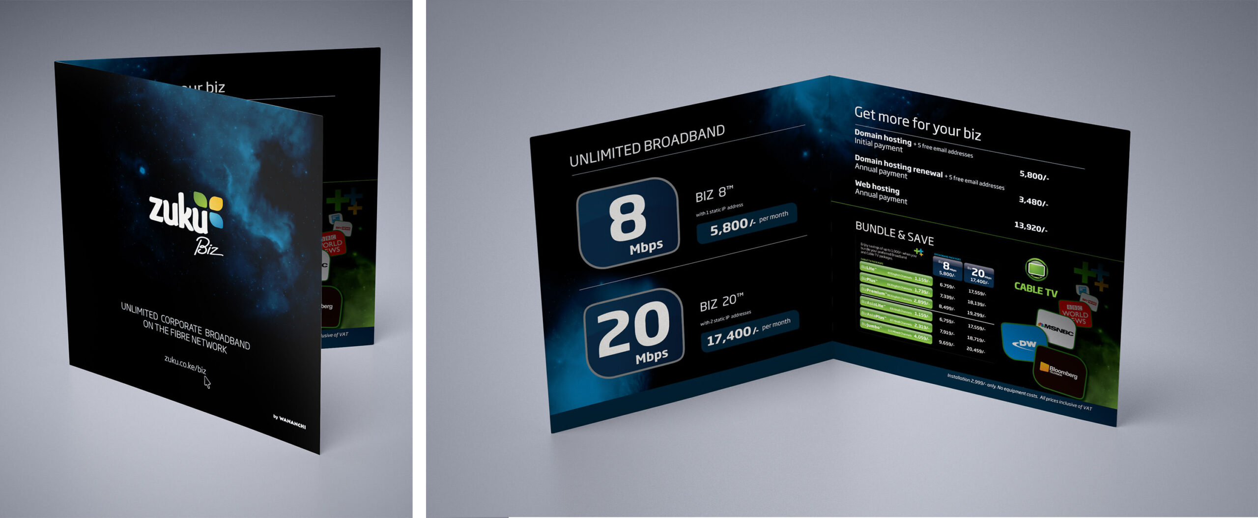
Zuku Biz
Corporate Demand
A sub-brand and minisite was also developed specifically for the ZukuBiz product set, targeted purely at corporates & SMEs.
Zuku TV
A new Direct-to-home model
Zuku needed to scale faster than hard fibre infrastructure. This called for a completely new service line – Zuku TV delivered over satellite. Wananchi Group planned to roll out this DTH product throughout Greater East Africa within the course of 2011.
Of course, we had to take a crack at creating the Zuku TV brand.


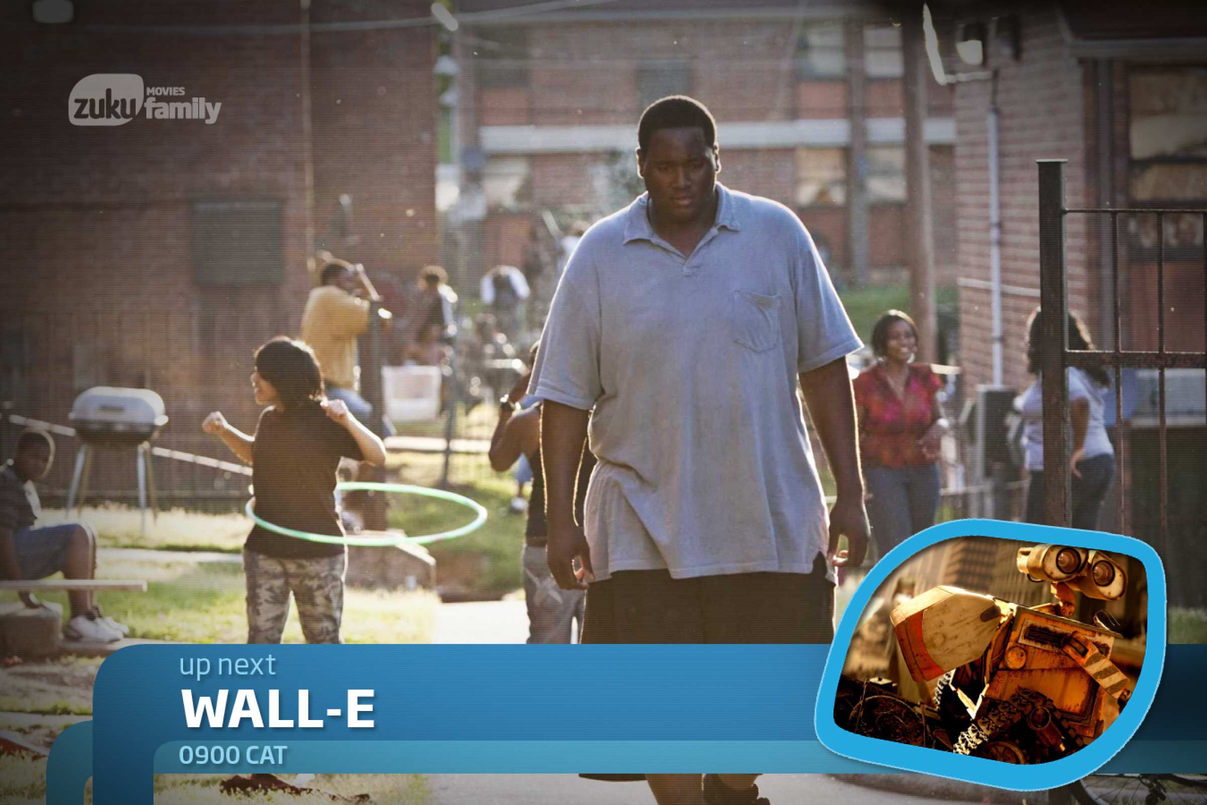

Next, we built out the channel brands and idents.
Parent Brand
Wananchi Group Corporate Brand
We weren’t quite done. The parent brand also needed some love, so we gave that a facelift too.
Wah, si tumechoka!? Ok bye.