CASE STUDY – Acorn Group
Build tomorrow
Creating strategic placemaking frameworks to allow Acorn Group and its new developments to create relevant, meaningful and emotional connections with their audiences, beyond the built spaces provided.
In 2014, we partnered with Acorn Group, one the of the leading property developers in the region, to propel its stable of brands into the top tier of East Africa’s booming property sector.
Corporate Brand Audit & Strategy
Our first task was to develop an overarching corporate brand strategy. Next, develop an design system that would serve as the leveraging platform for subsequent property brands. We embarked on a brand audit considering the key parts of Acorn’s rich history within the market context that would underscore key brand pillars moving forward. The brand strategy was then developed, encompassing specific real estate brand strategies that facilitate growth though audience targeting and partnership brand architecture systems.
Placemaking
Placemaking in real-estate terms is an approach that creates spaces that promote people’s well being. As part of Acorn’s brand strategy, we created a strategic placemaking framework that ensured the projects developed created meaningful and emotional connections with their audiences, beyond the physical spaces provided.
Brand Architecture & Positioning
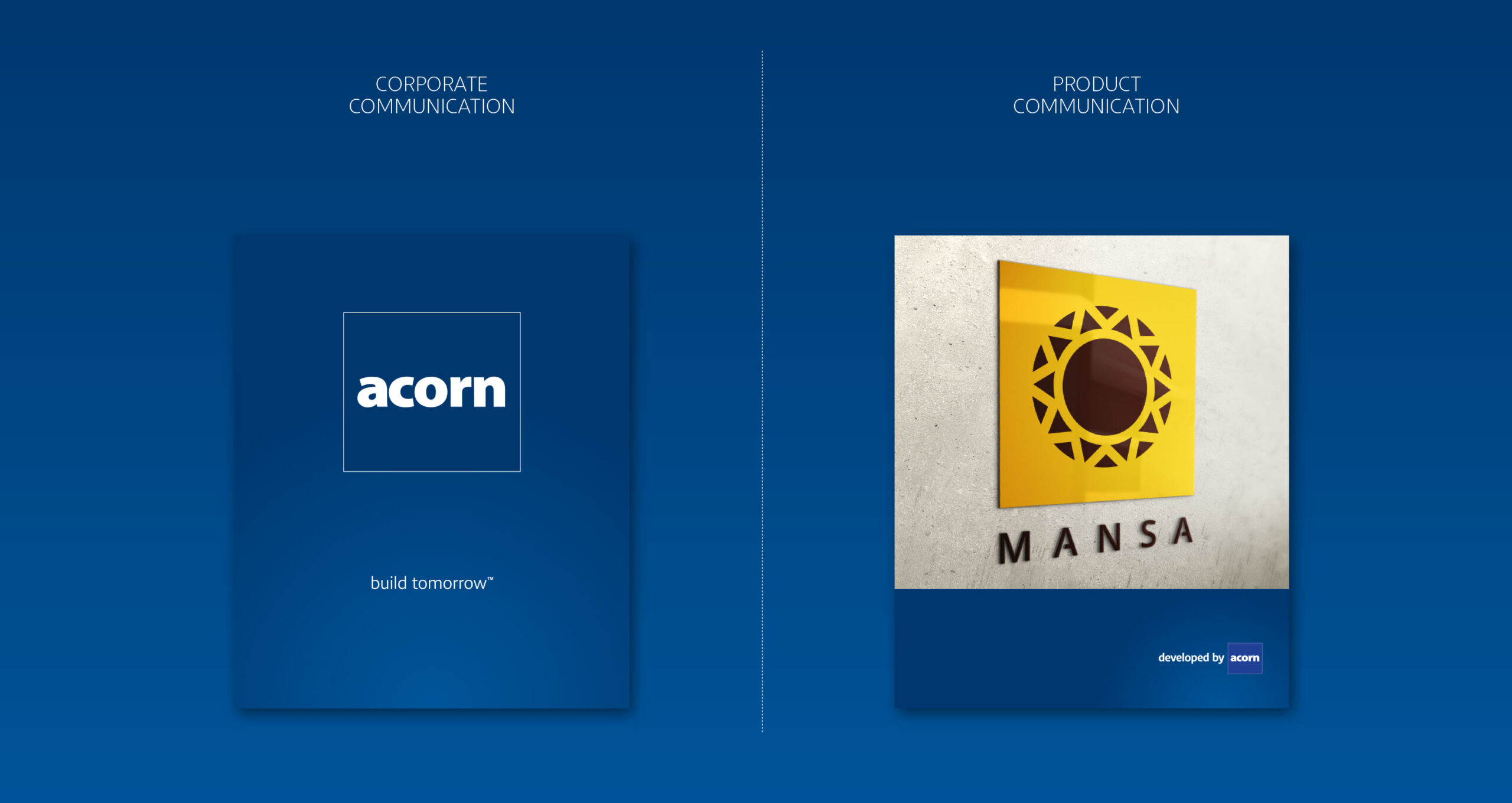
The Acorn brand identity was refined to improve balance in the graphic construction of the logo, as well as extended the brand’s image through a comprehensive brand language that would include colour, typography, and graphic systems.
We developed the “build tomorrow” positioning statement for the Acorn corporate brand, to signify the value creation, community building, and bright future ahead.
Given its successful past as project managers, Acorn needed to reinforce its new positioning in the property development space. Property project brands would be tied back to the corporate brand through a statement that also qualified the property brands as top quality developments via association.

Digital
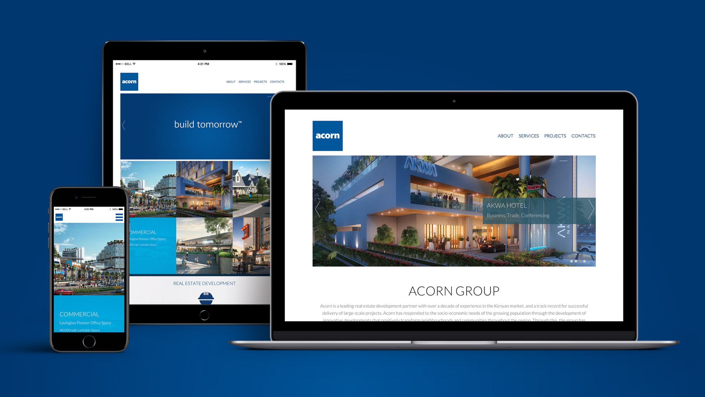
A corporate website developed to showcase Acorn’s signature real estate developments, as well Acorn’s proficiency in the sector.
Storytelling
To better deliver the Acorn story and connect with key industry players and potential investors, we filmed a 5-minute documentary to deliver on Acorn’s vision. The story would be effectively told by three people bringing diverse perspectives enrich the narrative:
- Dr. David Ndii, an authority on African economics who would explain the status of the region’s real estate market.
- Mutua Matheka, a Nairobi-based photographer who would share his take on an ideal future Nairobi.
- Edward Kirathe, Acorn Group CEO. The brand’s visionary and chief strategist.
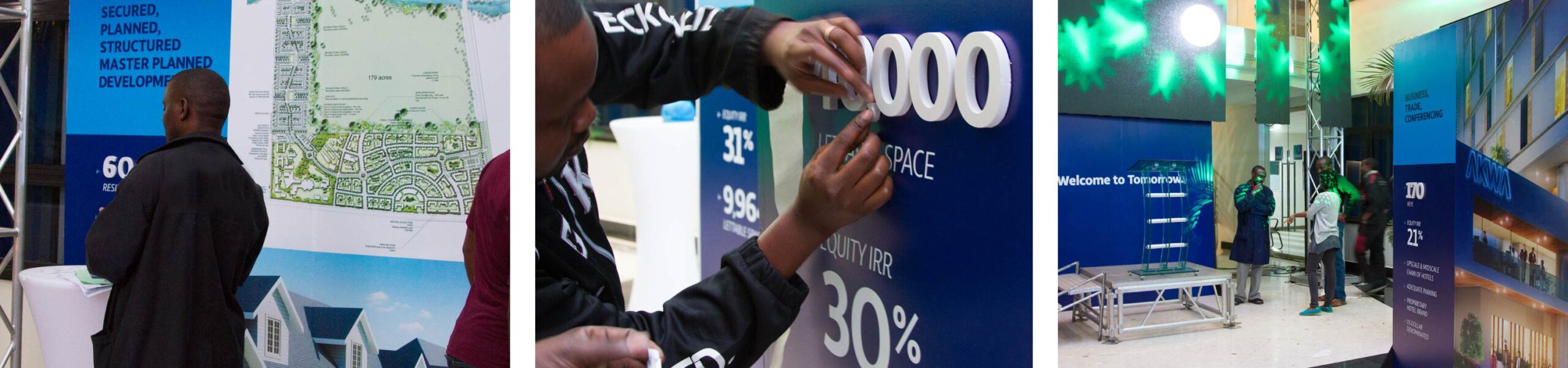
Product Launch
In July 2014, we set out to launch the ambitious BREF event, for which we’d developed the concept and strategy. We worked with extremely talented partners to create a stage design & event setup that would host approximately 200 guests from within the development sector, who’d witness the launch of the grand flagship Arboretum Square development.


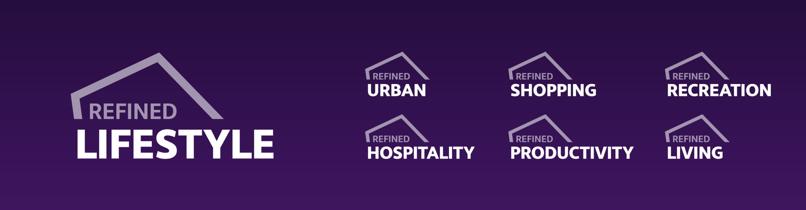
Refined Lifestyle
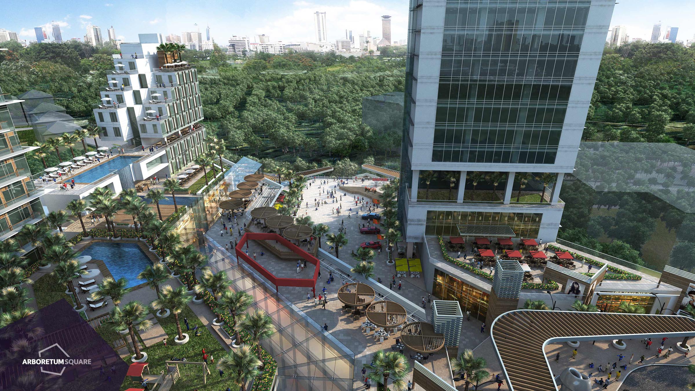
Placemaking for Nairobi’s newest Mixed Use Development
In 2014, a joint venture between Acorn Group and Britam sought to develop one of Africa’s most ambitious integrated developments, never before experienced in the region. Showcasing Corporate Offices, a Lifestyle Mall, a Contemporary Piazza, a Business Hotel, Residential Suites and a host of other matured amenities, the development is set to define style and innovation around the business and leisure landscape in Nairobi.
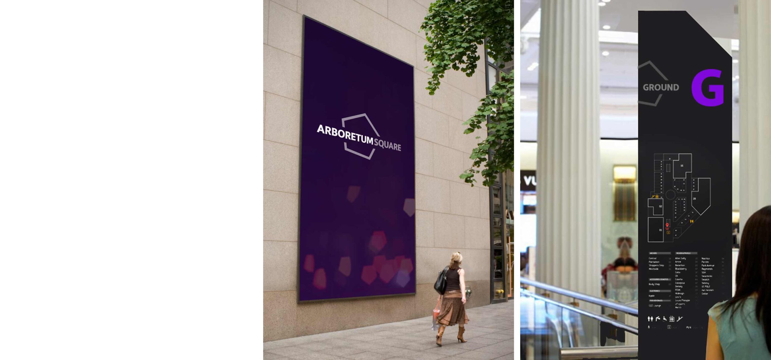
Arboretum Square
We set out to develop the brand and placemaking strategy for the development – a new concept in living, recreation and work. It features sustainability and grand spaces both indoors and outdoors, while seamlessly harmonising structure and environment in a serene and laid-back atmosphere.
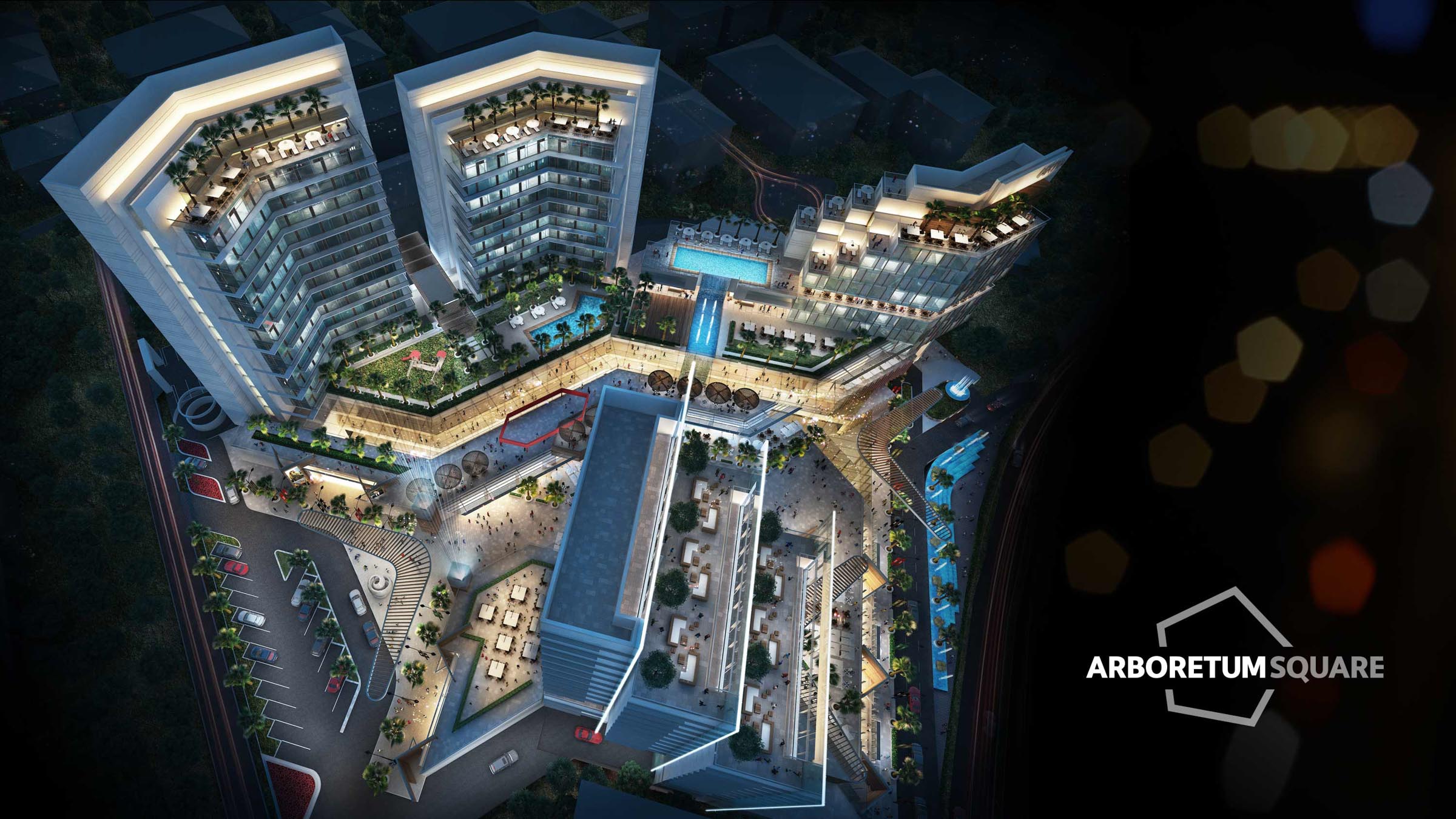
Our brand identity was inspired by the architectural arrangement of the master-plan.
Brand extension concepts were explored to develop design systems for future signage and wayfinding.
Positioning Strategy
A refined balance of community and commercial expectations was key to the project’s success, offering an unobtrusive blend of business, lifestyle and recreation – all key in building a timeless and beneficial space to the wider Nairobi population.
Fly-through
We developed the narrative for the development, and worked with global partners to showcase the development’s key features and attractions in a video fly-through.
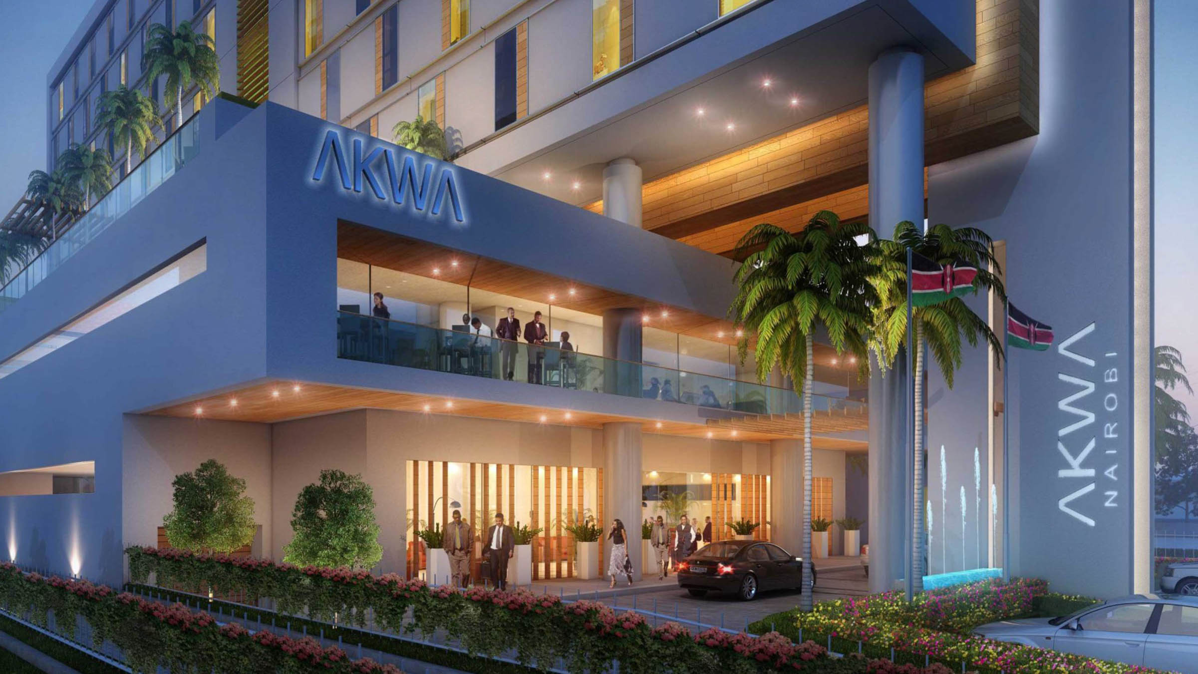
New in Town
Creating a brand for Kenya’s newest Business Hotel
The positioning was simple – create a chic, inviting and impressive brand for a homegrown 3 star hotel chain: primarily targeting the business traveller.
Brand Strategy
Taking a fine-tooth comb over their needs, wants and expectations, we immersed ourselves in the quest to understand the would-be guest. We were intent on creating the look and feel, as well as influencing the experience design. This would optimise impact on the brand’s ability to be charismatic and memorable.
Before we could position the new brand, we mapped out the perceptual positioning of like existing brands. A firm grip on context would expose buried golden nuggets for our taking.

Brand Creation
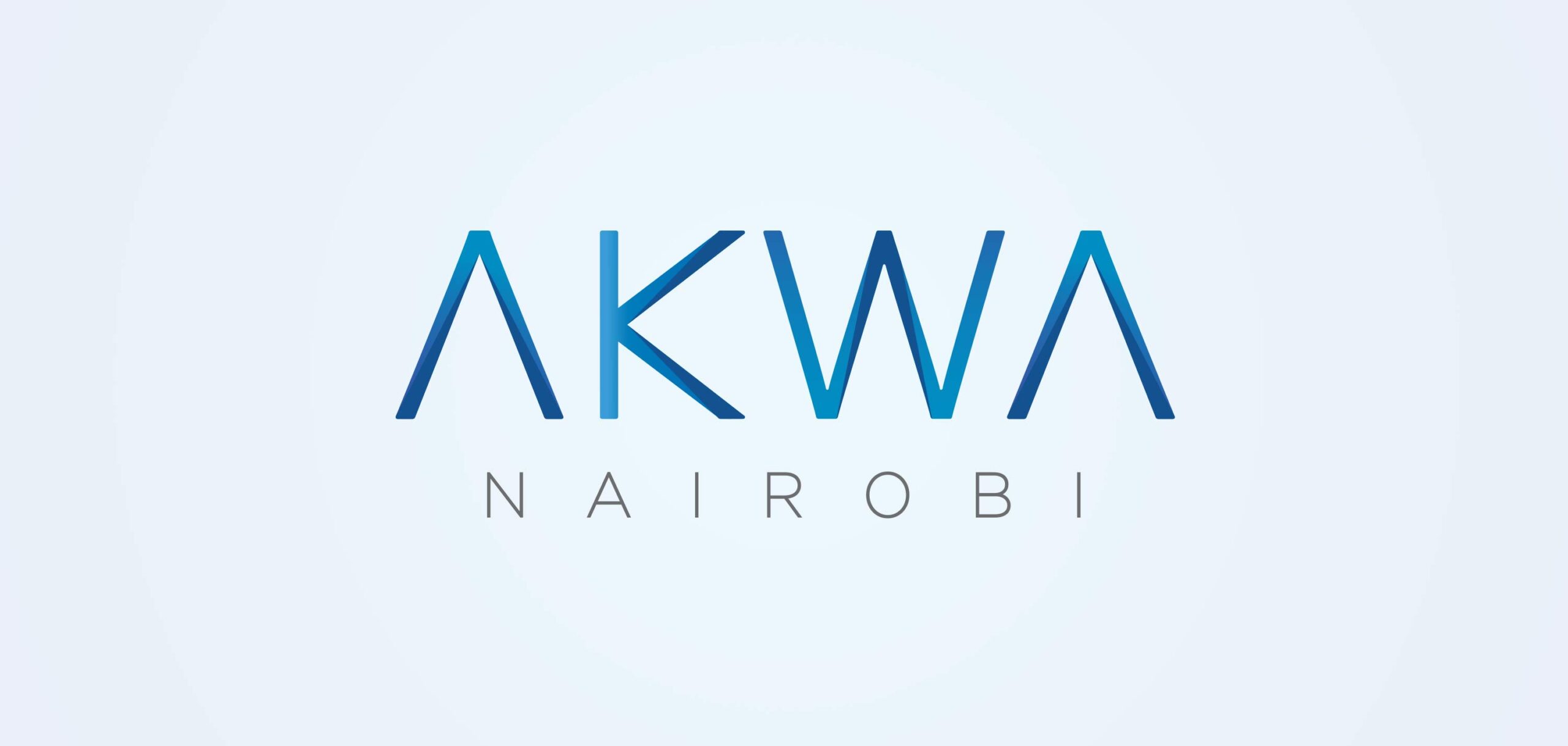
Naming
Africa was our muse. This brand proudly spoke of its roots with global expansion potential. The name Akwa is derived from the Kiswahili word makwa, meaning pillar or groove in the wood. Its appealing duo syllabic phonetic structure makes it easy to pronounce and recall.
Brand Identity
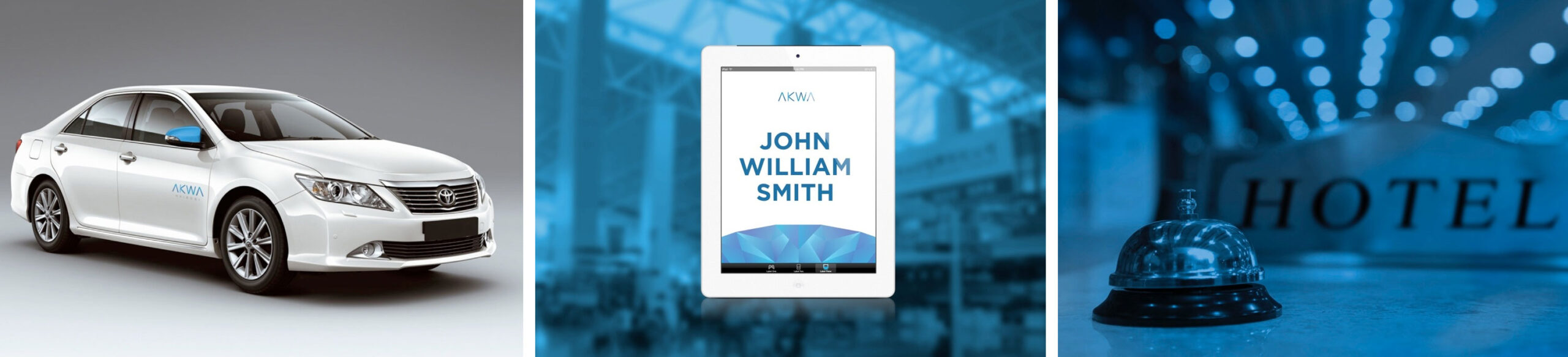
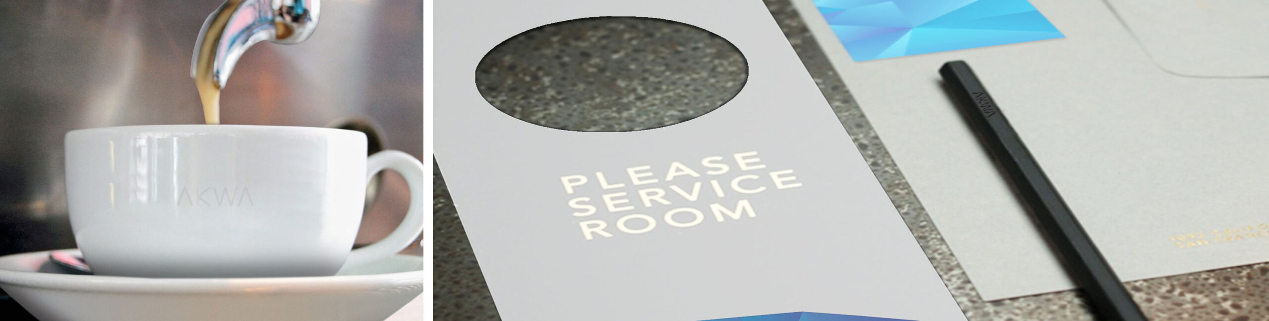
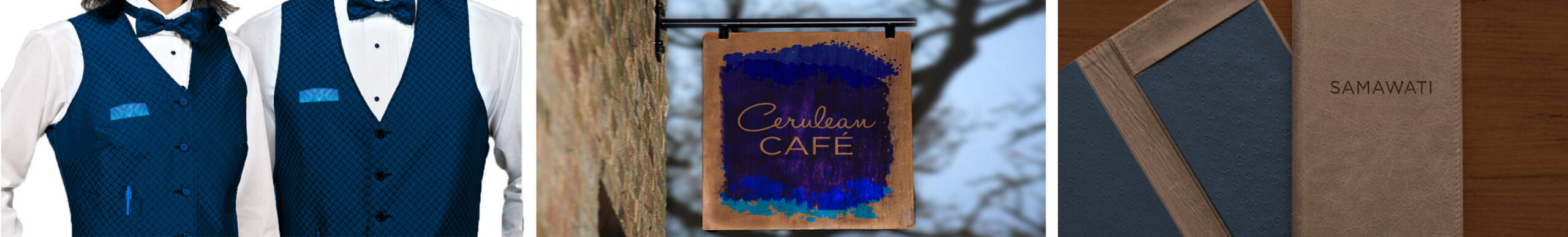
The clean & modern identity was designed to balance attributes of ‘affordable class’ with a healthy dose of care and attention – what you’d expect from East Africa’s newest business hotel.
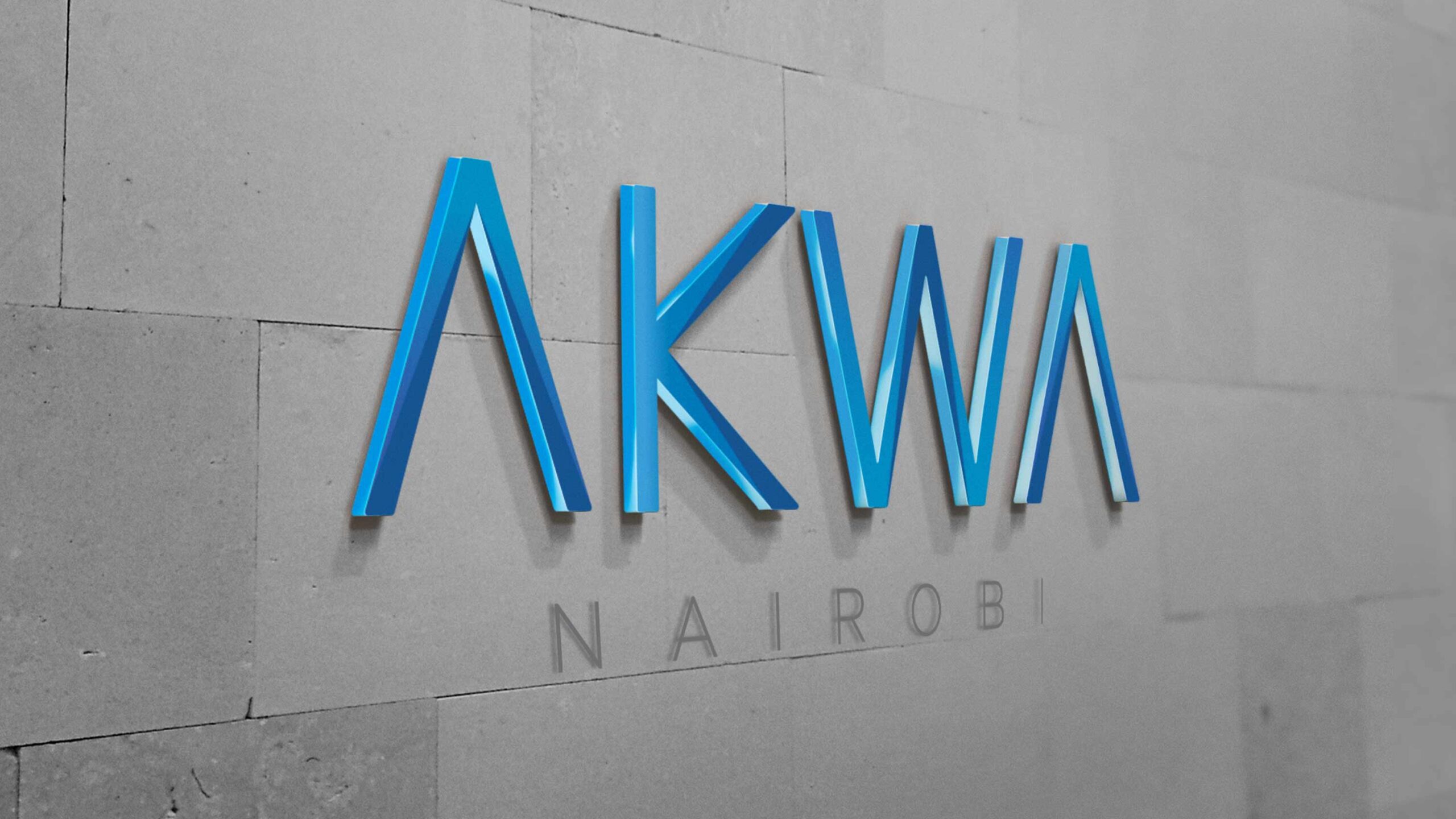
Design System
The design system extended, relied heavily on the angular geometry derived from the brand’s elements.


Guest Experience Journey Design
We developed a comprehensive customer journey, serving as an initial wishlist of all the various touchpoints a user would interact with from arrival to check-out.