+HUMAN DESIGN LAB
Kenya Highways Signage Redesign
A re-design of the gantry-mounted signage at the Survey of Kenya exit on Thika Road.
Countering Mediocrity
It may seem ridiculous to claim that there might be some design hiccups with the new Thika Road project. On the whole, it is a very important piece of infrastructure for Kenya – both as a physical and psychological stimulus for economic growth. However, there are some inherent flaws in its design that should be pointed out.
Most large-scale construction projects have often been hijacked for some overarching symbolic meaning, usually portrayed as positive but ostensibly pregnant with political agenda. For the Thika Road project, state agencies are readily totemising it as a national monument.
The “Proudly African” industry dominates the rest of the debate, postured around reframing the Western media’s portrayal of African stories.
Unfortunately, the social media avalanche of pride that this brings about, carries an unpromising celebration of mediocrity, among other such vehicles of underdevelopment. This scenario is in direct contradiction to what national and African pride should be all about in the first place. Humbly African anyone?
One can wrongly argue that in Kenya, we’ve been so long in the habit of building nothing, that we can now be forgiven for celebrating things that we build a little poorly. This context is not ignored here, but since bad design has the potential to cause loss of life, the responsibility for proper design should be greater.
This piece seeks to prompt intelligent discussion on some of the design issues, specifically the quality of the traffic signage on Thika Road, by focusing on the case study of the Thika Road gantry sign located at the Survey of Kenya exit.
Kenyan Standards?
In order to suggest that the sign meets or falls below certain standards, it would be necessary to measure it against a set benchmark. This is a very difficult undertaking without a proper reference as to what the Kenya National Highways Authority standards for signage are (if any), and objective inferences based on existing signs would have to be made.
Though Kenya has recently assented to the Vienna Convention on Road Signs and Signals (there are a couple more steps before ratification), this is not a sufficient directive on uniformity, design and content of highway signs to use as a benchmark.
Current Kenyan highway signs, in various states of disrepair, can however offer clues as to which system best leads to uniformity with existing signage. Standardisation, consistency of message and uniformity are key pillars of signage, traffic or otherwise.
By observing typefaces & styling, we can deduce that Kenyan highway signs have borrowed heavily from the British system of highway traffic signage design.
Thus, we have chosen to base our discussion on improving this specific sign to those standards, to maintain uniformity across the national road network.
The Highway Code in the Kenya Traffic Act is insufficient in providing guidelines for directional highway signage, though it does however provide guidelines for warning and regulatory signs, some of which are employed below.
The Design Problem
So what’s wrong with our sign? To be effective, a traffic control device should meet five basic requirements.
- Fulfil a need;
- Command attention;
- Convey a clear, simple meaning;
- Command respect from road users; and
- Give adequate time for proper response.
Design, placement, operation, maintenance, and uniformity are aspects that should be carefully considered in order to maximize the ability of a traffic control device to meet the five requirements listed above.
Vehicle speed should also be carefully considered as an element that governs the design, operation, placement, and location of various traffic control devices and should be based on the most appropriate speed data available.
Our case study fails in all these, except perhaps B – mainly due to the novelty of a gantry mounted sign on Kenyan roads. According to the British standards, the dedicated lane signs, the stack design, and a lane drop design are failures. This is not withstanding other design issues pertaining to colour and legibility.
A Closer Look
Our case-study sign, photographed below:
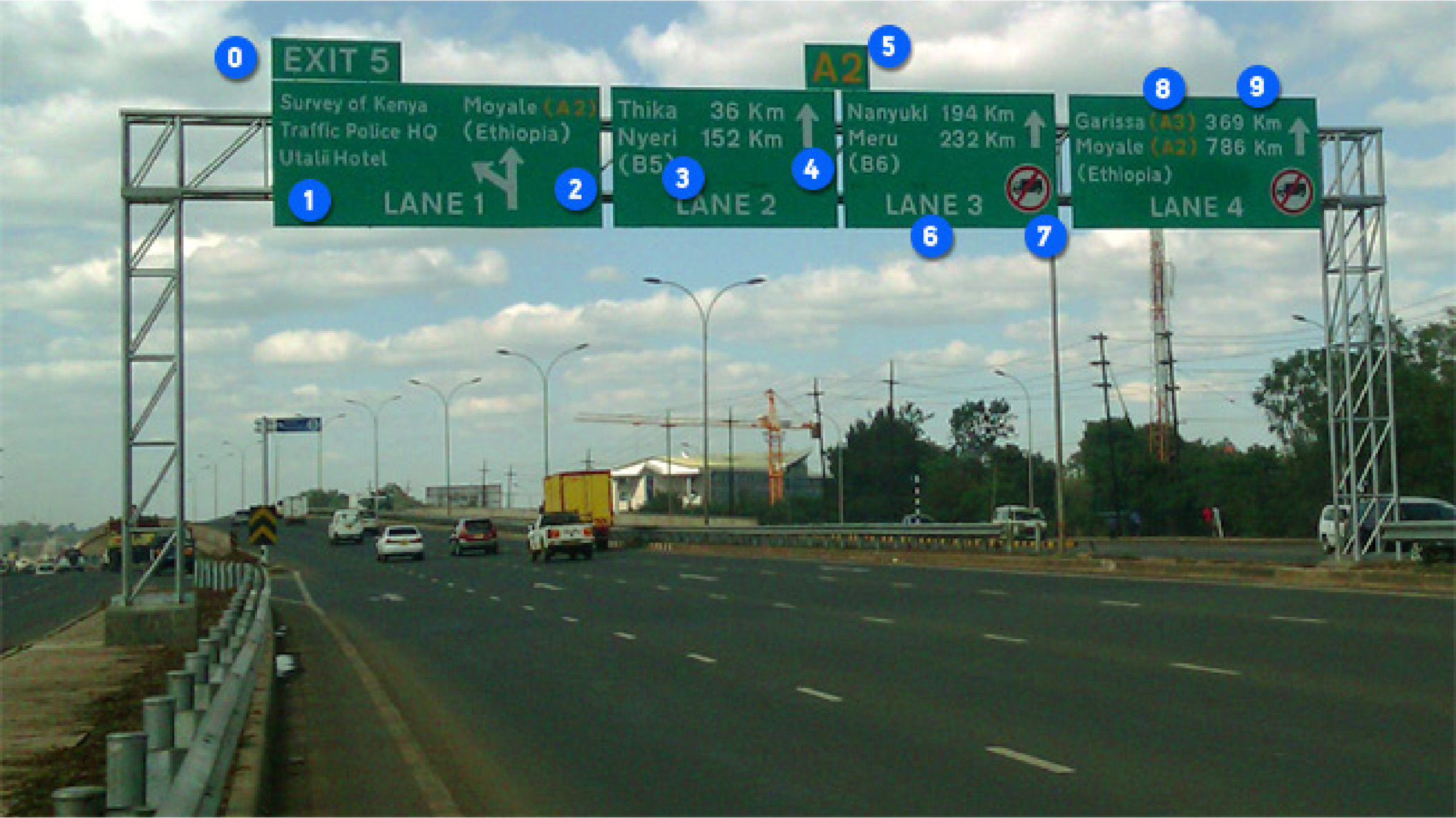
Diagram of the current sign denoting what does not meet the British design standards.
- The exit number is in the wrong place.
- The exit design is out of standard for recommended exit designs for a gantry-mounted directional sign.
- A content prioritisation failure results in destinations ~1000 km apart in the same panel. (Lane 1 takes you to Utalii Hotel a few metres away, or should you forget to indicate – dumps you in Moyale, 786km away on the Kenya-Ethiopia border.)
- Disregard of design rules regarding spacing, colour and typography common to all rectangular traffic control devices.
Content stacking opposes arrow progression. - Wrong and inconsistent labeling of the road name, this is repeated throughout the sign.
- Lane numbering unnecessary and takes up valuable design space (traffic control devices or their supports should not bear any advertising message or any other message that is not related to traffic control).
- The inclusion of warning and regulatory signs is not permitted on gantry-mounted directional signs. Furthermore the presumed problem of speed is not solved by the sign reading “entry forbidden to all heavy commercial vehicles.”
- The relation of destinations to dedicated lanes is wrong and misdirecting i.e. it is confusing to suggest that any particular lane will lead to Ethiopia.
- The inclusion of distances to destinations is not permitted on gantry-mounted directional signs, furthermore the use of km to denote distance unit is unnecessary on highway signage and takes up valuable space, and is furthermore registered incorrectly with a capital K (Kelvin unit of measurement).
Finally, the distance between the sign and the exit is too close to allow enough time for a proper and safe response – even at minimum highway speeds.
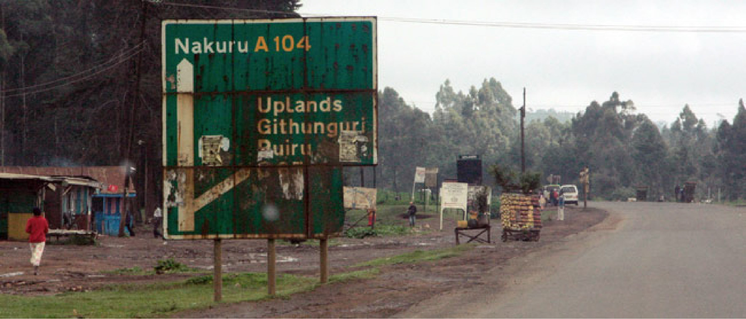
So where did it come from?
Let’s Fix This
We’ll work with the British system (BS EN 12899) to maintain uniformity with other signage systems in the Kenyan road network.
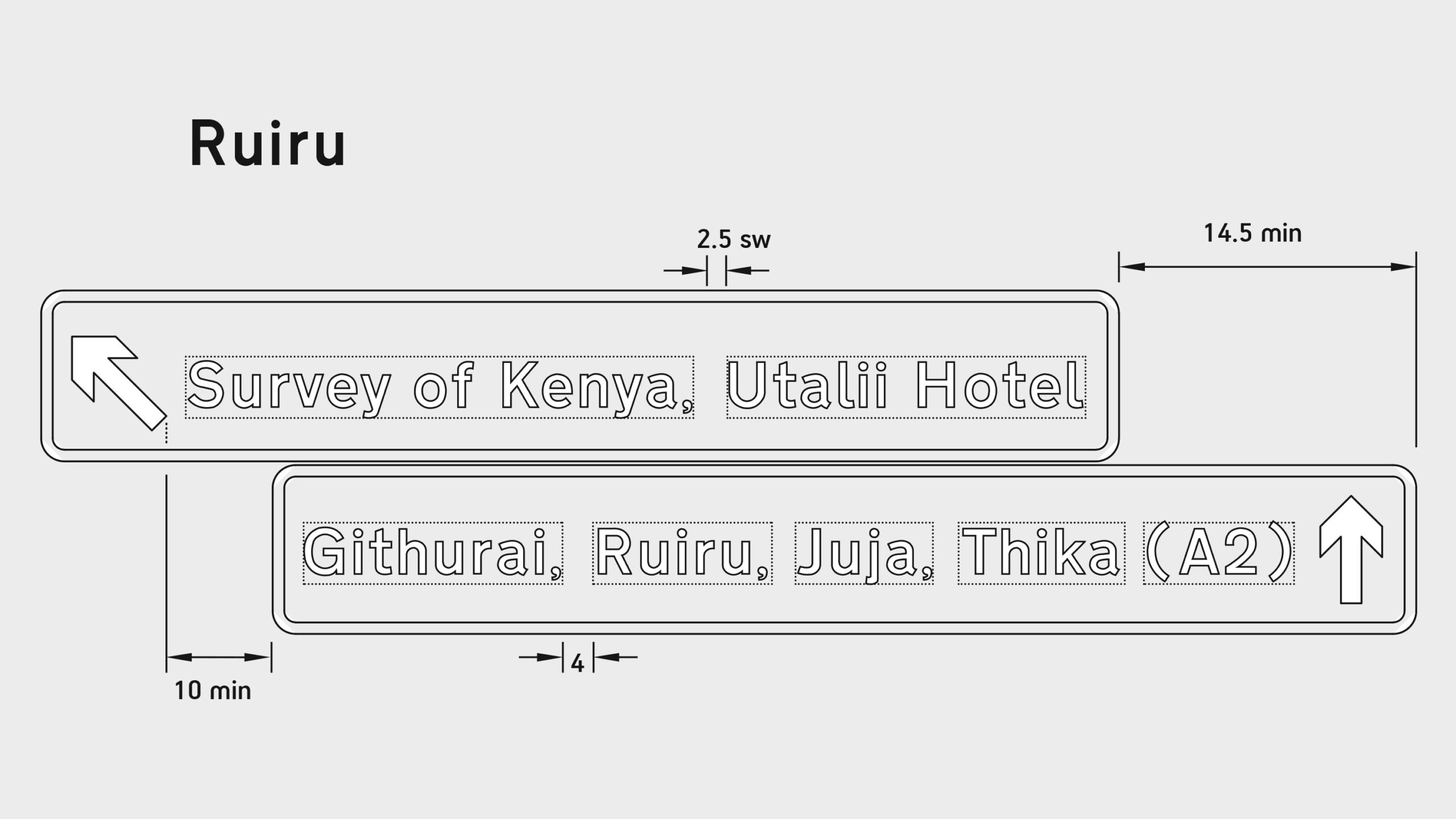
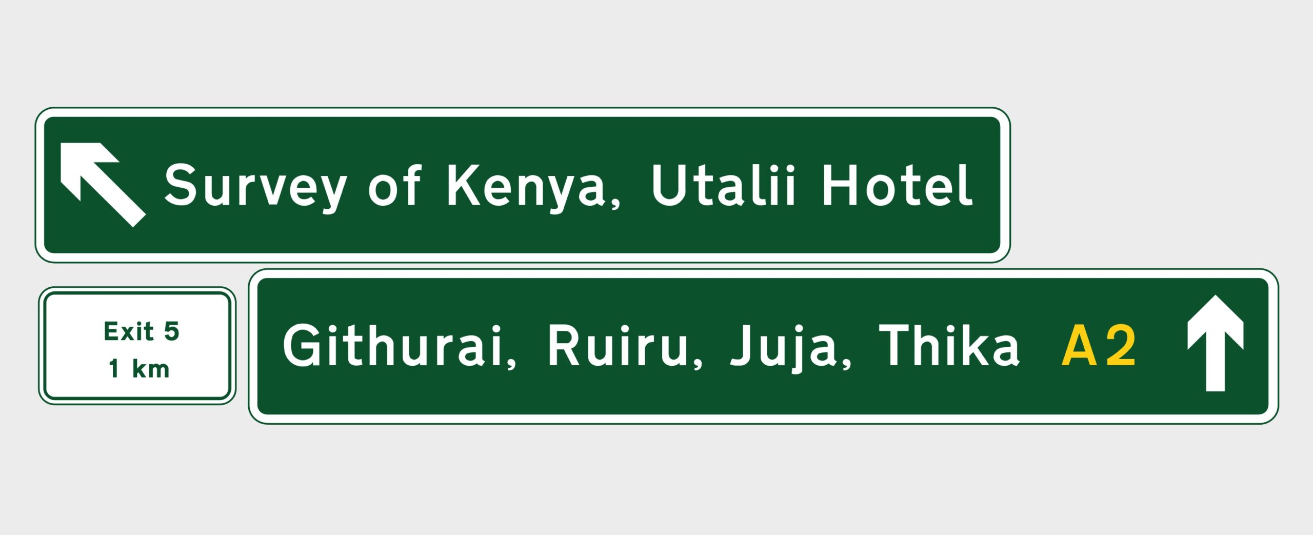
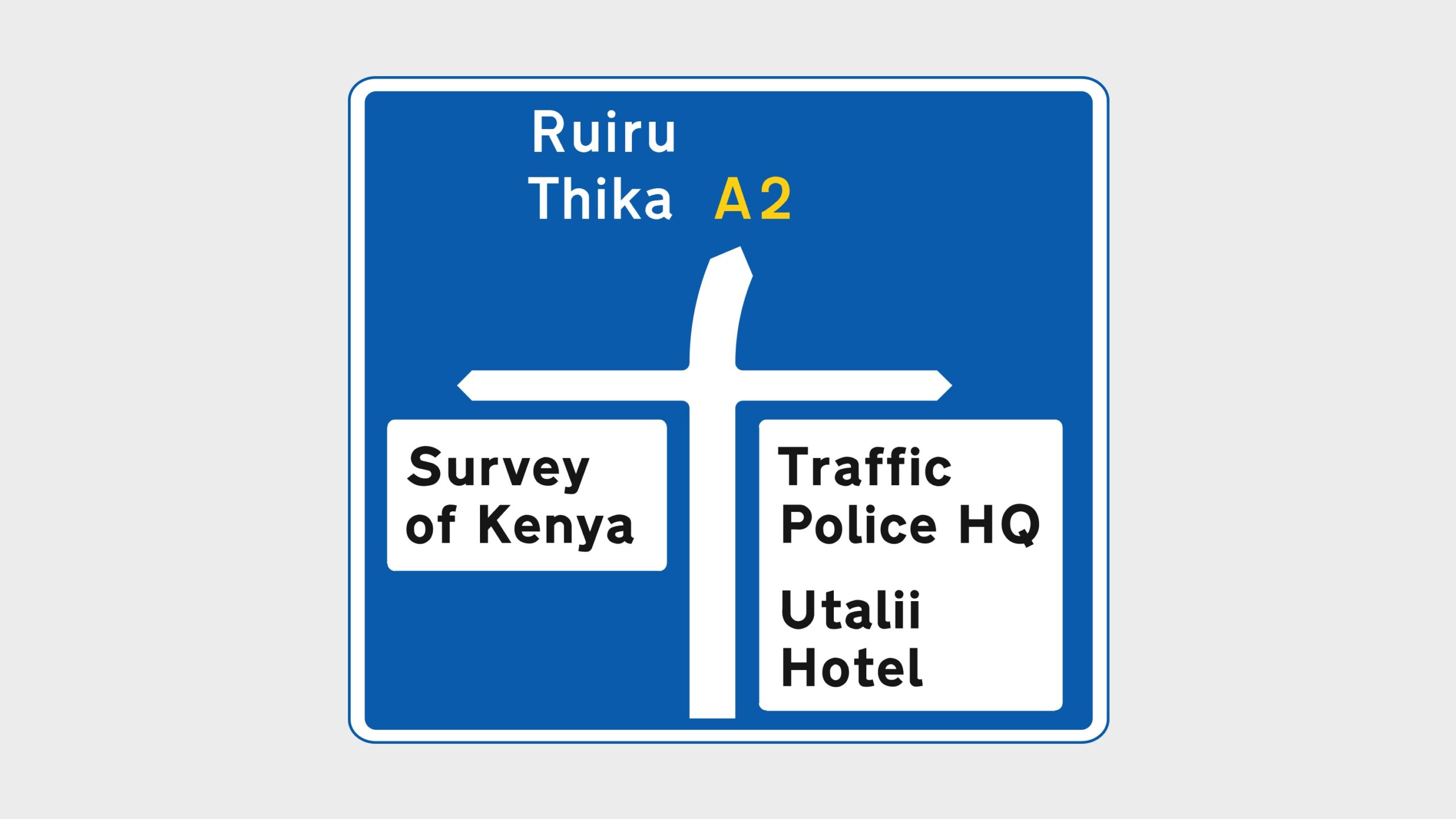
This is how the gantry-mounted signs at the Survey of Kenya grade-separated junction would appear under proper design rules. There are two distinctive designs for gantry-mounted signs; one for junctions without lane drops, and one for junctions with lane drops. The manual states that “It is vitally important that the correct design is used for the two different types of junction.”
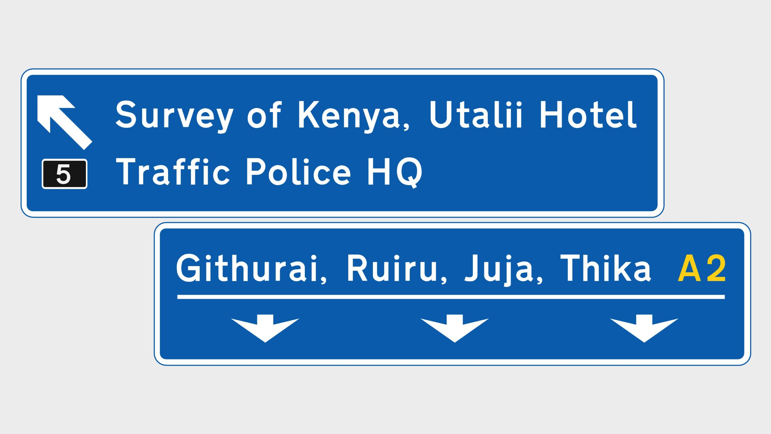
For contrast purposes, the above is an example of a gantry-mounted sign for a junction with a lane drop, using the egress onto Garrisa Road from Thika Road heading North. This clearly indicates that traffic on the left lane goes to a different direction, while the highway continues on to the major town sequence listed.
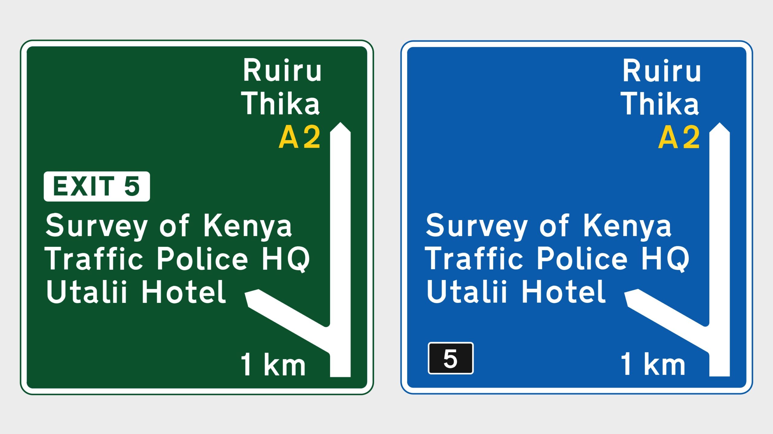
Wait… where did Blue come from?
Thika Road is now a 4-lane dual carriageway, with an additional 2-lane access road on either side. That’s 12 lanes folks! Definitely ranks higher in the hierarchy of roads than it did previously, or any other road in Kenya at the moment. There is a provision for upgrade to Motorways that necessitates use of the colour blue in the British signage standards. If it can be argued that Thika Road is the first road with sufficient traffic throughput to be considered a Motorway, and since Motorway signage in blue is designed to manage high-speed traffic better, then it should be applied here.
Some Context
Traffic control devices notify road users of regulations, as well as provide warning and guidance needed for the reasonably safe, uniform, and efficient operation of all elements of the traffic stream.The gantry-mounted sign should not exist alone. It has to be supplemented by advance direction signs upstream, and followed up by route confirmatory signs downstream of traffic flow for it be sufficiently effective.
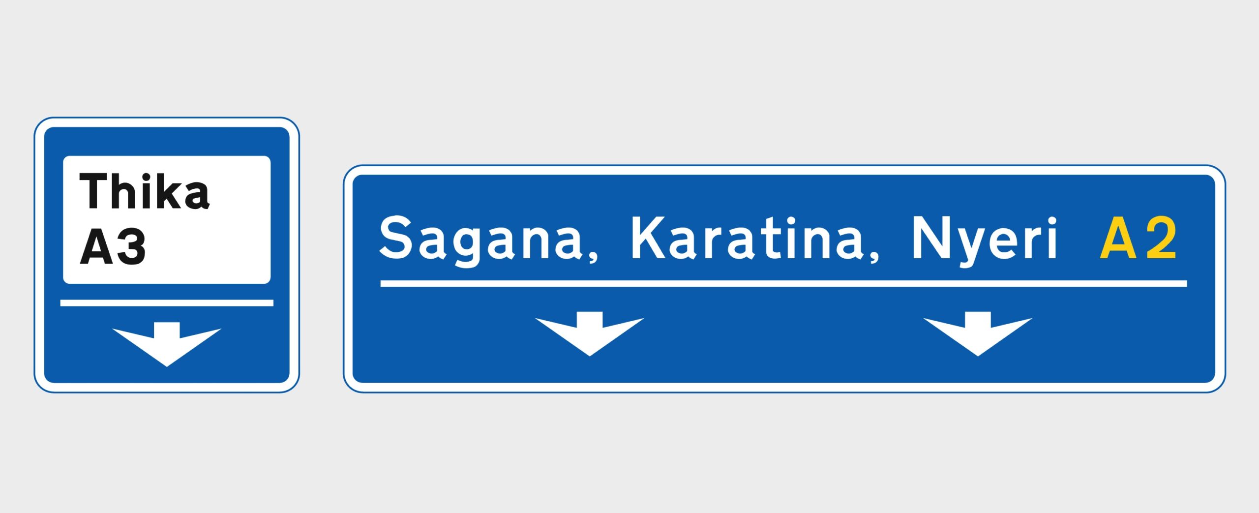
These are map type advance direction signs that should be placed 1 km before the gantry-sign. We have illustrated one in each highway style (Highway and Motorway), to delineate the difference in route exit notation, and indicating the distance to the exit.
After the exit from the Motorway has been made, route confirmatory signs offer further context and reassurance to the driver that the correct directional decision was made, as well as further directional guidance to the intended destination.
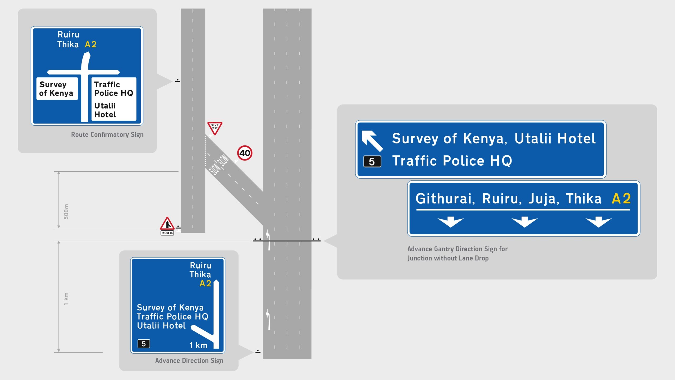
Grade separation for egress onto the slip road is fairly abrupt, even assuming low speeds. Warning signs like those illustrated in the diagram above are necessary to manage and give notice of the confluence of traffic in that junction.
Obviously, the placement of signs should consider reading distance and accounting for traffic speed, as well as distance for the response to the information.
Road markings, warning and regulatory signs are necessary to make the exit as safe as possible. The signage on Thika Road should also attend further physical standards such as visibility, retro-reflectivity and safety in case of collisions.
The Future
Advances have since been made in the field of highway signage that supersede the dated UK system. As any designer would, our first instinct was to indulge in creating an experimental new signage system for the use in the country.
Thika Road needs more proper signage per kilometer to correct the numerous points of failure and potentially fatal design flaws.
Currently it would be more cost effective to match the British standards because of their level of adoption, uniformity and to avoid overlap between two different systems. After all, we are all paying for the road. However, in future, we’ll definitely take a crack at designing a brand new highway signage system for Kenya… and we’ll be sure to make it Matatu-friendly.
Road Closures
A little extra.
In 2020, the roundabout right outside our office was closed for culvert rerouting. Naturally, this is an unavoidable disruption, but we witnessed a lot of unnecessary chaos and risks that could have been avoided by simple signage measures. This was our take on the matter.