CASE STUDY – Kenya Nut Company
Higher steaks
Creating the brand and retail positioning for Kenya's premium aged beef.
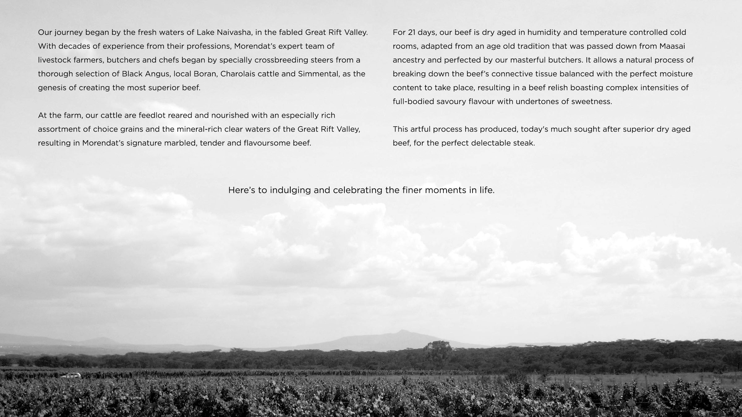
The agricultural town of Naivasha nestles The Morendat Farm, home of the revered premium aged beef brand.
Premium Beef
Until early 2015, the brand’s business model was generally B2B. Morendat had remarkably built a reputation on the back of product quality sans a visual brand aspect. Now that they were thinking of expanding into a B2C market, they realised a need for a distinctive and compelling visual brand. This included an identity system and packaging: reverent of the established reputation, and irresistible to the avid meat eater.
Brand Audit & Strategy
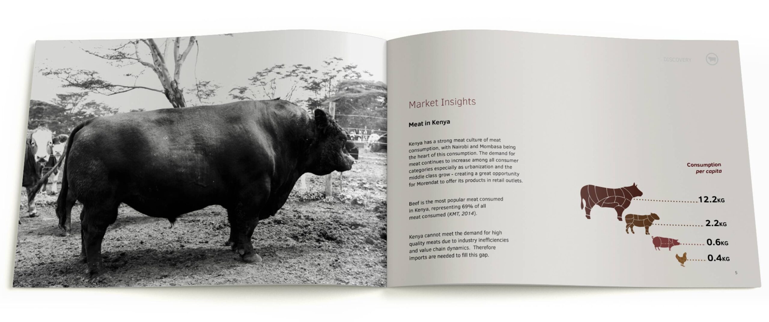
The discovery phase was extensive. We gathered in-depth insights into the regional meat-consumption market, existing products and processors, as well as retail competitors. A thorough audit on the brand to assess current assets was also undertaken. Analysis of the collective information identified opportunities for our brand positioning, look and feel.
Brand Architecture
Morendat’s brand is placed in the ecosystem of the Kenya Nut Company, a parent brand that has diverse dealings. We created a brand architecture system to crystallise the relationship of the parent brand to its various sub-brands, and sub-brands to sub-brands, including Morendat. This would strategically guide brand actions such as nomenclature systems, information hierarchies on the packaging and opportunities in future growth strategies.
Brand Creation
Brand Story
Everyone loves a good story. For centuries, they have not only been a tool to entertain, but also pass down our culture, values and beliefs. We created a brand story that would do the same for the Morendat brand, while enhancing the brand experience for an emotional connection to the meat lover.
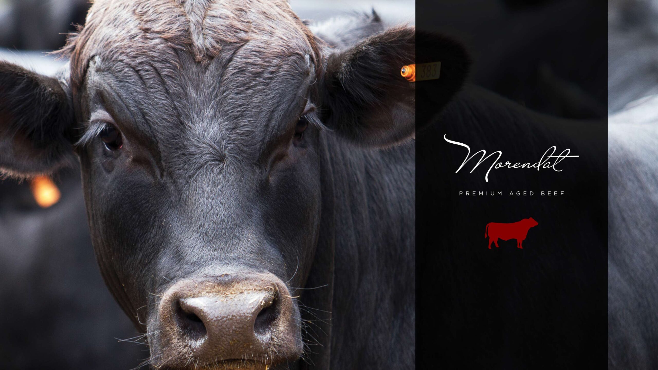
Identity Design
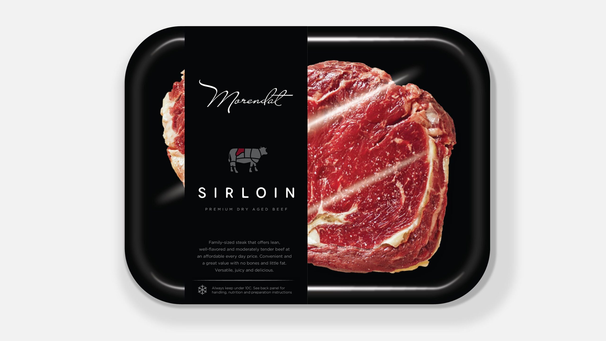
Morendat’s husbandry, feeding and ageing process is nonpareil. We created the brand identity to symbolise Morendat’s endorsement of quality. This is echoed in the identity’s hand-written illustration, with ligature styled in the form of a personal signature.
To reflect its premium positioning, we only assigned two colours in the brand’s primary palette. Less is more.
We also incorporated a subtle but special graphic element – an extended swish on the first letter, representative of a bull’s horn.
Rich Imagery
We went for a bold and precise communication style. Using lots of professionally shot, high-quality, high-contrast and rich-colour imagery.
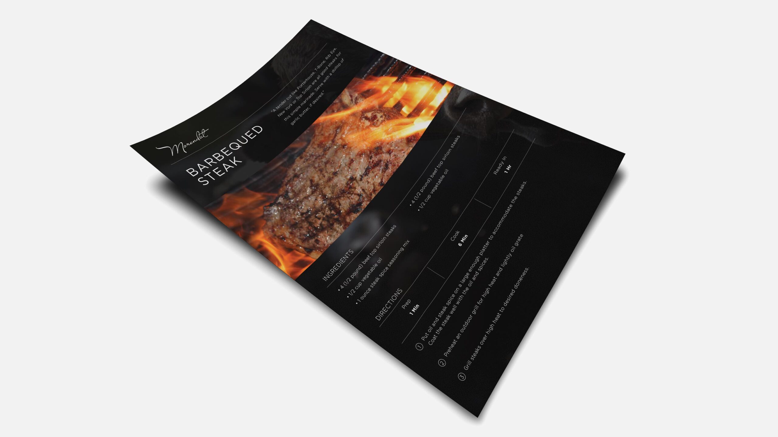

Packaging & Retail
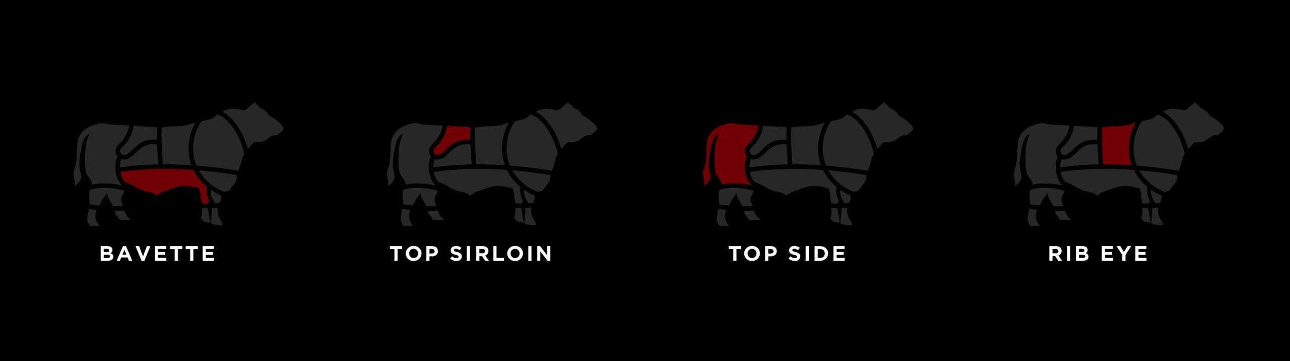
The premium theme followed through to the packaging. We recommended a befitting packaging type that would be eye-catching on the shelf and applied best practice on the label’s information hierarchy. Customers can easily see the actual product and quickly establish what cut of beef they are buying, as well as instructions on how best to keep it – on the labelling.
eCommerce
An online luxury experience
ARK is currently working on developing a eCommerce platform for Morendat, launching soon.