CASE STUDY – Advocacy International
Developing a maternal health programme.
Creating a grassroots programme to improve maternal and newborn survival in 6 countries across Africa.
Advocacy International is a consulting company, based in London and Brooklyn. Started in 2004, they use advocacy, design, communications and policy skills to advance their clients’ public interest goals, and through them, tackle social and environmental injustice.
The Challenge
A brand to inspire action
In late April 2012, we were approached by Advocacy International to develop an on-the-ground campaign brand for their 5 year programme which aims to improve maternal and newborn survival in six different countries in Africa.
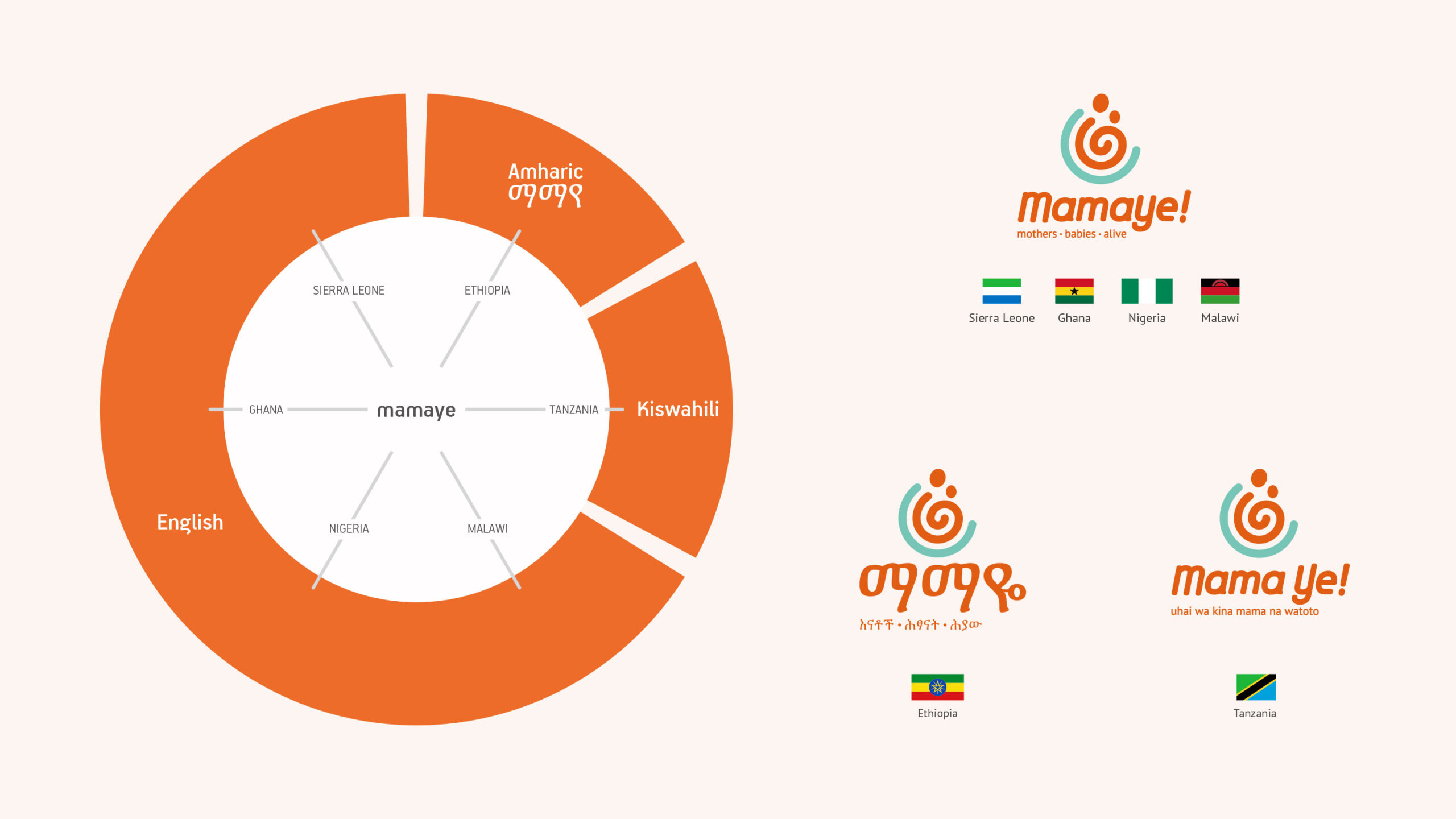
The DFID-funded programme is called Evidence 4 Action (E4A), but they felt that they needed a name and a brand that would connect better with their target audience and act as a banner for the campaign on the ground— and it had to be the same in all five countries; Ethiopia, Ghana, Malawi, Nigeria, Sierra Leone and Tanzania.
When we first sat down to discuss the project, the enormity of the challenge dawned on us. Looking at the culture and spoken languages, these are very different countries, a one size fits all solution seemed impossible. So we took a step back and spent time reading some of the E4A materials and understanding what brought about the need for the campaign.
An inside-out campaign strategy
How do you spark a movement?
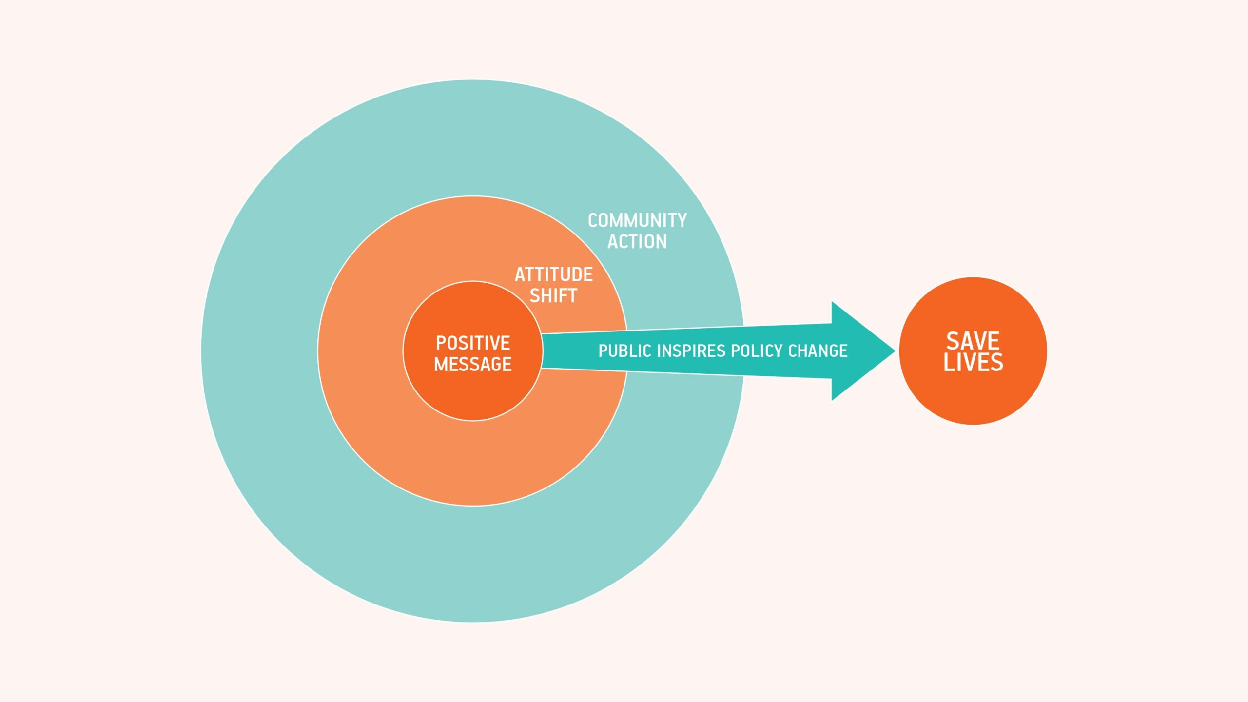
The focus of the campaign is based on the right information. The desired long term response is a movement. Understand what matters to people and cultural norms. Respect their choices and aspirations. Deliver the knowledge and tools they need to bring about change in their communities. The knowledge that there are steps that can be taken to reduce the number of fatalities.
The movement is one of hope – a positive message, birthed from knowledge, that will affect attitudes and spur on community action.
Brand Strategy
Once we had a campaign strategy, the brand strategy flowed from it. It had to be captivating and connect with the audience we wanted to reach. It also had to remain relevant to the campaign message and provide a strong platform for effective communication and interaction. We looked at several approaches but the concept of ‘Motherhood’ stood out the most. The brand core would be centred on the virtue and concept of ‘Motherhood.’
Why Motherhood?
The virtue of motherhood has a strong emotional appeal.
- It focuses on the human aspect, not the event
- It implies nurturing, love, care and affection
- It connects with the child/children
- It is our first emotional connection to the world
- Everyone relates to a mother
The principal and journey of motherhood from conception, through pregnancy, and post-birth is relevant to all members of community; the immediate and extended family, health practitioners & professionals and the community at large, touching every division of the target audience for the campaign. Everyone has a mother, or knows a woman that is mother. This is our common ground in all five countries.
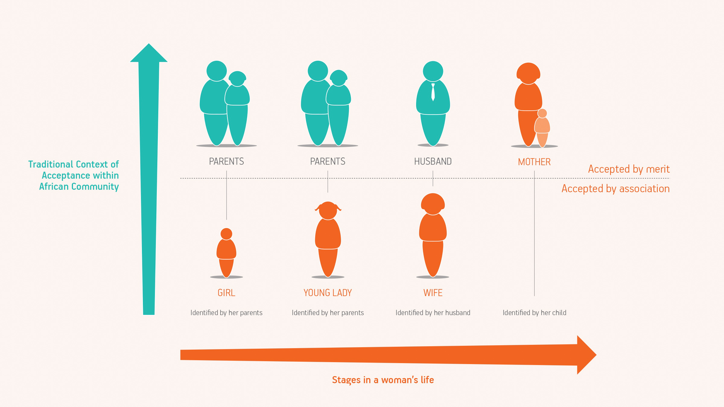
Generally speaking, in African communities, motherhood has a strong and complex network of bonds associated with it.
- An African mother is a mother to the community, not just her children.
- Being a mother “qualifies” a woman, you gain a greater position and status in the community
- A mother is identified by her firstborn’s name (e.g. Mama Isaac)
Naming
In conclusion, what we needed was a rally call, a universal word that could cross multi-cultural audience and capture the core of the brand – motherhood. We also wanted it to have a celebratory tone. This campaign is about shedding light on the positive possibilities that are worth celebrating about in regards to maternal care.
We also looked at the different way in which mothers are called, ama, emaye, mama, mae, etc. After several days of experimenting with phonetics and different sounds and rallying calls used for celebration, MamaYe emerged.
Identity
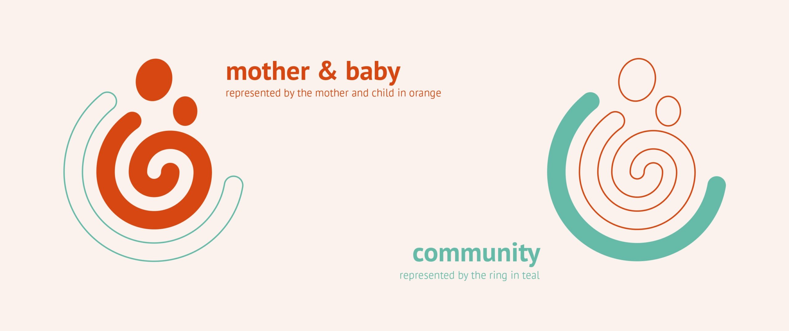
While developing the brand, we knew that in order to capture the heart of the campaign, it had to be representative of its focus (mothers and babies) and the target audience (the community at large).
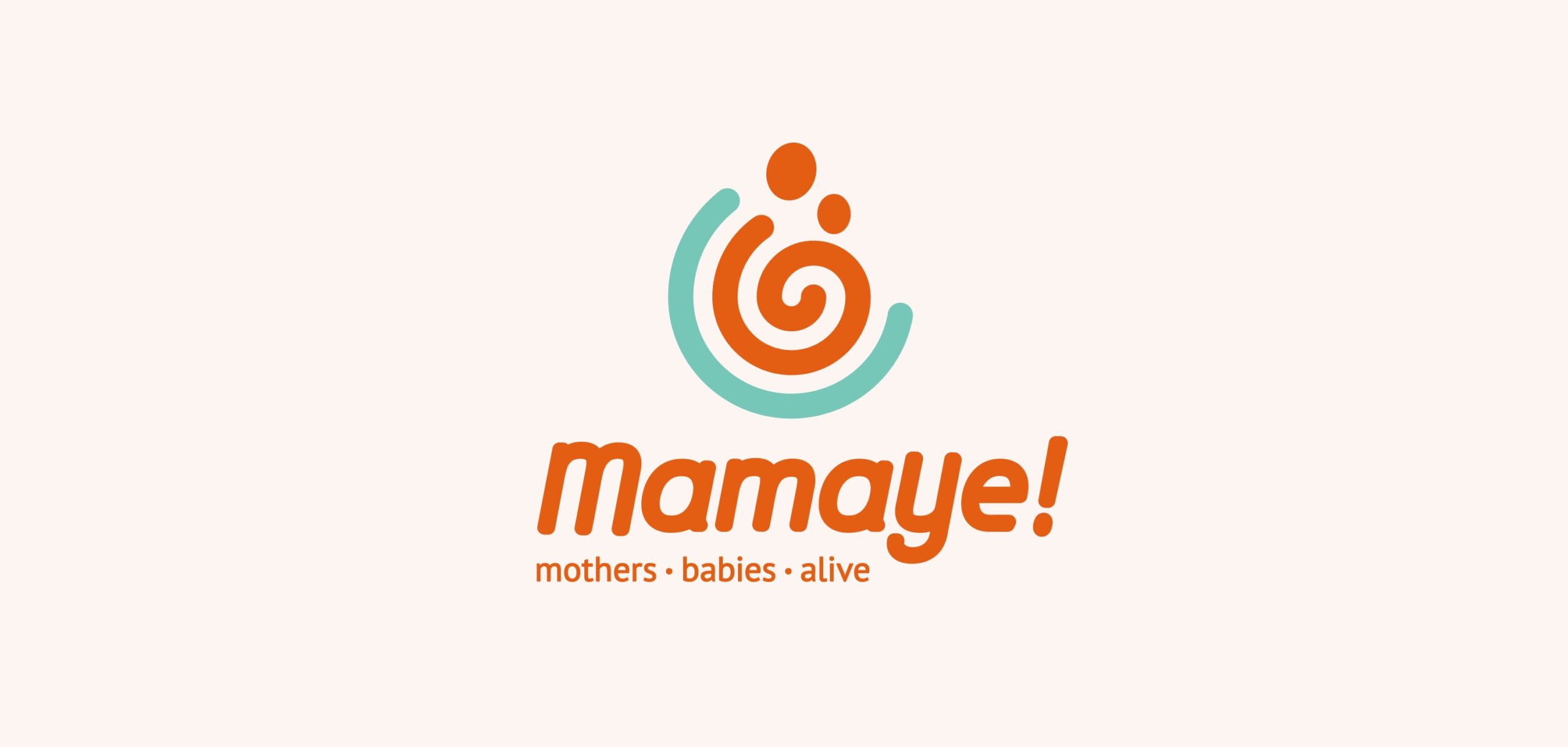
Mothers and babies are the focus of the campaign and the community rallies to protect their mothers and babies. The strap-line is descriptive of the campaign and inspires action.
We proceeded to carry out name studies in each country and to our delight it passed! Requiring only slight modification in two countries. In Ethiopia, the most widely spoken language is Amharic, so while the phonetic passed, the brand would have to be written in Amharic. In Tanzania, we found that the written form needed to be modified to imply tonal emphasis on “Ye’ for it to be read correctly, and the strap line would also have to be written in Kiswahili, their official language.
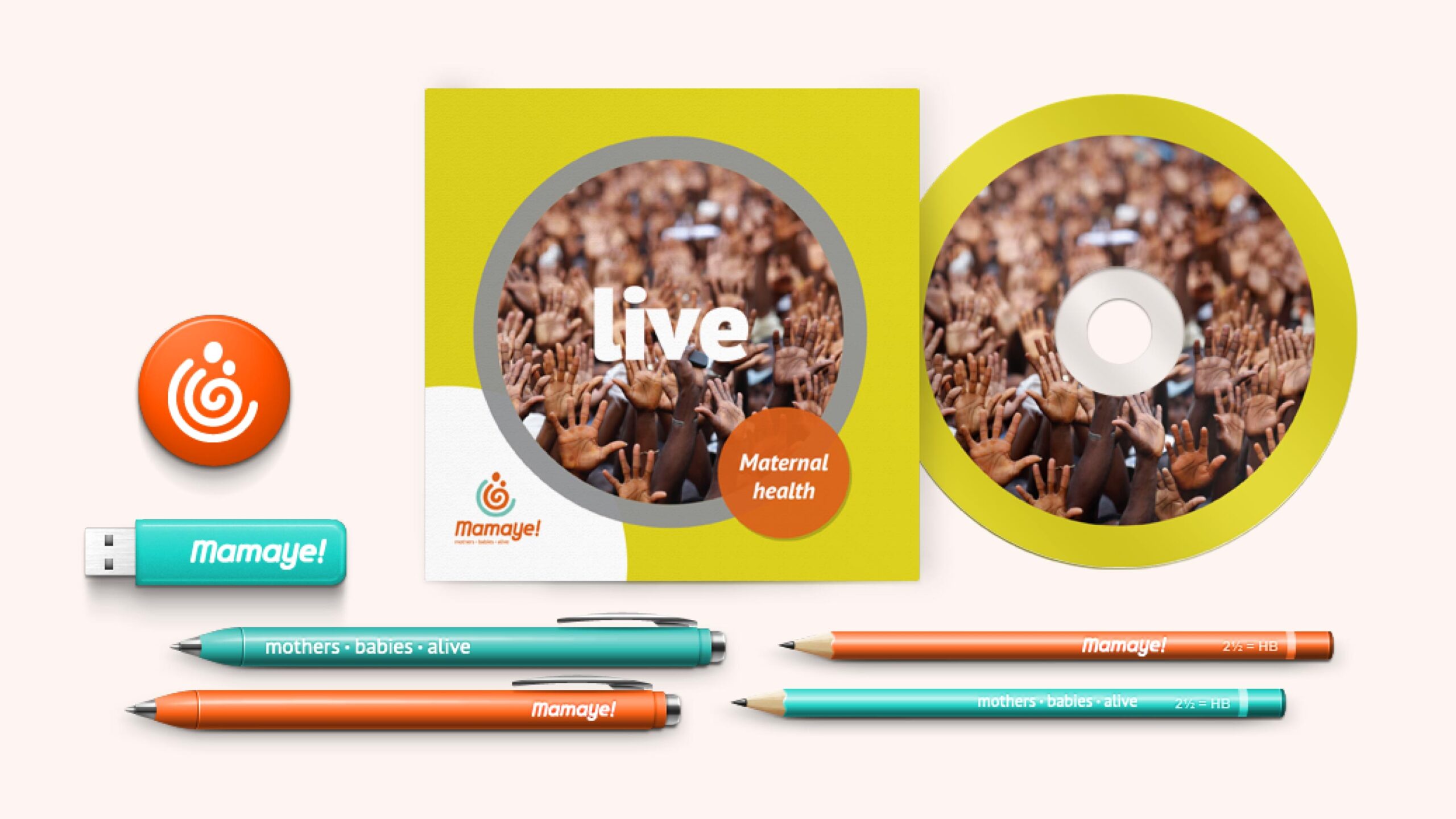
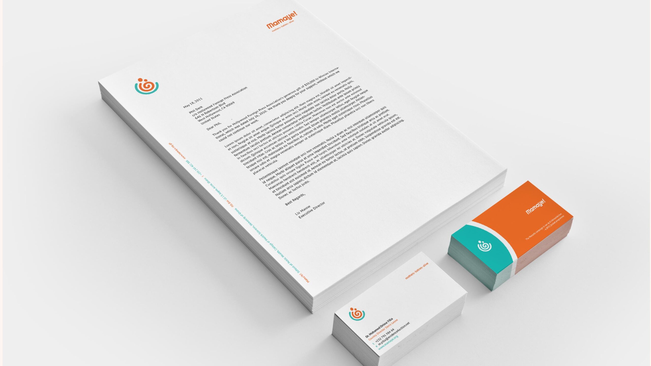
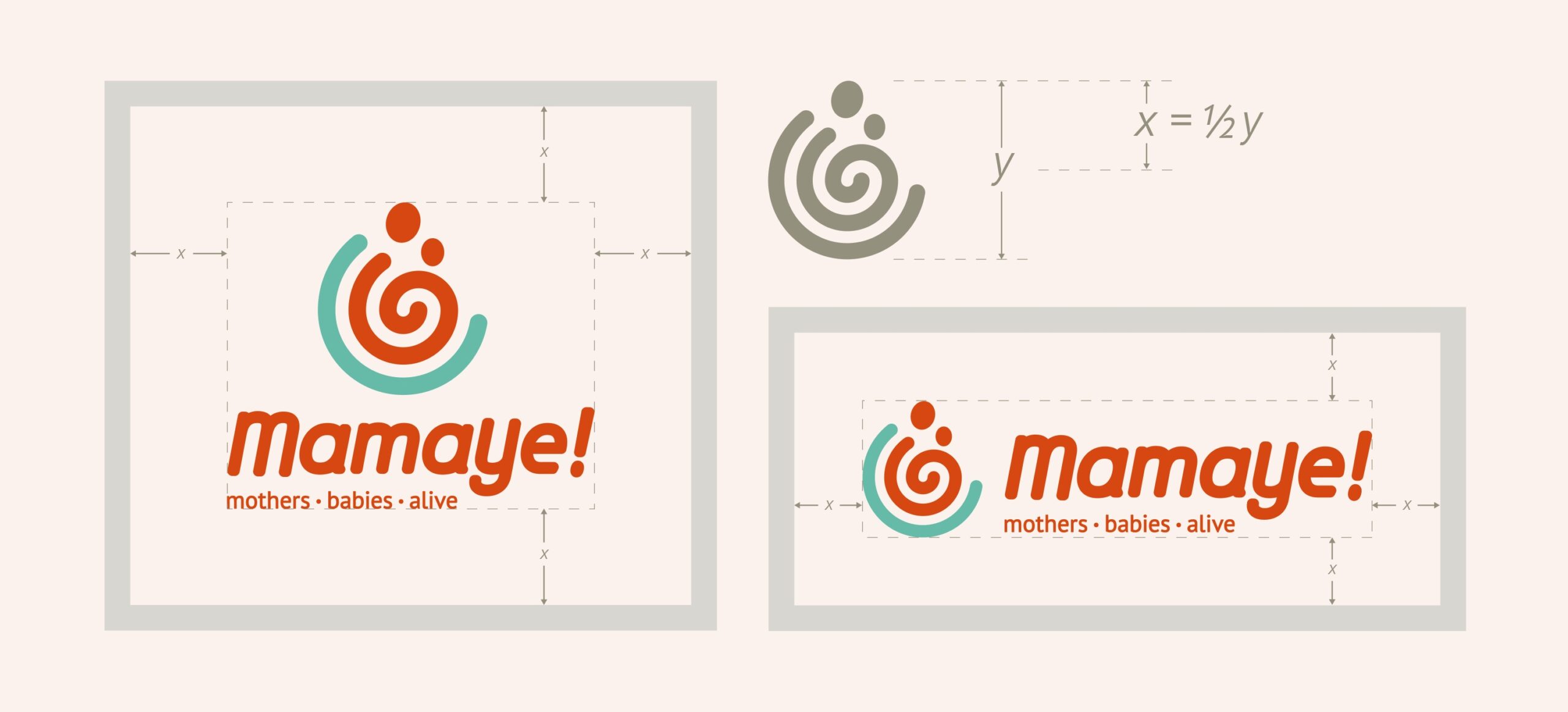
We developed a brand guide for the identity, detailing colours, stationery and stylistic devices and a photography style.
Brand Image
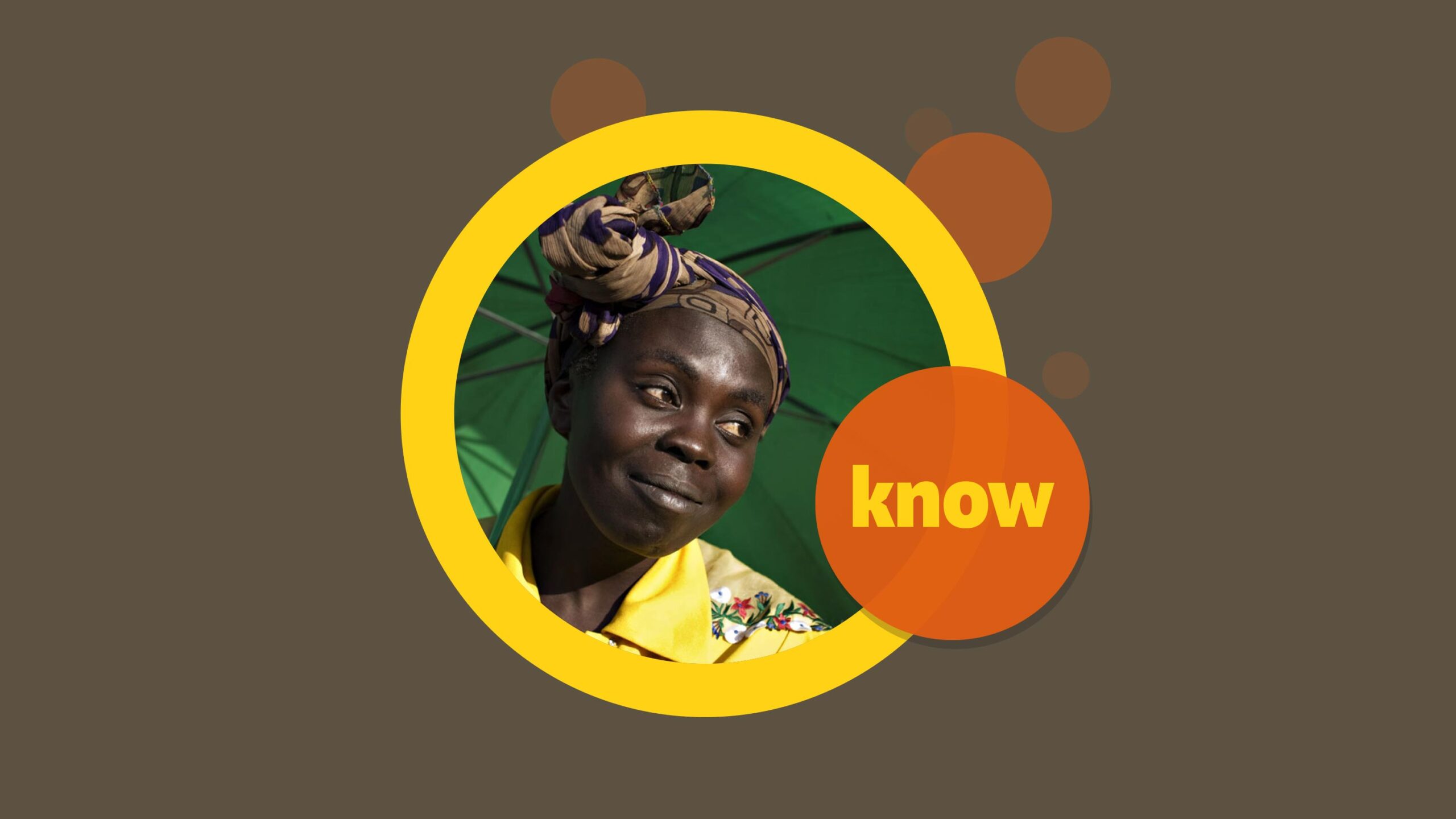
In keeping with the positive message, images are shot and selected for both their aesthetic spectacle as well as editorial context. Happy faces. No sad faces or sad situations. This rules out photos of malnourished kids, people in tattered clothes, children without clothes, distended bellies, and such unfortunate representations. And since vibrant Africa, in all its natural beauty forms the basis of our setting, photographs are taken in-situ, instead of using studio settings or superimpositions. To add relevance and credibility, no models are used, only real beneficiaries of the programme – the evidence for action.